Theme selector
widget.ThemeSelector
is a ready-made appearance setting. It shows a System, Light and Dark switch
above a row of swatches for the eight standard primary colours.
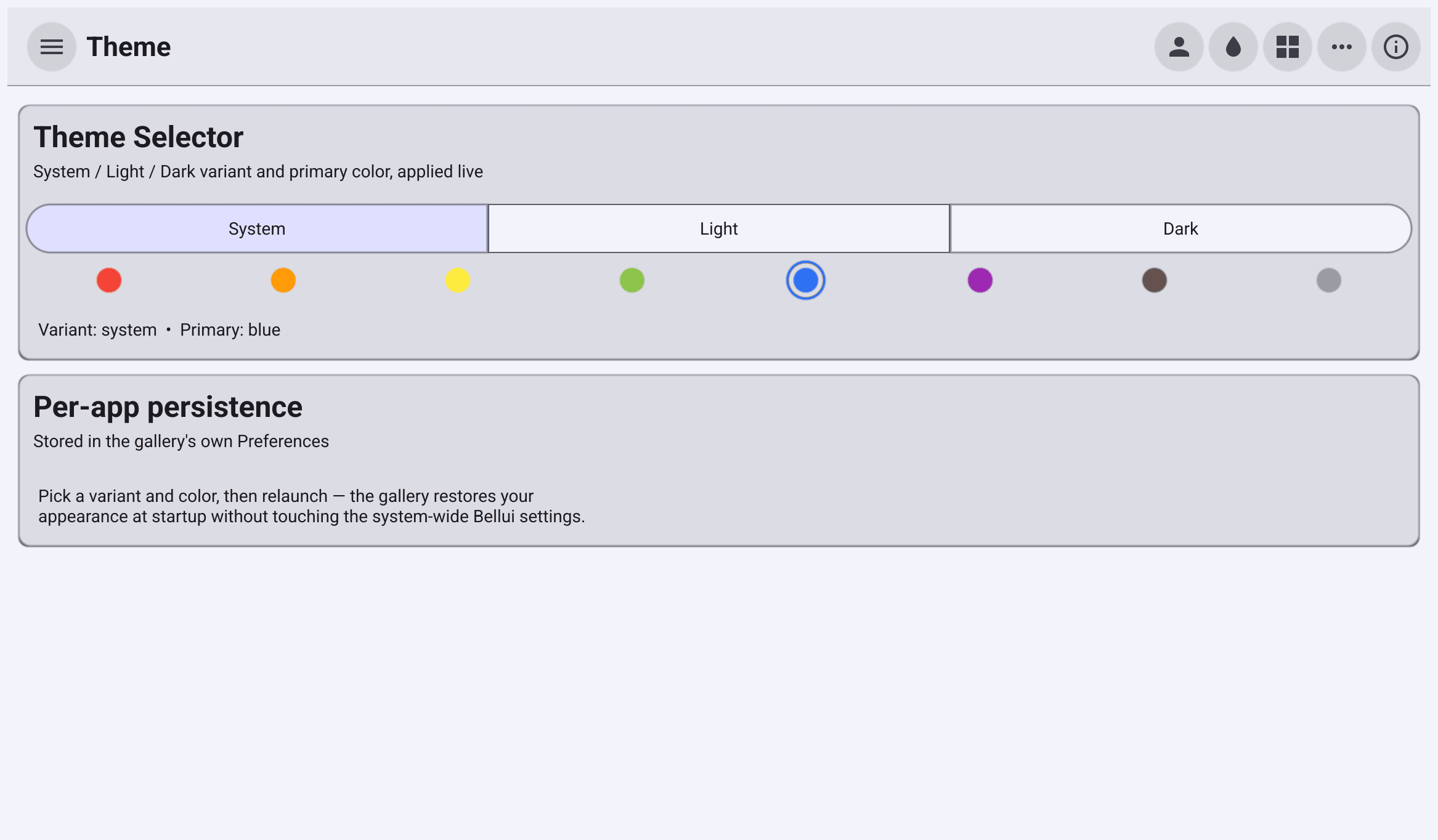
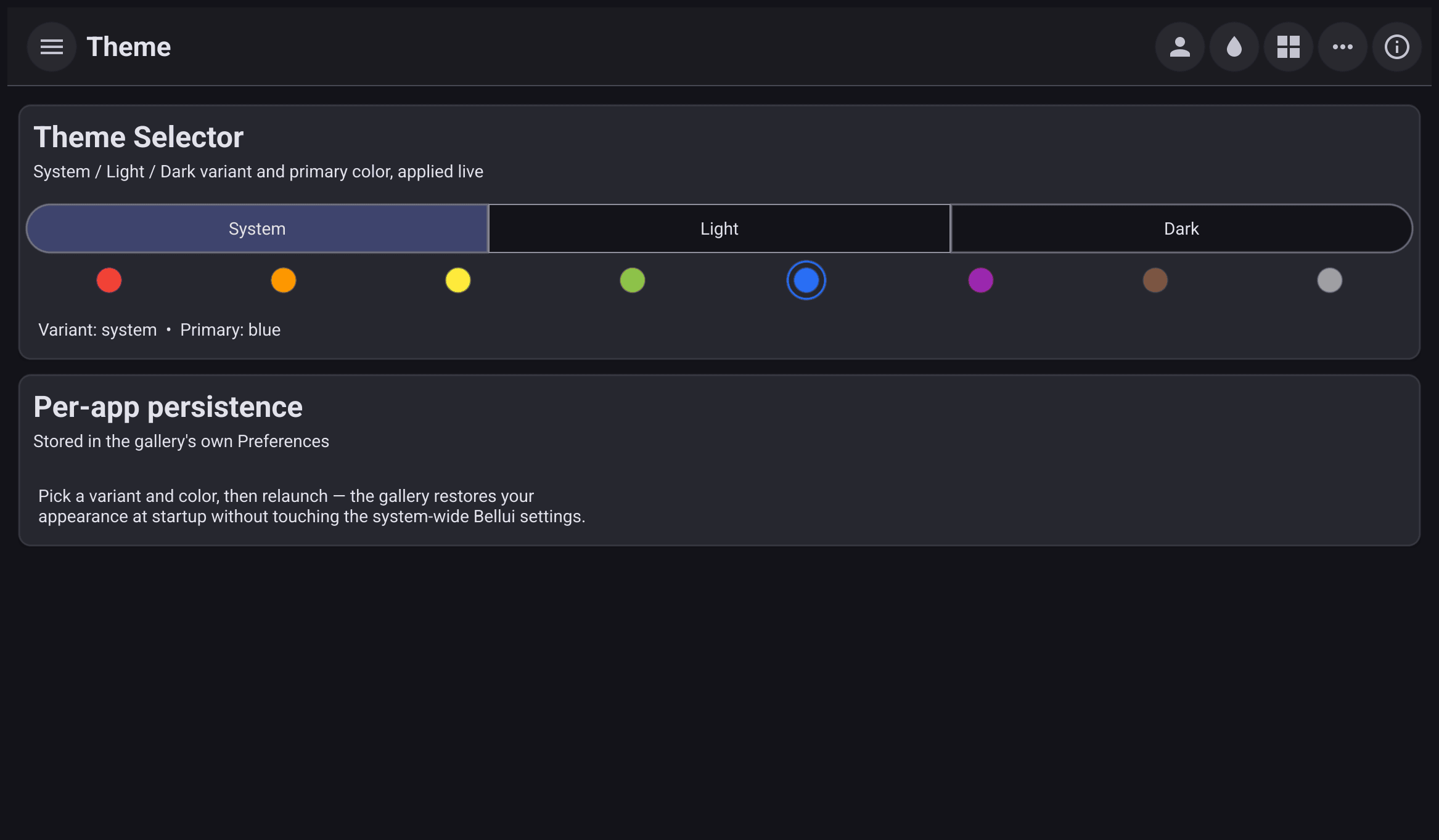
Add the selector
The widget only reports what the user picks. It does not change the theme or save anything itself, so you decide what happens:
selector := widget.NewThemeSelector(func(sel widget.ThemeSelection) {
	sel.Apply()                                     // re-theme this app now
	widget.SaveThemeSelection(sel, a.Preferences()) // remember it
})
if saved, ok := widget.LoadThemeSelection(a.Preferences()); ok {
	selector.Selection = saved // show the saved choice without firing OnChanged
}OnChangedreceives awidget.ThemeSelection: the variant choice (widget.ThemeVariantSystem,ThemeVariantLightorThemeVariantDark) and the name of the primary colour.ThemeSelection.Applyre-themes the running app. An emptyPrimaryleaves the primary colour as it is.widget.SaveThemeSelectionstores the choice in the preferences you pass, normally the app’s own.
A new selector starts on System, with the app’s current primary colour (blue
if none is set). To show a saved choice, assign it to the Selection field
before the selector is displayed. Assigning the field does not call
OnChanged. SetSelection does, when the value changes.
Restore the choice at startup
Load the saved selection and apply it before you show the first window, so the app does not open in one theme and then switch:
// Preferences need an app ID.
a := app.NewWithID("com.example.themeselector")

// Restore the saved appearance before the first window is shown.
if saved, ok := widget.LoadThemeSelection(a.Preferences()); ok {
	saved.Apply()
}
widget.LoadThemeSelection
returns false when nothing was saved. The app then follows the system
appearance, as it does by default.
Preferences need an app ID, so create the app with app.NewWithID (or set
the ID in the app’s metadata). Without one, Preferences() logs an error and
nothing is stored between runs.
What it does not do
- It does not change other apps. The choice applies to your app and is saved in your app’s preferences. Bellui’s system-wide settings, shared by all Bellui apps, are not touched.
- System is resolved when it is applied.
ApplywithThemeVariantSystemreads the system appearance at that moment. - No custom colours. The swatches are the eight named primary colours. For any other colour, build a custom theme.
The full program:
// An appearance setting built from widget.ThemeSelector, applied live and
// remembered in the app's own preferences.
package main

import (
	"github.com/belluikit/bellui"
	"github.com/belluikit/bellui/app"
	"github.com/belluikit/bellui/widget"
)

func main() {
	// Preferences need an app ID.
	a := app.NewWithID("com.example.themeselector")

	// Restore the saved appearance before the first window is shown.
	if saved, ok := widget.LoadThemeSelection(a.Preferences()); ok {
		saved.Apply()
	}

	w := a.NewWindow("Appearance")

	selector := widget.NewThemeSelector(func(sel widget.ThemeSelection) {
		sel.Apply()                                     // re-theme this app now
		widget.SaveThemeSelection(sel, a.Preferences()) // remember it
	})
	if saved, ok := widget.LoadThemeSelection(a.Preferences()); ok {
		selector.Selection = saved // show the saved choice without firing OnChanged
	}

	w.SetContent(widget.NewCard("Appearance", "Theme and accent colour", selector))
	bellui.ShowAndRun(w)
}