Pickers
Pickers let the user choose a structured value, such as a date, a time or a font, without typing it in a particular format.
Which one to use
| You want | Use |
|---|---|
| A date chosen on a calendar, shown in place | NewDatePicker |
| A date or time chosen in a dialog from a button | ShowDatePicker, ShowTimePicker, ShowDateTimePicker |
| A form field where the user can type a date or open a calendar | NewDateEntry |
| The same for a date and a time | NewDateTimeEntry |
| A time on a clock dial, shown in place | NewTimePicker |
| A font family, size, weight and style | NewFontPicker, NewFontPickerWithSystemFonts |
| A light, dark or system appearance setting with a colour | NewThemeSelector |
Date and time pickers
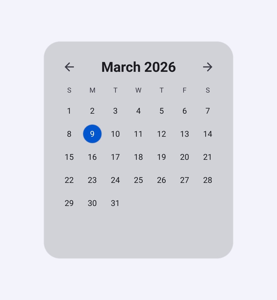
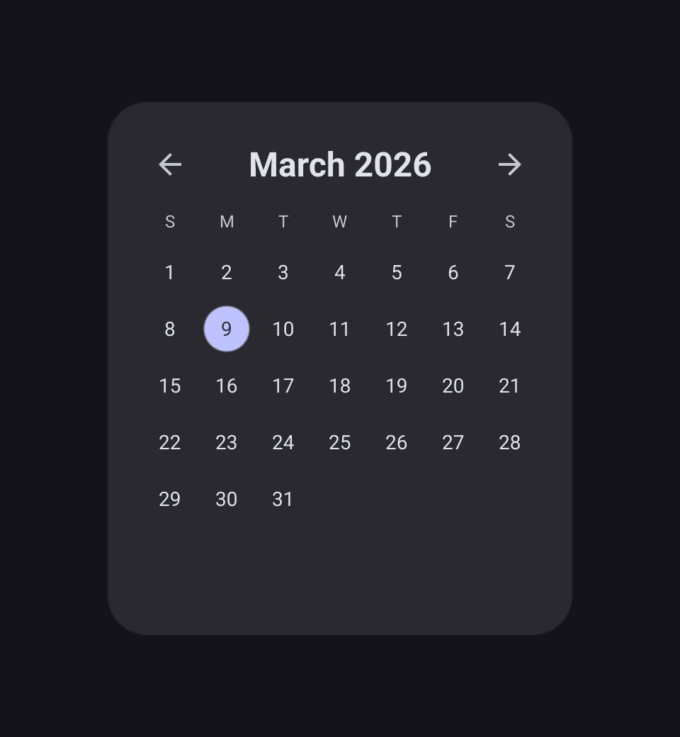
DatePicker
is a month calendar. Selected holds the chosen date and OnChanged receives
each new one.
calendar := widget.NewDatePicker(time.Now(), func(d time.Time) {
	status.SetText("Date: " + d.Format("2006-01-02"))
})
With the keyboard, the arrow keys move between days (and into the next or previous month), Home and End jump to the edges of the week, Page Up and Page Down move a month, and Enter or Space selects.
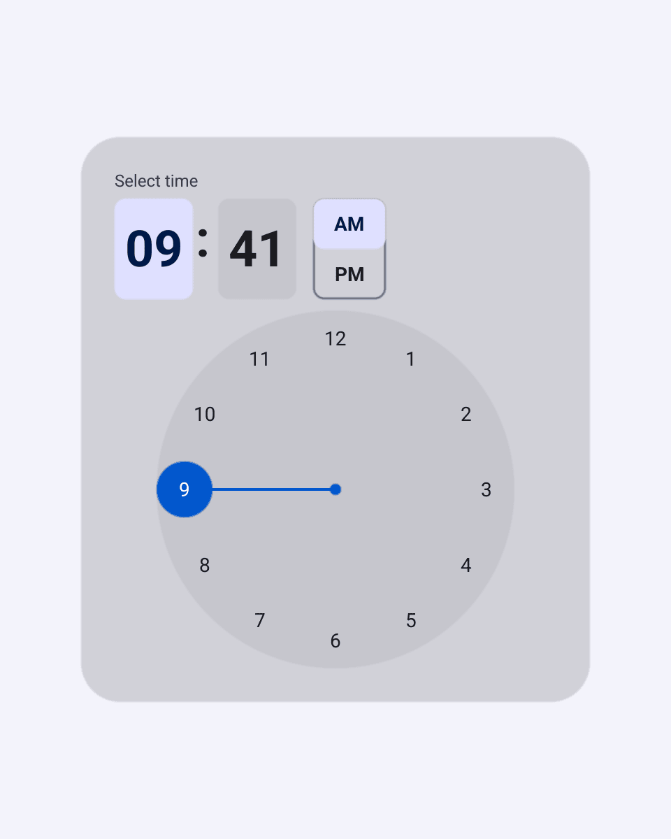
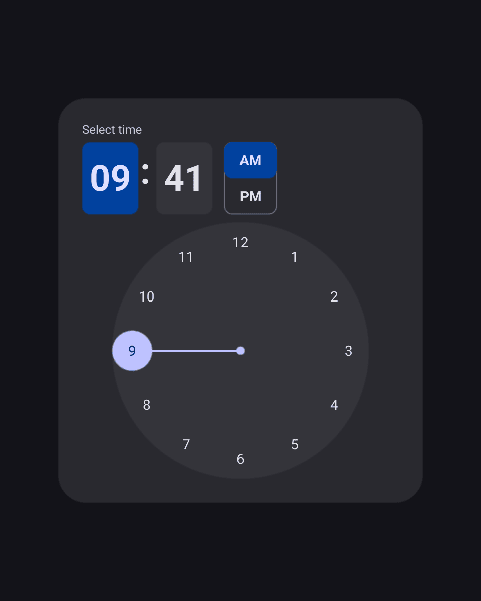
TimePicker
is the MD3 clock dial. Hour and Minute hold the time, and Use24Hour
switches between the 24-hour dial and AM/PM. The user can also type digits
into the hour and minute fields.
DateTimePicker
puts a date picker and a time picker on two tabs, switched with Date and Time
buttons above them.
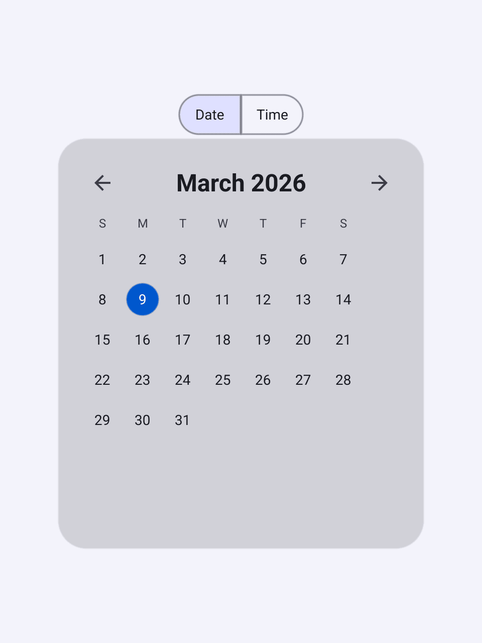
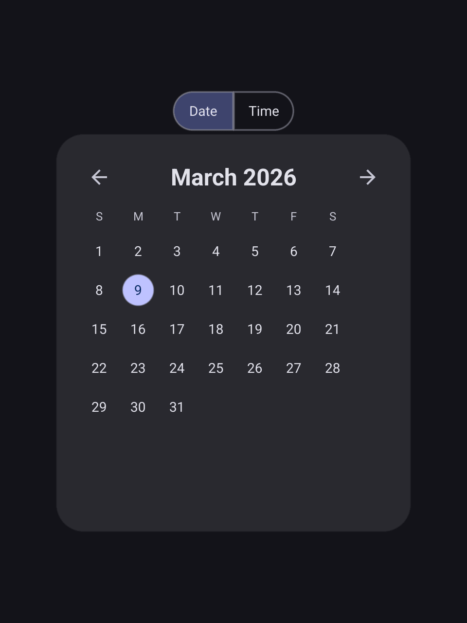
Each picker has a Show function that opens it in a modal dialog with OK
and Cancel buttons. Your function runs only when the user presses OK:
pickTime := widget.NewButton("Pick a time", func() {
	now := time.Now()
	widget.ShowAutoTimePicker(now.Hour(), now.Minute(), func(h, m int) {
		status.SetText(fmt.Sprintf("Time: %02d:%02d", h, m))
	}, w.Canvas())
})

pickBoth := widget.NewButton("Pick date and time", func() {
	widget.ShowAutoDateTimePicker(time.Now(), func(t time.Time) {
		status.SetText("When: " + t.Format(time.RFC822))
	}, w.Canvas())
})| Picker | In place | In a dialog |
|---|---|---|
| Date | NewDatePicker | ShowDatePicker |
| Time | NewTimePicker, NewAutoTimePicker | ShowTimePicker, ShowAutoTimePicker |
| Date and time | NewDateTimePicker, NewAutoDateTimePicker | ShowDateTimePicker, ShowAutoDateTimePicker |
The Auto variants choose 12-hour or 24-hour mode from the user’s locale.
The others take a use24h argument.
Date entries
DateEntry
and DateTimeEntry
are entries for forms. The user types a date in the locale’s format, or taps
the button at the end of the field to open a calendar. Characters that cannot
be part of a date are ignored, including in pasted text.
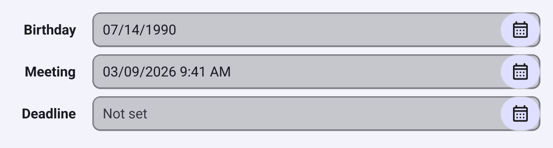
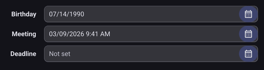
birthday := widget.NewDateEntry()
birthday.SetPlaceHolder("Birthday")
birthday.OnChanged = func(d time.Time) {
	status.SetText("Birthday " + d.Format("2 Jan 2006"))
}

meeting := widget.NewDateTimeEntry()
meeting.SetDateTime(time.Now().Add(24 * time.Hour))
meeting.OnChanged = func(t time.Time) {
	status.SetText("Meeting " + t.Format(time.Kitchen))
}- Use the entry’s own
OnChanged, which receives atime.Time. The embeddedEntry.OnChangedreceives the raw text instead. Selectedholds the last valid value.Date()andDateTime()parse the current text and return an error if it is not valid.SetDateandSetDateTimewrite a value in the locale’s format.DateTimeEntry.Use24Houris set from the locale and controls the time picker it opens.
Font picker
FontPicker
combines controls for a font family, size, weight and style. It reports a
FontPickerConfig
with Family, Size, Weight, Bold, Italic and Underline.
TextStyle() turns that into a bellui.TextStyle for a label or rich text.
font := widget.NewFontPickerWithSystemFonts(
	widget.FontPickerConfig{Size: 14},
	func(cfg widget.FontPickerConfig) {
		preview.TextStyle = cfg.TextStyle()
		preview.SetText(fmt.Sprintf("%s, %.0f pt", cfg.Family, cfg.Size))
	})
NewFontPickerWithSystemFonts lists the fonts installed on the system,
loading the list in the background. NewFontPicker takes your own
FontFamily
list, each with a name and the font file as a resource. ShowFontPickerPopup
opens a picker in a modal dialog with OK and Cancel buttons.
Theme selector
ThemeSelector
is a ready-made appearance setting: System, Light or Dark above a row of
primary colour swatches. It only reports the user’s choice. Call
ThemeSelection.Apply to re-theme the app and SaveThemeSelection to
remember it:
appearance := widget.NewThemeSelector(func(sel widget.ThemeSelection) {
	sel.Apply()
	widget.SaveThemeSelection(sel, a.Preferences())
})
// Restore the choice saved last time.
if sel, ok := widget.LoadThemeSelection(a.Preferences()); ok {
	sel.Apply()
	appearance.Selection = sel
}
Theme selector in the Theming section covers it in more detail.