Text input
widget.Entry
is the text field. Most of the other text inputs on this page build on it, so
what you learn about Entry (placeholder, callbacks, validation, styles)
applies to them too. SearchSelect and RichEntry are separate widgets.
Which one to use
| You want | Use |
|---|---|
| One line of free text | NewEntry |
| A secret, with a button to reveal it | NewPasswordEntry |
| Several lines, such as notes or a message | NewMultiLineEntry |
| A number, with typing limited to digits | NewNumericEntry, NewIntegerEntry |
| Free text with a list of common values to pick from | NewSelectEntry |
| A search box that filters as the user types | NewSearchField |
| One value from a long list, found by typing | NewSearchSelect |
| Suggestions under the caret while the user types | Entry.ShowCompletion |
| Text with bold, italic and other styled runs | NewRichEntry |
| A date or a date and time | DateEntry, DateTimeEntry (see Pickers) |
If the user must pick from a fixed list and may not type their own value, use
Select instead.
Entry
name := widget.NewEntry()
name.SetPlaceHolder("Your name")
name.OnChanged = func(s string) {
	status.SetText("Typing: " + s)
}
name.OnSubmitted = func(s string) {
	status.SetText("Submitted: " + s)
}OnChangedruns after every edit with the whole text.OnSubmittedruns when the user presses Enter or Return in a single-line entry. In a multi-line entry, Shift+Enter submits.OnEscape, when set, runs when the user presses Escape.SetTextreplaces the text and clears the undo history.Textholds the current text.SetTextandSetPlaceHolderare safe to call from any goroutine.Undo()andRedo()step through the edit history; the usual keyboard shortcuts work too.
Variants
email := widget.NewEntry()
email.Style = widget.EntryStyleOutlined
email.SetPlaceHolder("Email")
email.SetIcon(theme.MailComposeIcon())

password := widget.NewPasswordEntry()
password.SetPlaceHolder("Password")

notes := widget.NewMultiLineEntry()
notes.Wrapping = bellui.TextWrapWord
notes.SetMinRowsVisible(4)

licence := widget.NewMultiLineEntry()
licence.SetText("Read-only text can be selected and copied.")
licence.ReadOnly = true- Style.
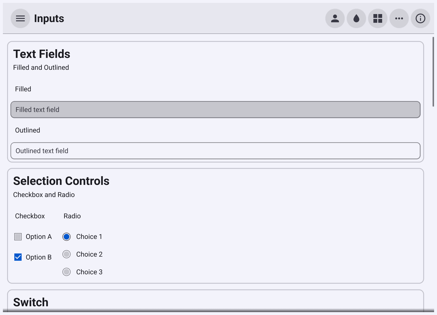
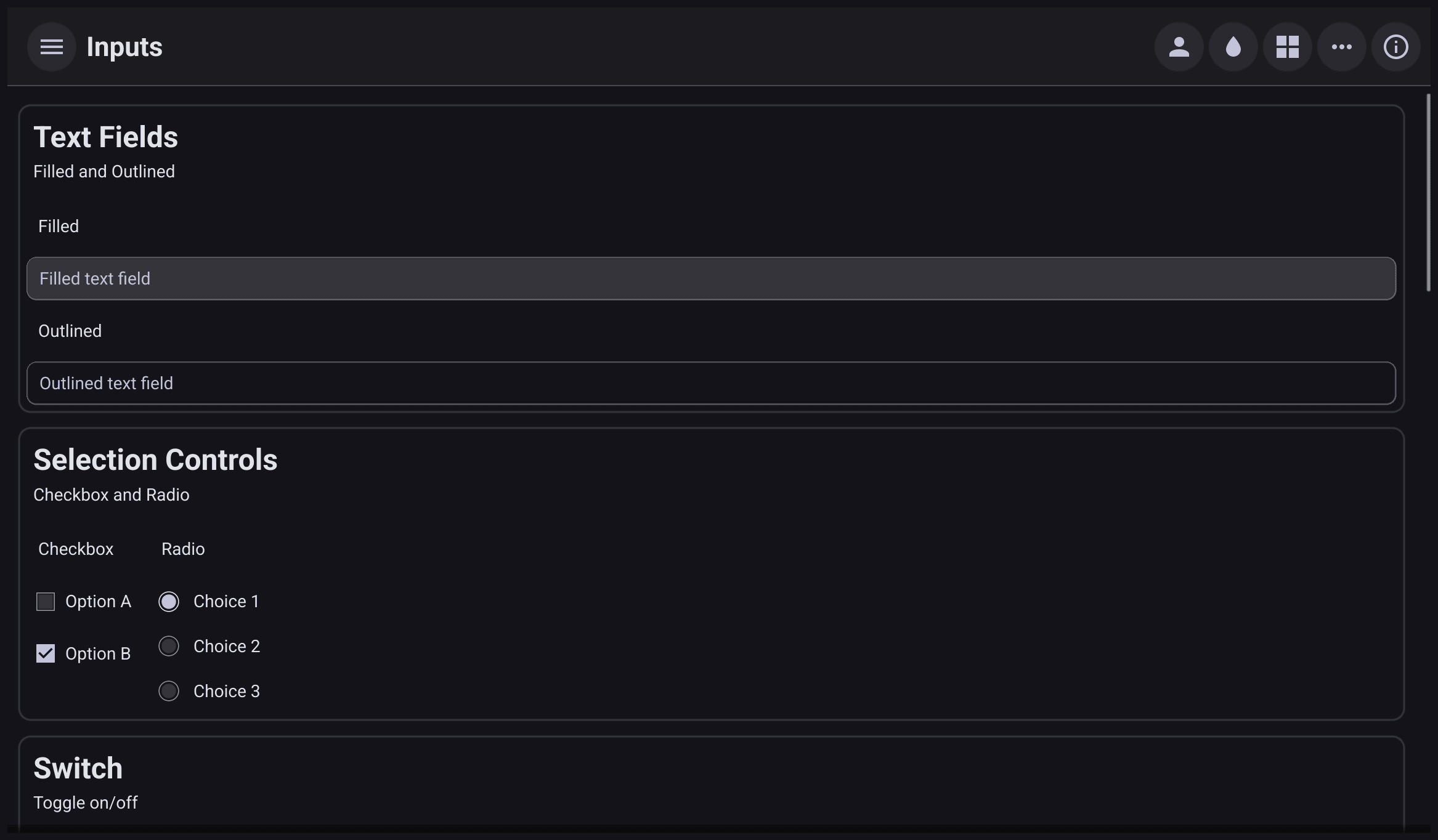
EntryStyleFilled(the default) has a filled background.EntryStyleOutlinedhas a border and no fill. - Icon.
SetIconshows an icon at the leading edge. It is decoration only and cannot be tapped.ActionItemholds an object for the trailing edge; the password entry puts its reveal button there. - Password.
NewPasswordEntryhides the characters and adds a button that reveals them. Screen readers are never given the text. - Multi-line.
NewMultiLineEntryaccepts new lines. SetWrappingtobellui.TextWrapWordto wrap long lines, andSetMinRowsVisible(n)to make it at leastnrows tall (3 by default). - Read-only.
ReadOnly = truestops editing but keeps the normal look, and the user can still focus, select and copy the text.Disable()instead blocks all interaction and draws the entry in the disabled style. - Alignment and style.
Alignmentaligns the text, andTextStylesets bold, italic or monospace for the whole entry.
Validation
Set Validator to a function that returns an error for invalid text. A
bellui.StringValidator
is a func(string) error. The
data/validation
package has ready-made ones: NewRegexp, NewTime and NewAllStrings,
which combines several.
zip := widget.NewEntry()
zip.SetPlaceHolder("Postcode (5 digits)")
zip.Validator = validation.NewRegexp(`^\d{5}$`, "must be five digits")

user := widget.NewEntry()
user.SetPlaceHolder("Username")
user.Validator = func(s string) error {
	if strings.ContainsAny(s, " \t") {
		return errors.New("no spaces")
	}
	return nil
}
The entry shows its state at the trailing edge:
- valid, non-empty text gets a check mark;
- invalid text gets an error mark, but only once the user has edited the entry and moved focus away, so a half-typed value is not flagged.
Set AlwaysShowValidationError to show an error before the user has typed
anything. Set ValidateWithBorder to show errors as a thicker border in the
error colour instead of the icon.
Validate() runs the validator now and returns its error, which is useful
before you save:
check := widget.NewButton("Check", func() {
	if err := user.Validate(); err != nil {
		status.SetText("Username " + err.Error())
		return
	}
	status.SetText("Looks good")
})
SetValidationError sets the error shown until the next edit, for example an
error your server returned. Inside a Form, the form collects these
errors and disables its submit button while any field is invalid.
Numbers
price := widget.NewNumericEntry()
price.SetPlaceHolder("Price")
price.OnValueChanged = func(v float64) {
	status.SetText(fmt.Sprintf("Price %.2f", v))
}

qty := widget.NewIntegerEntry()
qty.SetBounds(1, 99)
qty.SetValue(1)
NumericEntry
right-aligns its text and ignores keys that cannot be part of a number,
including in pasted text. NewNumericEntry accepts decimals and
NewIntegerEntry accepts whole numbers.
OnValueChangedruns with the parsed number when the text changes to a valid number. Do not assignOnChangedon aNumericEntry: it replaces the handler that drivesOnValueChanged.Value()returns the current number, or an error if the text is not one.SetValuewrites a number.SetBounds(min, max)setsMinandMax. A value outside them is a validation error such as “minimum is 1”. Passmath.Inf(-1)ormath.Inf(1)to remove a bound.AllowNegativeandAllowFloatcontrol whether a minus sign and a decimal point are accepted.NewNumericEntrysets both to true.NewIntegerEntrysetsAllowNegativeto true andAllowFloatto false.LocaleFormatuses the locale’s decimal separator instead of a dot.
For a number the user nudges up and down, see SpinBox.
Choices and search
colour := widget.NewSelectEntry([]string{"Red", "Green", "Blue"})
colour.SetPlaceHolder("Pick or type a colour")
colour.OnOptionSelected = func(s string) {
	status.SetText("Picked " + s)
}

country := widget.NewSearchSelect(
	[]string{"Austria", "Belgium", "Brazil", "Canada", "Germany", "Japan"},
	func(s string) { status.SetText("Country " + s) })
country.Preferred = []string{"Germany", "Austria"}
country.PlaceHolder = "Country"SelectEntryis an entry with a drop-down button listingoptions. The user can pick an option or type anything else.OnOptionSelectedruns only for a pick, never for typing.SetOptionschanges the list.SearchSelectlooks like aSelect. Tapping it opens a pop-up with a search box that filters the options.Preferredoptions are listed first, above a divider.ClearSelectedempties the choice.
search := widget.NewSearchField(func(s string) {
	status.SetText("Filter: " + s)
})
search.OnSearched = func(s string) {
	status.SetText("Search for " + s)
}
SearchField
is an entry with a search icon, a clear button and the placeholder
“Search…”. The function you pass to NewSearchField is its own OnChanged
and runs on every keystroke, which suits live filtering. OnSearched runs
when the user presses Enter.
Completion
Entry.ShowCompletion(title, items) opens a suggestion list just below the
caret, or above it when there is no room. Your code decides what to suggest,
usually from OnChanged. Passing no items hides the list. When the user
accepts an item with Enter, Tab or a tap, OnCompletionSelected receives
it. Space types a space into the entry.
fruit := widget.NewEntry()
fruit.SetPlaceHolder("Fruit")
fruit.OnChanged = func(s string) {
	var items []widget.CompletionItem
	for _, f := range fruits {
		if s != "" && strings.HasPrefix(strings.ToLower(f), strings.ToLower(s)) {
			items = append(items, widget.CompletionItem{Text: f})
		}
	}
	fruit.ShowCompletion("", items) // no items hides the popup
}
fruit.OnCompletionSelected = func(item widget.CompletionItem) {
	fruit.SetText(item.Text)
	fruit.HideCompletion()
}
While the list is open the user keeps typing into the entry, and the arrow
keys move through the suggestions. A
CompletionItem
can also carry an Icon, a short Detail and longer Documentation
(optionally Markdown), which is shown in a panel beside the list.
CompletionPopup is the same list as a standalone widget, for editors that
manage their own caret.
RichEntry
RichEntry
is an editor whose content is a list of styled
RichText segments instead of one string. It supports
typing, selection, undo and redo, input methods, images, and word wrapping
through Wrapping.
editor := widget.NewRichEntry()
editor.Wrapping = bellui.TextWrapWord
editor.SetSegments([]widget.RichTextSegment{
	&widget.TextSegment{Text: "Select some text and press ", Style: widget.RichTextStyleInline},
	&widget.TextSegment{Text: "Bold", Style: widget.RichTextStyleStrong},
	&widget.TextSegment{Text: ".", Style: widget.RichTextStyleInline},
})
editor.OnChanged = func() {
	count.SetText(editor.String())
}

bold := widget.NewButton("Bold", func() {
	editor.ApplyStyle(widget.RichTextStyleStrong)
})
italic := widget.NewButton("Italic", func() {
	editor.ApplyStyle(widget.RichTextStyleEmphasis)
})SetSegmentsreplaces the content andSegments()returns it. Treat the returned slice as read-only.ApplyStylestyles the current selection. With nothing selected it setsTypingStyle, the style for the next characters typed.String()returns the plain text.OnChangedruns after each edit, andOnContentChangedreceives the segments.InsertImageandInsertInlineImageadd an image as a block or within a line of text.
RichEntry is newer than Entry and has fewer features. It has no
validator, placeholder or completion, and images added with SetSegments are
shown but the caret cannot stop on them yet. For plain text, use Entry.