Charts
x/charts draws charts inside a Bellui window. You describe a chart with one
chart.Option
value: a title, axes, a list of series, and the interactions you want. The
chart.Chart
widget renders it with ordinary Bellui canvas objects, so there is no web view
and no JavaScript.
The model follows Apache ECharts: if you know
ECharts’ option object, the field names will look familiar.
Install
go get github.com/belluikit/bellui/x/charts@latestThe module is split into packages. You import the ones you use:
| Package | What it holds |
|---|---|
chart | The Chart widget, Option, overlays, multi-pane groups |
series | One struct per series type |
axis | Axis configuration and scales |
component | Legend, tooltip, toolbox and visual-map settings |
interact | Zoom and brush settings, events |
dataset | Column-oriented data with filter and sort steps |
builder | A fluent alternative to writing an Option by hand |
A first chart
// A line chart: one category axis, one value axis, one series.
package main

import (
	"github.com/belluikit/bellui"
	"github.com/belluikit/bellui/app"
	"github.com/belluikit/bellui/geo"

	"github.com/belluikit/bellui/x/charts/axis"
	"github.com/belluikit/bellui/x/charts/chart"
	"github.com/belluikit/bellui/x/charts/component"
	"github.com/belluikit/bellui/x/charts/series"
)

func main() {
	a := app.New()
	w := a.NewWindow("Weekly sales")
	w.Resize(geo.NewSize(700, 450))

	c := chart.New(chart.Option{
		Title:   &chart.Title{Text: "Weekly sales", SubText: "Revenue per day"},
		Tooltip: &component.TooltipConfig{Trigger: component.TooltipTriggerAxis},
		XAxis: []axis.Config{{
			Type: axis.TypeCategory,
			Data: []string{"Mon", "Tue", "Wed", "Thu", "Fri", "Sat", "Sun"},
		}},
		YAxis: []axis.Config{{Type: axis.TypeValue}},
		Series: []series.Series{
			&series.LineSeries{
				SeriesName: "Revenue",
				Data:       []float64{150, 230, 224, 218, 135, 147, 260},
				Symbol:     series.SymbolCircle,
				AreaStyle:  &series.AreaStyle{Opacity: 0.15},
			},
		},
		Animation: true,
	})

	w.SetContent(c)
	bellui.ShowAndRun(w)
}
chart.New returns a widget, so you place it like any other: here it fills the
window. The X axis is a category axis, one label per data point. The Y axis is
a value axis whose range is computed from the data. Animation: true plays a
short entrance animation the first time the chart is drawn.
To change the chart later, call
SetOption
with a new Option. When both the old and the new option have Animation
set, the chart animates from the old state to the new one.
Option()
returns the current one, so you can modify it and set it back.
Series types
Every series is a struct in the series package that you add to
Option.Series. x/charts v1.0.0 has 27 of them. The pages below describe
each one, with its main fields, a compiled example and a screenshot:
Series fall into three groups, and the group decides how the chart lays them out:
Cartesian series (line, bar, scatter, effect scatter, pictorial, candlestick and boxplot) are drawn on the chart’s X and Y axes. Any number of them can share one chart, such as bars and a line. Bars with the same
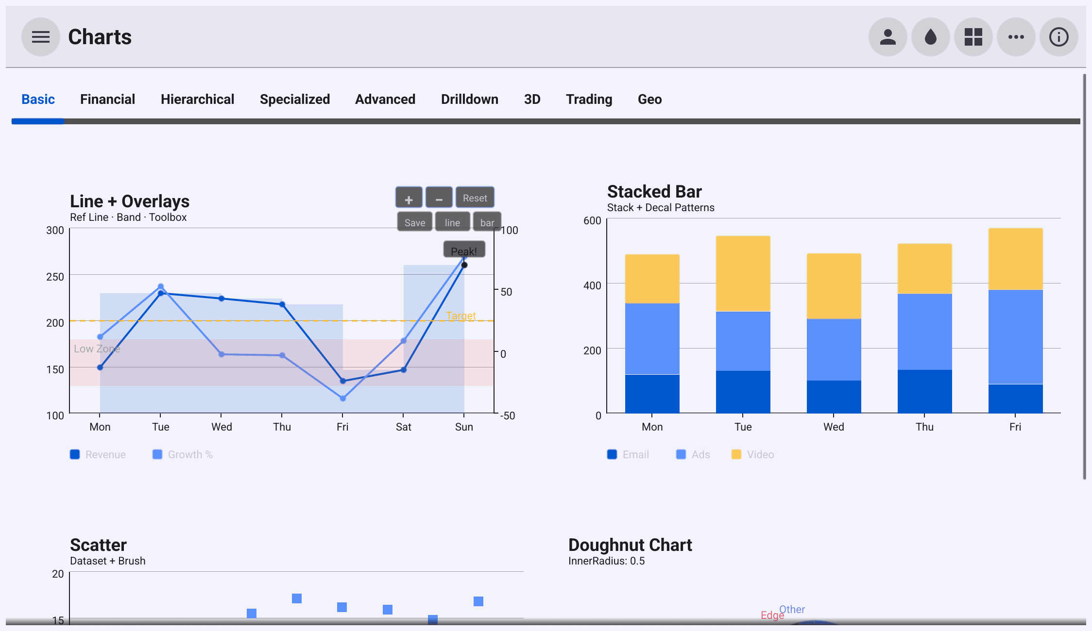
Stackname are stacked:stacked := chart.New(chart.Option{ Title: &chart.Title{Text: "Stacked bars"}, Legend: &component.LegendConfig{Position: component.LegendBottom}, XAxis: []axis.Config{{Type: axis.TypeCategory, Data: days}}, YAxis: []axis.Config{{Type: axis.TypeValue}}, Series: []series.Series{ &series.BarSeries{SeriesName: "Email", Data: []float64{120, 132, 101, 134, 90}, Stack: "total"}, &series.BarSeries{SeriesName: "Ads", Data: []float64{220, 182, 191, 234, 290}, Stack: "total"}, }, })Self-laid-out series (pie, gauge, radar, heatmap, funnel, treemap, sunburst, tree, sankey, graph, parallel, custom and the map series) ignore the axes and draw themselves in the whole plot area.
3D series draw into a 3D scene that the user can orbit.
Color, LineStyle.Color) is not shown in its legend swatch. Pie,
radar, funnel, treemap, sunburst, tree, sankey, graph and parallel series
colour their parts from a fixed built-in palette, not from Option.Color.
Legend labels, and the labels that radar, funnel, treemap, tree, sankey,
graph and parallel series draw, use fixed light colours, so in the light theme
they have low contrast, as several screenshots on these pages show.Axes
Axes are lists, Option.XAxis and Option.YAxis, of
axis.Config.
A config chooses the scale type and its range:
axis.TypeCategorylabels each data index with a string fromData.axis.TypeValueis a linear scale. Its range is computed from the data unless you setMinorMax(both are pointers, so nil means automatic).axis.TypeLogis a base-10 logarithmic scale.axis.TypeTimeformats tick labels withTimeFormat, a Go time layout.SplitCountis the number of tick intervals you would like (default 5); the scale rounds to readable values.
With no axes configured, a chart that needs them gets a category X axis and a value Y axis.
A chart has one X axis, the first entry of XAxis. It can have several Y
axes: the first is drawn on the left, the others on the right. A series picks
its Y axis with YAxisIndex:
zero, hundred := 0.0, 100.0
c := chart.New(chart.Option{
	Title:  &chart.Title{Text: "Revenue and growth"},
	Legend: &component.LegendConfig{Position: component.LegendBottom},
	Grid:   &chart.Grid{Left: 60, Right: 50, Top: 50, Bottom: 50},
	XAxis: []axis.Config{{
		Type: axis.TypeCategory,
		Data: []string{"Jan", "Feb", "Mar", "Apr", "May", "Jun"},
	}},
	YAxis: []axis.Config{
		{Type: axis.TypeValue, SplitCount: 5},
		{Type: axis.TypeValue, Min: &zero, Max: &hundred},
	},
	Series: []series.Series{
		&series.BarSeries{SeriesName: "Revenue", Data: []float64{150, 230, 224, 218, 135, 260}},
		&series.LineSeries{
			SeriesName: "Growth %",
			Data:       []float64{12, 53, 40, 33, 8, 77},
			YAxisIndex: 1, // plotted against the second Y axis
			Smooth:     true,
		},
	},
	Overlays: overlays,
})
axis.Config also declares Name, Position, Inverse, ShowLine,
ShowTicks, ShowLabels, ShowSplitLine, LineColor and LabelColor. In
v1.0.0 the chart renderer does not read them, so setting them has no effect.
The same is true of Option.VisualMap and Option.Decal.Overlays mark values on the plot in data coordinates: a reference line, a shaded band between two values, or a text annotation at a point, optionally with an arrow.
overlays := []chart.Overlay{
	&chart.ReferenceLine{Axis: chart.AxisHorizontal, Value: 200, Dashed: true, Label: "Target"},
	&chart.ReferenceBand{Axis: chart.AxisHorizontal, From: 100, To: 150, Label: "Low"},
	&chart.Annotation{X: 5, Y: 260, Text: "Best month", Arrow: true},
}
Grid sets the margins around the plot area, in pixels. Widen Right when
you have a right-hand axis, so its labels fit.
Interaction
Tooltips follow the pointer. With no Tooltip set, the chart shows the
nearest data point. A
TooltipConfig
changes that: TooltipTriggerAxis lists the line and scatter series at the
pointer’s X position (bar and candlestick series are not found by it in
v1.0.0; see Trading charts), TooltipTriggerNone turns tooltips off, Crosshair chooses
vertical, horizontal, both or no crosshair lines, and Formatter replaces the
text. Clicking pins the tooltip.
Zoom is enabled by setting DataZoom with Enabled: true. The scroll wheel zooms the X range
around the pointer, + and − buttons appear on the chart, and once zoomed you
drag to pan. MinSpan and MaxSpan limit the visible fraction of the data.
c := chart.New(chart.Option{
	Tooltip: &component.TooltipConfig{
		Trigger:   component.TooltipTriggerAxis,
		Crosshair: component.CrosshairBoth,
	},
	DataZoom: &interact.ZoomConfig{Enabled: true, MinSpan: 0.05, MaxSpan: 1, ZoomSensitivity: 0.1},
	XAxis:    []axis.Config{{Type: axis.TypeValue}},
	YAxis:    []axis.Config{{Type: axis.TypeValue}},
	Series:   []series.Series{&series.LineSeries{SeriesName: "Signal", Data: data}},
})
Events arrive on the chart’s Events bus. Each handler receives a value
you type-assert to the event’s struct:
c.Events.On(interact.EventClick, func(evt interface{}) {
	e := evt.(interact.DataPointEvent)
	status.SetText(fmt.Sprintf("Clicked %s, point %d: %.1f", e.SeriesName, e.DataIndex, e.Value.Y))
})
c.Events.On(interact.EventZoomChange, func(evt interface{}) {
	e := evt.(interact.ZoomChangeEvent)
	status.SetText(fmt.Sprintf("Showing %.0f%% to %.0f%% of the data", e.Start*100, e.End*100))
})
Other event types include EventHover, EventLegendToggle, EventDrilldown
and EventKeyPress; see
interact.EventType.
On returns an ID that you pass to Off to unsubscribe. To move the zoom from
code, call SetZoomWindow;
interact.DataWindow
expresses the window as fractions from 0 to 1 of the full data range.
Brush selection lets the user drag a rectangle over the plot. When the drag
ends, EventBrushSelect reports the points inside it. While the brush is
enabled, dragging selects instead of panning.
scatter := chart.New(chart.Option{
	Brush: &interact.BrushConfig{Enabled: true},
	XAxis: []axis.Config{{Type: axis.TypeValue}},
	YAxis: []axis.Config{{Type: axis.TypeValue}},
	Series: []series.Series{&series.ScatterSeries{
		SeriesName: "Samples",
		// x, y pairs
		Data:       []float64{10, 8.0, 8, 6.9, 13, 7.6, 9, 8.8, 11, 8.3, 14, 9.9, 6, 7.2, 4, 4.3, 12, 10.8},
		Symbol:     series.SymbolCircle,
		SymbolSize: 10,
	}},
})
scatter.Events.On(interact.EventBrushSelect, func(evt interface{}) {
	e := evt.(interact.BrushSelectEvent)
	status.SetText(fmt.Sprintf("Brushed %d points", len(e.Selected)))
})
More interactions, each switched on in the Option:
- Legend. Clicking a legend entry hides or shows that series. The legend
appears when you set
Legendor when the chart has more than one series. - Drilldown. Set
Drilldown.DataProviderto a function that returns a childOptionfor a clicked point. The chart shows the child with a breadcrumb trail back to the parent. - Toolbox.
Toolbox: &component.ToolboxConfig{SaveAsImage: true}adds a button that opens a save dialog and writes a PNG. In v1.0.0 that PNG holds only the chart’s background colour, not the chart.MagicType: []string{"line", "bar"}adds buttons that switch the series between line and bar. - Multi-pane layouts.
chart.NewChartGroupstacks several charts, such as price above volume, and keeps their zoom, pan and crosshair in step.
Two pages go further, with examples and screenshots:
Live data
AppendData
adds values to a line, bar or scatter series in place, without rebuilding the
Option. It is safe to call from any goroutine; the chart schedules its own
redraw on the UI thread. AppendCandlestick does the same for candlesticks.
c := chart.New(chart.Option{
	DataZoom: &interact.ZoomConfig{Enabled: true, MinSpan: 0.05, MaxSpan: 1},
	XAxis:    []axis.Config{{Type: axis.TypeValue}},
	YAxis:    []axis.Config{{Type: axis.TypeValue}},
	Series:   []series.Series{&series.LineSeries{SeriesName: "Price", Data: []float64{100}}},
})
c.SetFollowLatest(true) // snap the zoom window to the newest data

go func() {
	price := 100.0
	for range time.Tick(200 * time.Millisecond) {
		price += rand.Float64()*2 - 1
		c.AppendData(0, price) // safe from any goroutine
	}
}()
SetFollowLatest(true) keeps the zoom window on the newest data as it arrives.
It needs DataZoom to be set. If the user pans away, following stops until you
call it again.
Datasets
The dataset package stores tabular data by column, with float, string and
time columns. A
Pipeline
runs filter and sort steps over it, each producing a new dataset. ExtractXY
pulls two float columns out for plotting:
ds := dataset.New(
	dataset.Dimension{Name: "height", Type: dataset.DimFloat},
	dataset.Dimension{Name: "weight", Type: dataset.DimFloat},
	dataset.Dimension{Name: "name", Type: dataset.DimString},
)
_ = ds.AppendRow(161.2, 51.6, "Ana")
_ = ds.AppendRow(167.5, 59.0, "Ben")
_ = ds.AppendRow(159.5, 49.2, "Cleo")
_ = ds.AppendRow(174.0, 69.8, "Dev")
_ = ds.AppendRow(181.5, 74.3, "Eli")

// Keep rows taller than 160, sorted by height.
tall, err := (&dataset.Pipeline{Steps: []dataset.Transform{
	&dataset.FilterTransform{Dimension: 0, Predicate: func(h float64) bool { return h > 160 }},
	&dataset.SortTransform{Dimension: 0},
}}).Apply(ds)
if err != nil {
	panic(err)
}

xs, ys := dataset.ExtractXY(tall, dataset.DefaultEncode()) // column 0 → X, column 1 → Y
points := make([]float64, 0, 2*len(xs))
for i := range xs {
	points = append(points, xs[i], ys[i])
}
A dataset is not attached to the chart: you extract the slices you need and put them in a series.
The builder
The builder package writes the same Option as a chain of calls. Each
Add... call starts a series; Done() returns to the chart. Widget() builds
the chart, and Build() returns the Option instead.
c := builder.LineChart().
	Title("Sales and cost").
	CategoryX("Q1", "Q2", "Q3", "Q4").
	ValueY().
	Legend().
	Zoom().
	Palette(
		color.NRGBA{R: 255, G: 99, B: 132, A: 255},
		color.NRGBA{R: 54, G: 162, B: 235, A: 255},
	).
	AddLine("Sales", 40, 65, 50, 80).Symbol(series.SymbolCircle).Smooth().Done().
	AddLine("Cost", 30, 45, 35, 50).AreaFill(0.2).Done().
	ReferenceLine(chart.AxisHorizontal, 60).Label("Average").Dashed().Done().
	Animate().
Widget()builder.LineChart(), BarChart(), ScatterChart() and PieChart() start
with a suitable tooltip already set.
Colours and themes
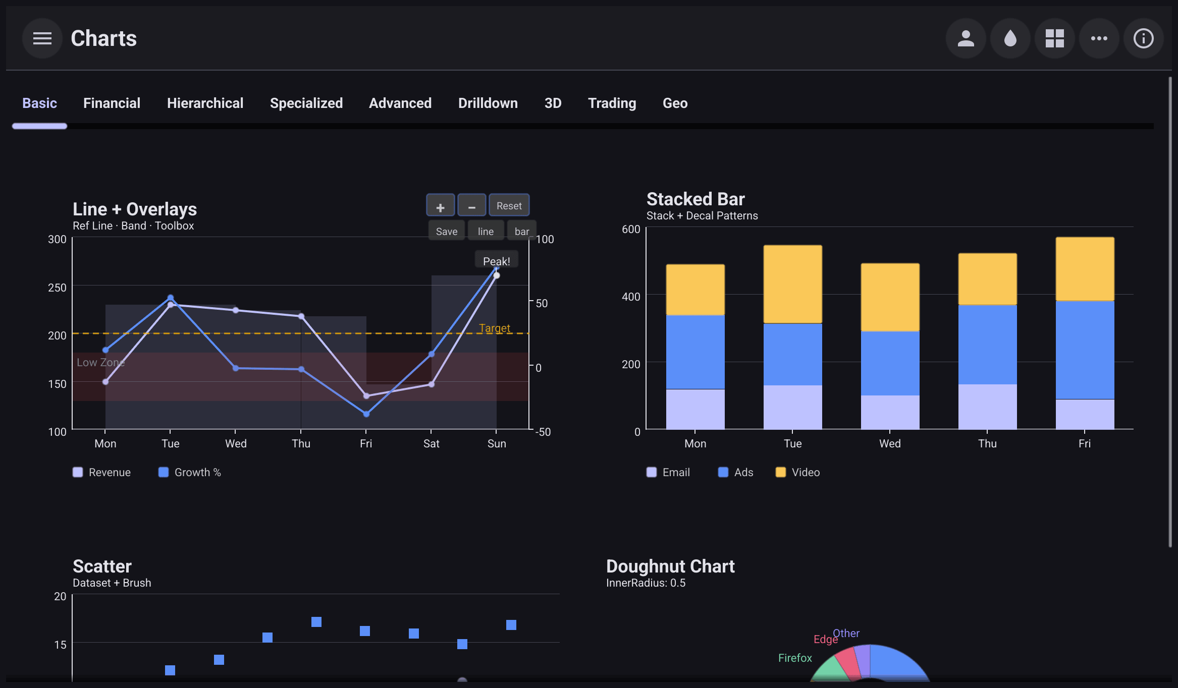
Charts take their colours from the current Bellui theme and follow it between
light and dark: the background, text, axis and grid lines come from the theme.
Series colours come from a palette that starts with the theme’s primary colour.
To choose the series colours yourself, set Option.Color (or call
Palette on the builder); series use the colours in order and wrap around.
A colour set directly on a series, such as LineStyle.Color, wins over the
palette.
Animation
With Animation: true, the chart plays a 400 ms entrance animation the first
time it is drawn, and a 300 ms transition when SetOption replaces an option
that also had Animation set.
Licence
x/charts is BSD 3-Clause licensed, like Bellui. Its configuration model
follows Apache ECharts’ option object; the module itself is written in Go
and has no JavaScript dependency.