3D charts
The 3D series draw into a 3D scene in the plot area, with axes and a ground grid. Drag to orbit the camera around the scene and scroll to zoom. The chart keeps the camera where the user left it when it redraws.
Coordinates are scene units, not pixels or axis values, and the default camera
looks at the origin from a few units away. Keep your data within a few units
of the origin, or scale it there, and it will be in view. Every 3D series has a
Camera field that replaces the default camera with a
canvas.Camera3D
of your own.
3D series show no tooltips: the chart does not hit-test them.
Bar3D
A Bar3DSeries
stands a bar on each cell of an X-Z grid. Use it for a value that depends on
two categories, such as sales by region and year.
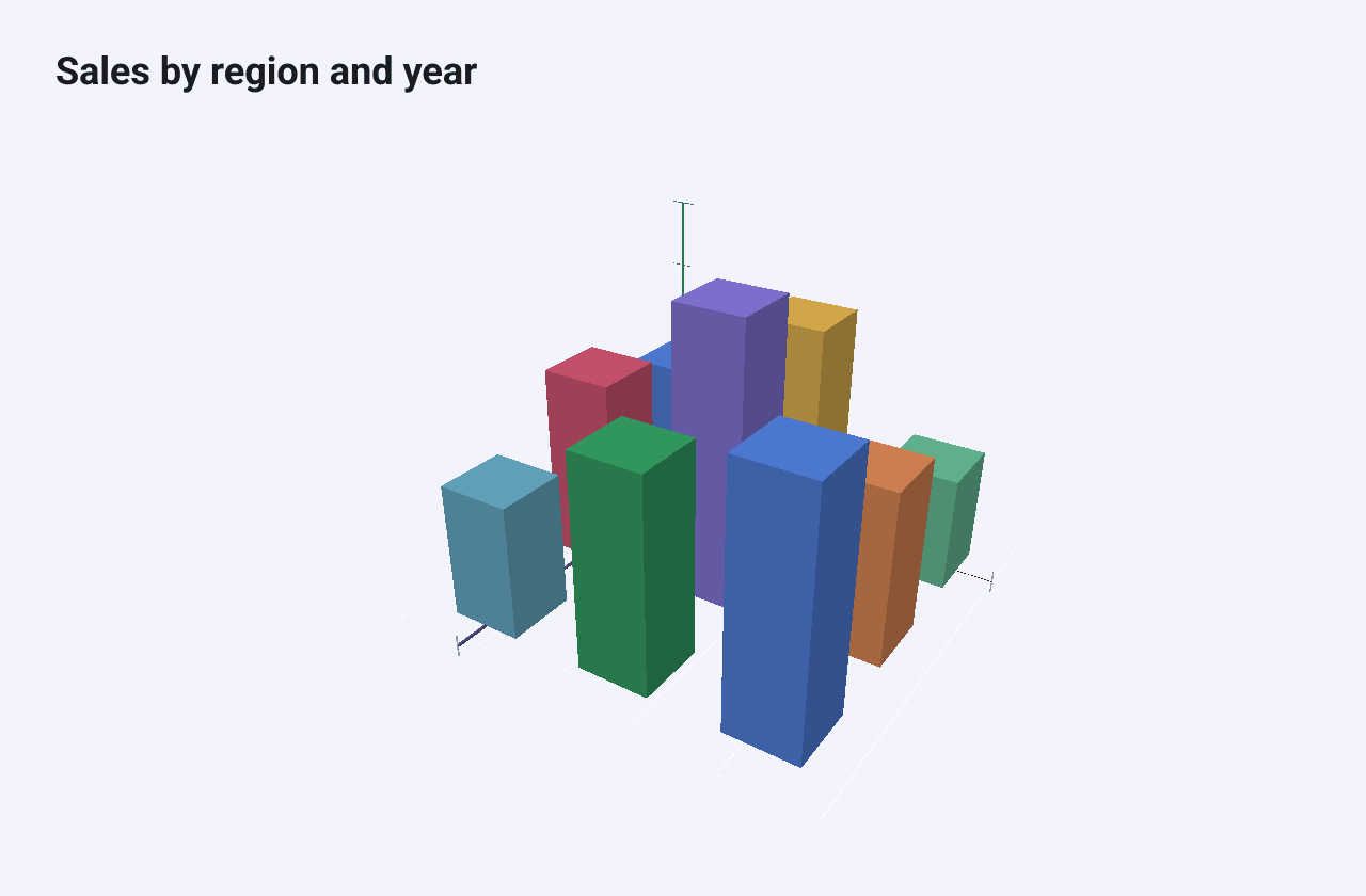
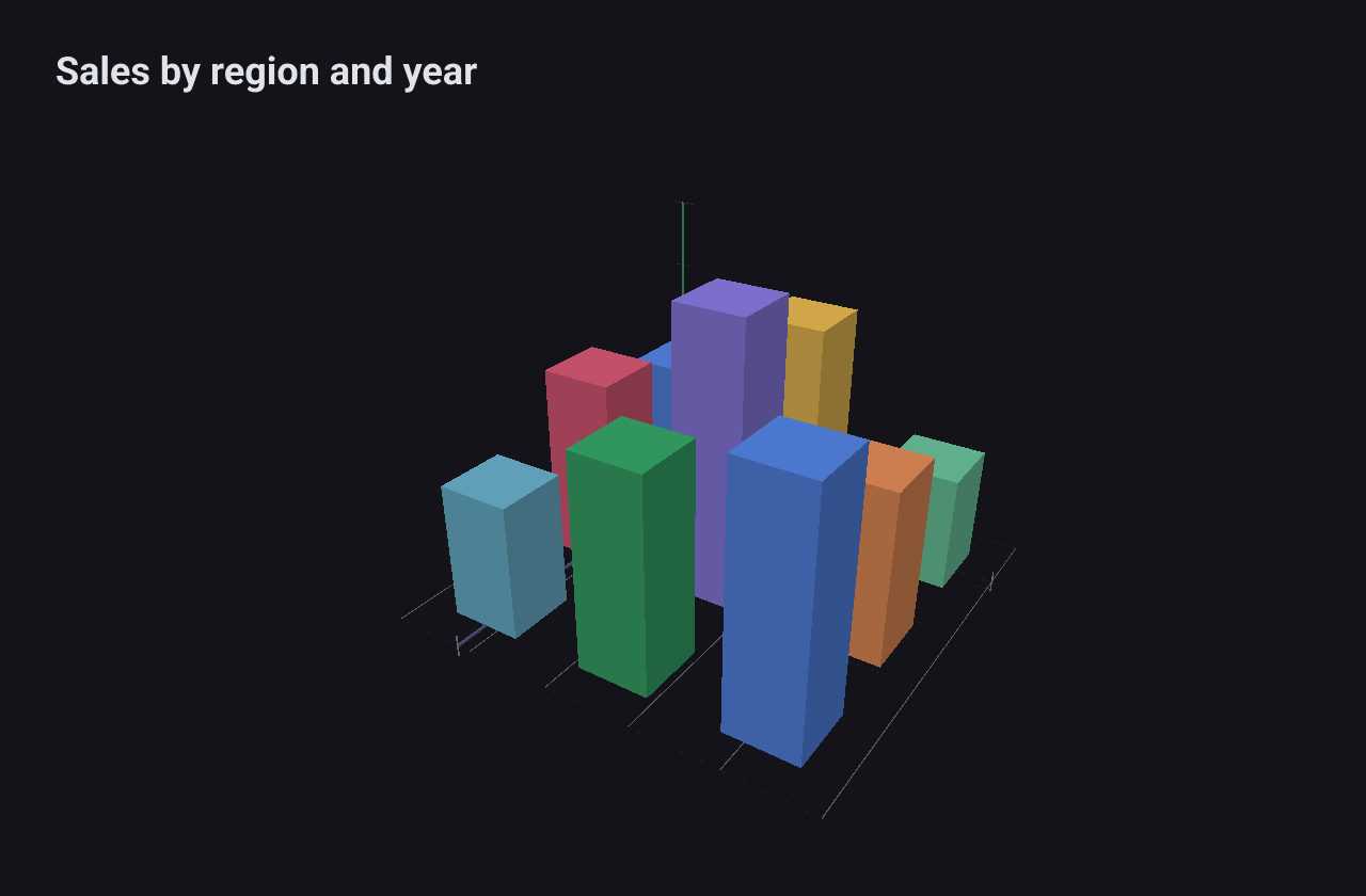
var bars []series.Bar3DData
for z, row := range sales {
	for x, v := range row {
		bars = append(bars, series.Bar3DData{X: float64(x), Z: float64(z), Value: v})
	}
}
c := chart.New(chart.Option{
	Title: &chart.Title{Text: "Sales by region and year"},
	Series: []series.Series{
		&series.Bar3DSeries{SeriesName: "Sales", Data: bars, BarSize: 0.5},
	},
})
Each Bar3DData
has grid positions X and Z and a Value. Heights are scaled so that the
tallest bar is 2 units high. BarSize is the width of each bar’s footprint
(default 0.4). Each bar takes the next colour from the built-in palette unless
you set Bar3DData.Color.
Scatter3D
A Scatter3DSeries
places a small solid at each point in space.
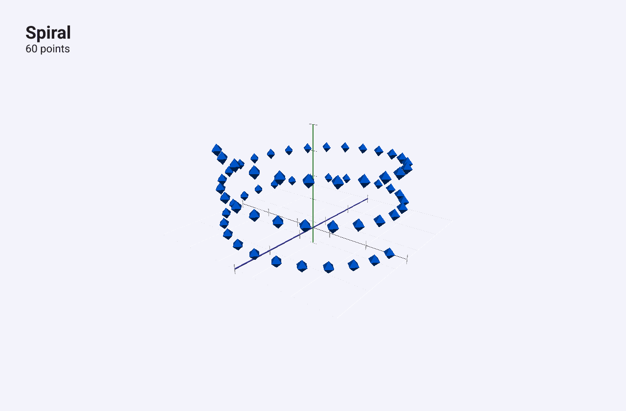
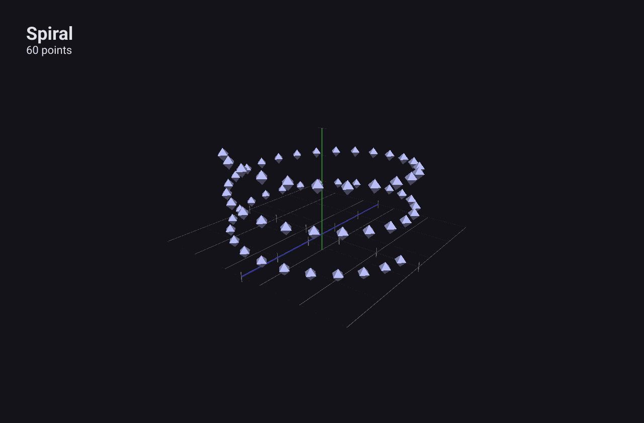
c := chart.New(chart.Option{
	Title: &chart.Title{Text: "Spiral", SubText: "60 points"},
	Series: []series.Series{
		&series.Scatter3DSeries{
			SeriesName: "Spiral",
			Data:       pts, // x0, y0, z0, x1, y1, z1, ...
			PointSize:  0.1,
		},
	},
})
Data stores x, y, z triplets flat: [x0, y0, z0, x1, y1, z1, ...]. Values
are used as scene coordinates as they are, with Y pointing up. PointSize sets
the size of each point (default 0.08), and Color overrides the palette
colour.
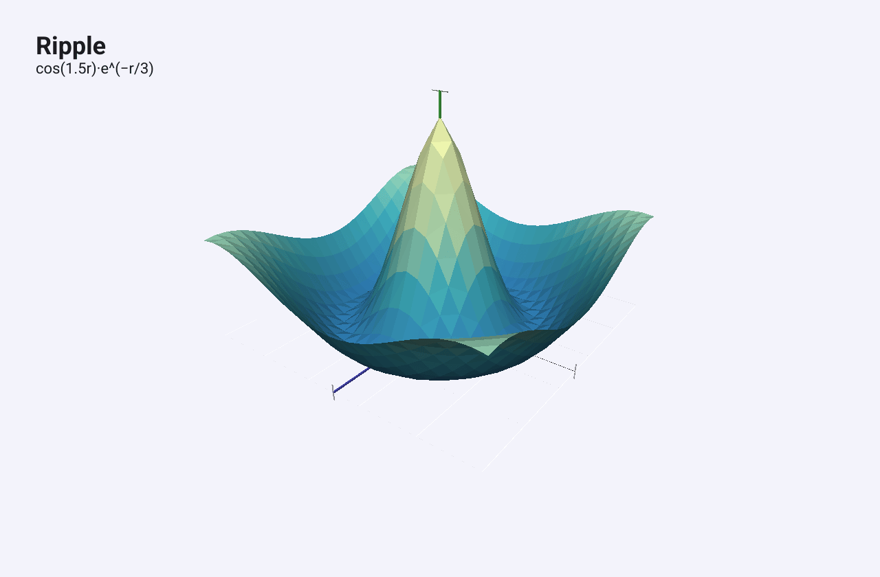
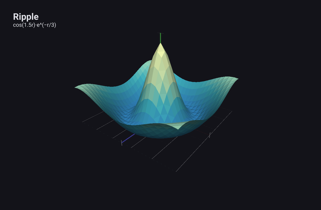
Surface
A SurfaceSeries
draws a height field: a grid of values as a coloured surface.
c := chart.New(chart.Option{
	Title: &chart.Title{Text: "Ripple", SubText: "cos(1.5r)·e^(−r/3)"},
	Series: []series.Series{
		&series.SurfaceSeries{
			SeriesName: "Ripple",
			Rows:       rows,
			Cols:       cols,
			Data:       heights, // row-major: Data[row*Cols+col] is the height
		},
	},
})
Rows and Cols give the grid size, and Data holds the heights row by row,
like a heatmap: Data[r*Cols+c]. The surface is scaled to fit the scene: the
grid spans 3 units across and the heights 2 units, whatever the units of your
data. XMin, XMax, ZMin and ZMax describe the grid’s extent in data
units (by default 0 to Cols-1 and 0 to Rows-1).
ColorStops colours the surface by height, from 0 at the lowest to 1 at the
highest; without stops it runs from blue through green to yellow.
Line3D
A Line3DSeries
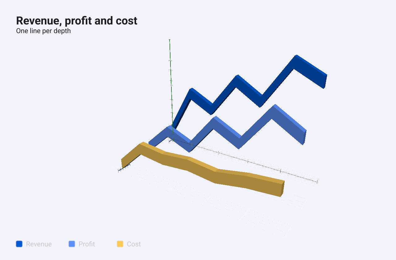
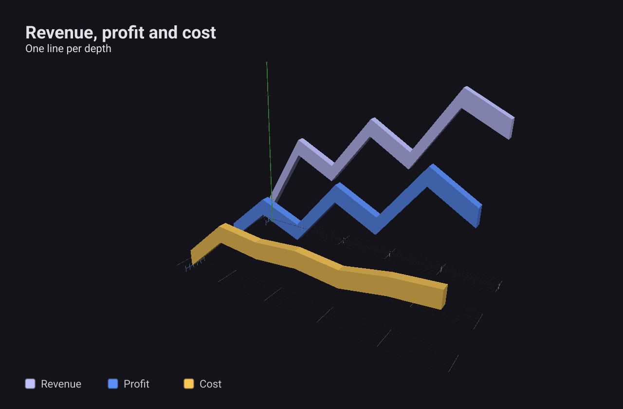
draws a line as a flat ribbon in space. It has two modes:
- A path in space. Leave
ZPositionnil and giveDataas x, y, z triplets. - A 2D line at a depth. Set
ZPositionand giveDataas x, y pairs. Several series at different depths stand one behind the other, like the 3D line charts of a spreadsheet.
depth := func(z float64) *float64 { return &z }
c := chart.New(chart.Option{
	Title: &chart.Title{Text: "Revenue, profit and cost", SubText: "One line per depth"},
	Series: []series.Series{
		&series.Line3DSeries{
			SeriesName: "Revenue",
			// With ZPosition set, Data is x, y pairs.
			Data:      []float64{0, 0.5, 1, 2.3, 2, 1.8, 3, 3.1, 4, 2.5, 5, 4.0, 6, 3.5},
			ZPosition: depth(0),
			LineWidth: 0.2,
		},
		&series.Line3DSeries{
			SeriesName: "Profit",
			Data:       []float64{0, 0.3, 1, 1.2, 2, 0.8, 3, 2.0, 4, 1.5, 5, 2.8, 6, 2.2},
			ZPosition:  depth(1.5),
			LineWidth:  0.2,
		},
		&series.Line3DSeries{
			SeriesName: "Cost",
			Data:       []float64{0, 0.2, 1, 1.1, 2, 1.0, 3, 1.1, 4, 1.0, 5, 1.2, 6, 1.3},
			ZPosition:  depth(3),
			LineWidth:  0.2,
		},
	},
})
LineWidth sets the ribbon’s width (default 0.15), and Color overrides the
palette colour. Each series draws its own set of axes sized to its own data, so
a chart with several 3D lines shows overlapping axes.