Line, area, bar, scatter and pie
These are the series most charts are made of. Line, bar and scatter series
are drawn on the chart’s axes and can be mixed in one chart. A pie needs no
axes. Every example on this page is a complete program; the parts shown are
the Option passed to chart.New.
Line
A LineSeries
joins one value per category with straight segments. Use it for values that
change over an ordered axis, such as time.
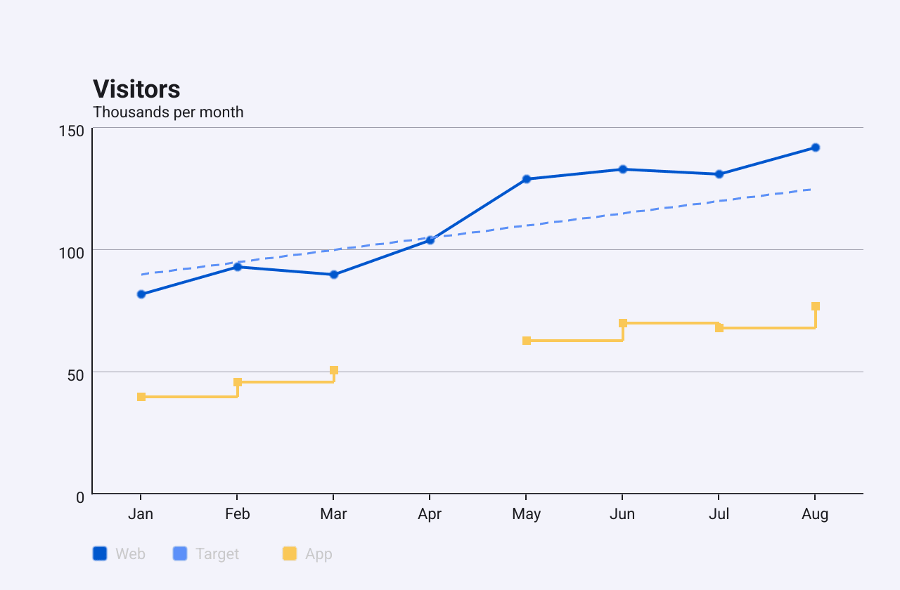
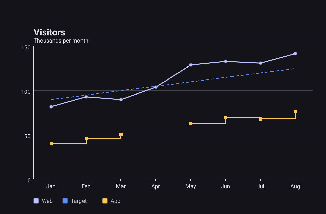
months := []string{"Jan", "Feb", "Mar", "Apr", "May", "Jun", "Jul", "Aug"}
c := chart.New(chart.Option{
	Title: &chart.Title{Text: "Visitors", SubText: "Thousands per month"},
	XAxis: []axis.Config{{Type: axis.TypeCategory, Data: months}},
	YAxis: []axis.Config{{Type: axis.TypeValue}},
	Series: []series.Series{
		&series.LineSeries{
			SeriesName: "Web",
			Data:       []float64{82, 93, 90, 104, 129, 133, 131, 142},
			Symbol:     series.SymbolCircle,
		},
		&series.LineSeries{
			SeriesName: "Target",
			Data:       []float64{90, 95, 100, 105, 110, 115, 120, 125},
			LineStyle:  series.LineStyle{Width: 1.5, Dash: []float32{6, 4}},
		},
		&series.LineSeries{
			SeriesName: "App",
			// math.NaN() is a missing value: the line breaks there.
			Data:   []float64{40, 46, 51, math.NaN(), 63, 70, 68, 77},
			Step:   series.StepEnd,
			Symbol: series.SymbolRect,
		},
	},
})
The main fields:
Dataholds one value per category.math.NaN()marks a missing value: the line breaks there. WithConnectNullsset, the gap is bridged with a dashed segment instead.SymbolandSymbolSizeput a marker on each point (default size 6). Markers are drawn only while the line has 200 points or fewer.Stepdraws a staircase instead of slopes:StepStart,StepMiddleorStepEndsays where in each interval the line jumps.LineStylesetsColor,Width(default 2) andDash, a pattern of dash and gap lengths in pixels:{6, 4}draws 6 px dashes with 4 px gaps.Stackstacks the line on top of other series with the same stack name.YAxisIndexpicks the Y axis when the chart has several.
A line with more points than the plot is pixels wide is downsampled before it
is drawn, with the LTTB algorithm, which keeps the shape of the curve.
AppendValues, or AppendData on the chart, adds points without rebuilding
the option (see Live data).
Smooth has no effect: the renderer never reads it, and lines are
always drawn with straight segments. SymbolTriangle and SymbolDiamond are
drawn as squares, the same as SymbolRect.Area
An area chart is a line series with an
AreaStyle.
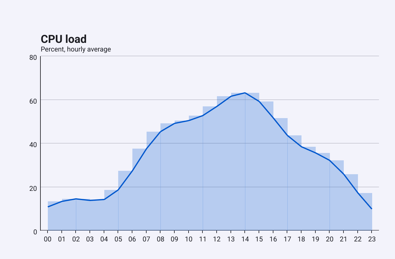
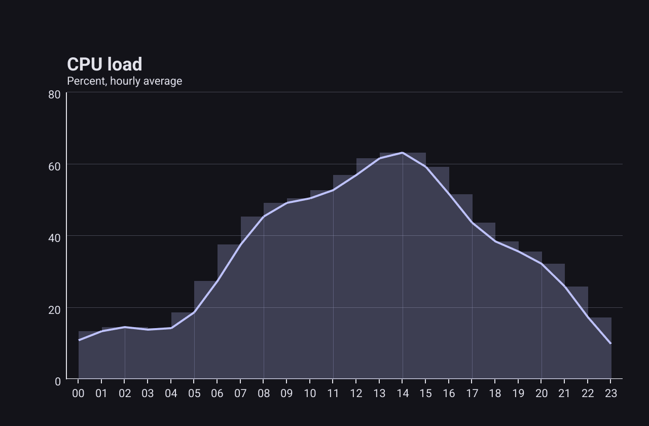
The fill shows volume under the line, such as load or traffic over a day.
c := chart.New(chart.Option{
	Title: &chart.Title{Text: "CPU load", SubText: "Percent, hourly average"},
	XAxis: []axis.Config{{Type: axis.TypeCategory, Data: hours}},
	YAxis: []axis.Config{{Type: axis.TypeValue}},
	Series: []series.Series{
		&series.LineSeries{
			SeriesName: "Load",
			Data:       load,
			AreaStyle:  &series.AreaStyle{Opacity: 0.25},
		},
	},
})
AreaStyle.Opacity sets how transparent the fill is (default 0.3), and
AreaStyle.Color overrides the line’s colour for the fill.
Bar
A BarSeries
draws one bar per category. Use it to compare amounts between categories.
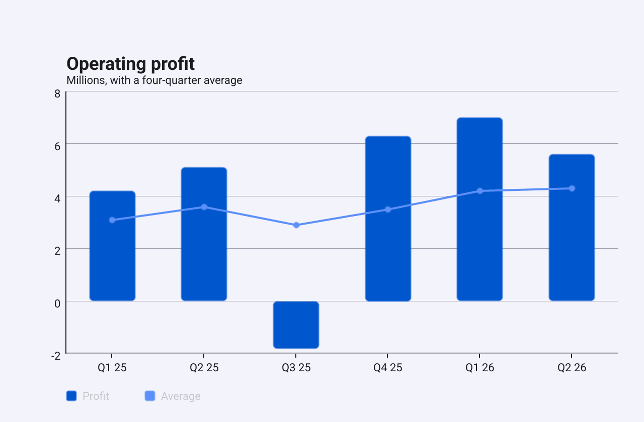
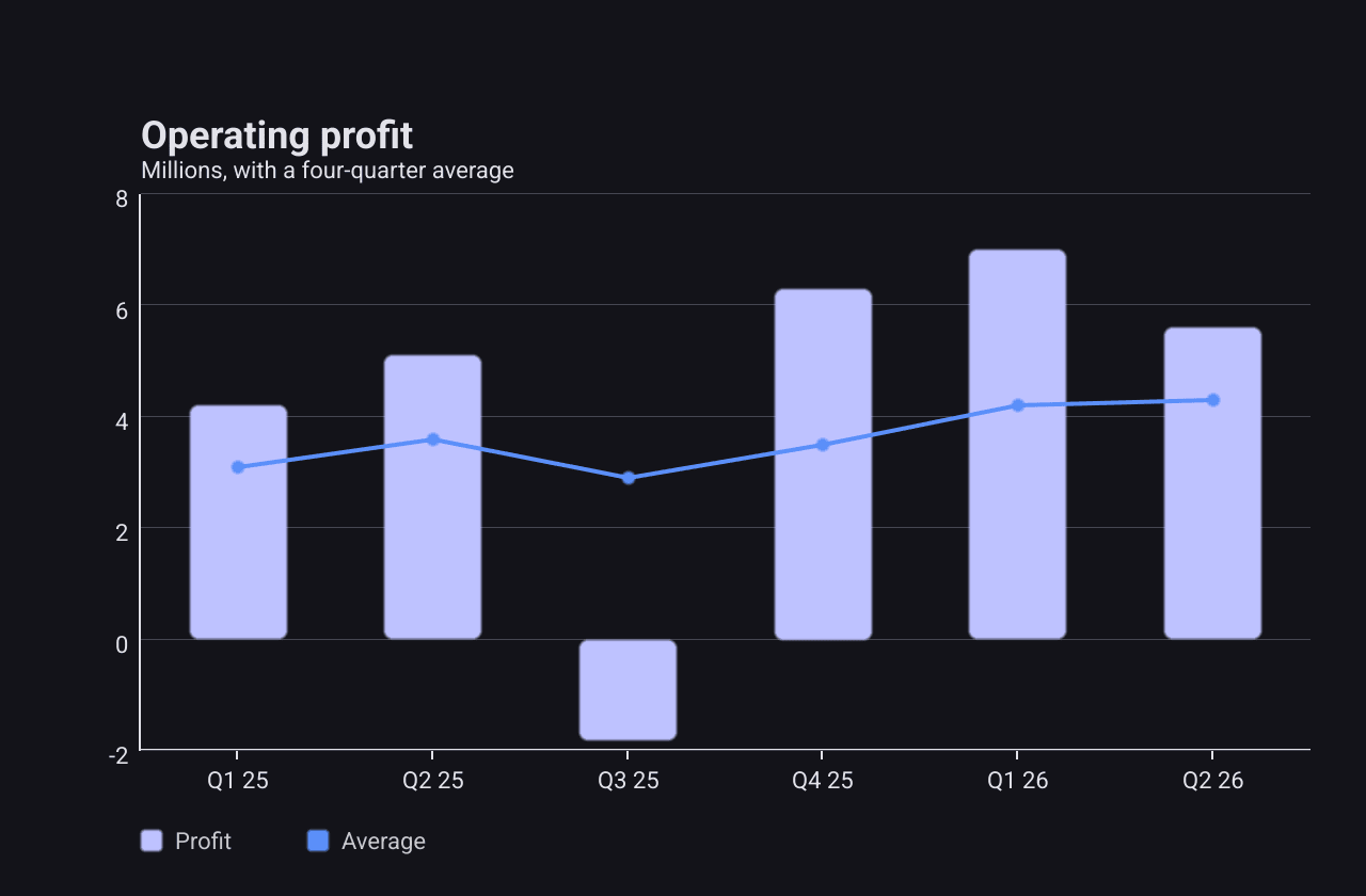
quarters := []string{"Q1 25", "Q2 25", "Q3 25", "Q4 25", "Q1 26", "Q2 26"}
c := chart.New(chart.Option{
	Title: &chart.Title{Text: "Operating profit", SubText: "Millions, with a four-quarter average"},
	XAxis: []axis.Config{{Type: axis.TypeCategory, Data: quarters}},
	YAxis: []axis.Config{{Type: axis.TypeValue}},
	Series: []series.Series{
		&series.BarSeries{
			SeriesName:   "Profit",
			Data:         []float64{4.2, 5.1, -1.8, 6.3, 7.0, 5.6},
			BarWidth:     0.5,
			CornerRadius: 4,
		},
		&series.LineSeries{
			SeriesName: "Average",
			Data:       []float64{3.1, 3.6, 2.9, 3.5, 4.2, 4.3},
			Symbol:     series.SymbolCircle,
		},
	},
})
The main fields:
Dataholds one value per category. Negative values grow down from zero.BarWidthis the bar’s width as a fraction of the space per category (default 0.6).CornerRadiusrounds the corners.BorderColorandBorderWidthadd an outline.Coloroverrides the palette colour.Stackstacks bars with the same stack name, as in the stacked example.
AppendValues adds bars in place, like the line series.
Stack are drawn at the same position, so the later one covers the earlier
one. BarGap is declared but has no effect.Scatter
A ScatterSeries
places a marker at each x, y pair. Use it to show how two measures relate.
Both axes are usually value axes.
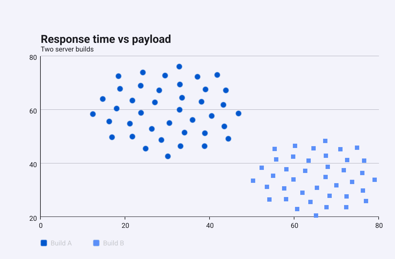
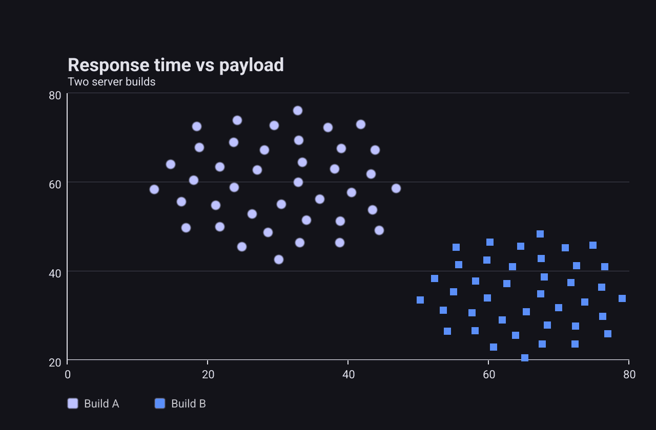
c := chart.New(chart.Option{
	Title: &chart.Title{Text: "Response time vs payload", SubText: "Two server builds"},
	XAxis: []axis.Config{{Type: axis.TypeValue}},
	YAxis: []axis.Config{{Type: axis.TypeValue}},
	Series: []series.Series{
		&series.ScatterSeries{
			SeriesName: "Build A",
			Data:       cluster(40, 30, 60, 18), // x0, y0, x1, y1, ...
			Symbol:     series.SymbolCircle,
			SymbolSize: 9,
		},
		&series.ScatterSeries{
			SeriesName: "Build B",
			Data:       cluster(40, 65, 35, 15),
			Symbol:     series.SymbolRect,
			SymbolSize: 7,
		},
	},
})
Data stores the pairs flat: [x0, y0, x1, y1, ...]. Symbol chooses the
marker shape, SymbolSize its size (default 8), and Color overrides the
palette. AppendValues takes further pairs in the same flat form.
Pie
A PieSeries
shows how a whole divides into parts. It ignores the axes and is drawn in the
middle of the plot area.
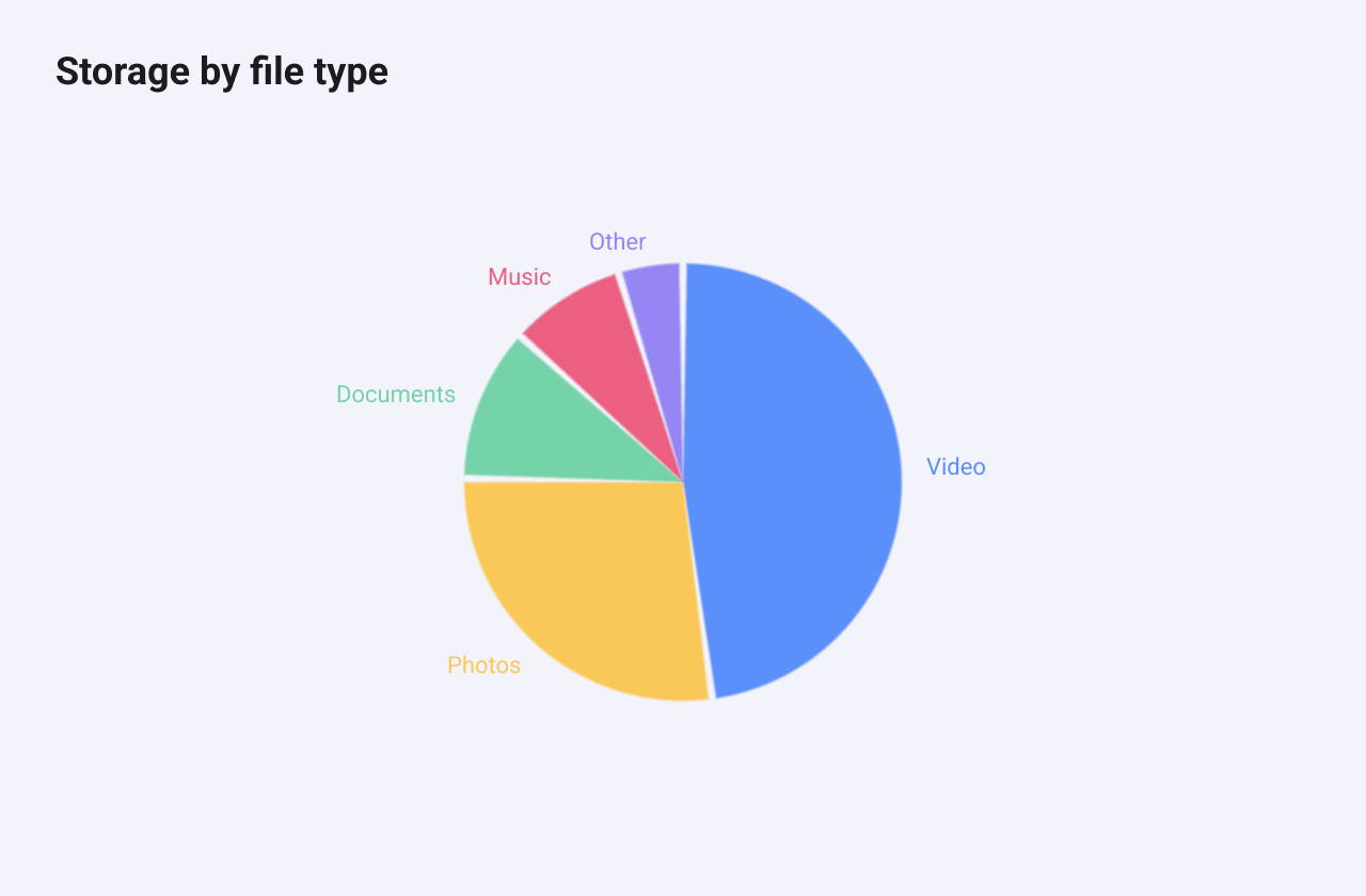
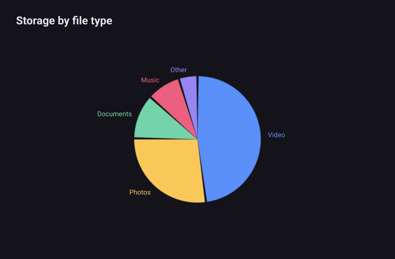
c := chart.New(chart.Option{
	Title: &chart.Title{Text: "Storage by file type"},
	Series: []series.Series{
		&series.PieSeries{
			SeriesName: "Storage",
			Radius:     0.8,
			PadAngle:   2, // degrees of space between slices
			ShowLabels: true,
			Data: []series.PieDataItem{
				{Name: "Video", Value: 412},
				{Name: "Photos", Value: 236},
				{Name: "Documents", Value: 98},
				{Name: "Music", Value: 74},
				{Name: "Other", Value: 41},
			},
		},
	},
})
The main fields:
Datais a list ofPieDataItem: aName, aValueand an optionalColorfor that slice.Radiusis a fraction of the available space (default 0.75).InnerRadiusis a fraction ofRadius. Any value above 0 cuts a hole in the middle and makes a doughnut.StartAngleis where the first slice starts, in degrees, with 0 at the top. Slices go clockwise.PadAngleleaves a gap of that many degrees between slices.ShowLabelswrites each slice’s name outside it, in the slice’s colour.
Slices take their colours from a fixed built-in palette, not from
Option.Color. Set PieDataItem.Color to choose them.