Hierarchies and flows
These series show structure rather than values on an axis: a hierarchy, the size of its parts, or flows between things. They ignore the chart’s axes and lay themselves out in the plot area.
Nodes take their colours from a fixed built-in palette unless you set a node’s
own Color. The tree, treemap, sankey and graph series draw their labels in a
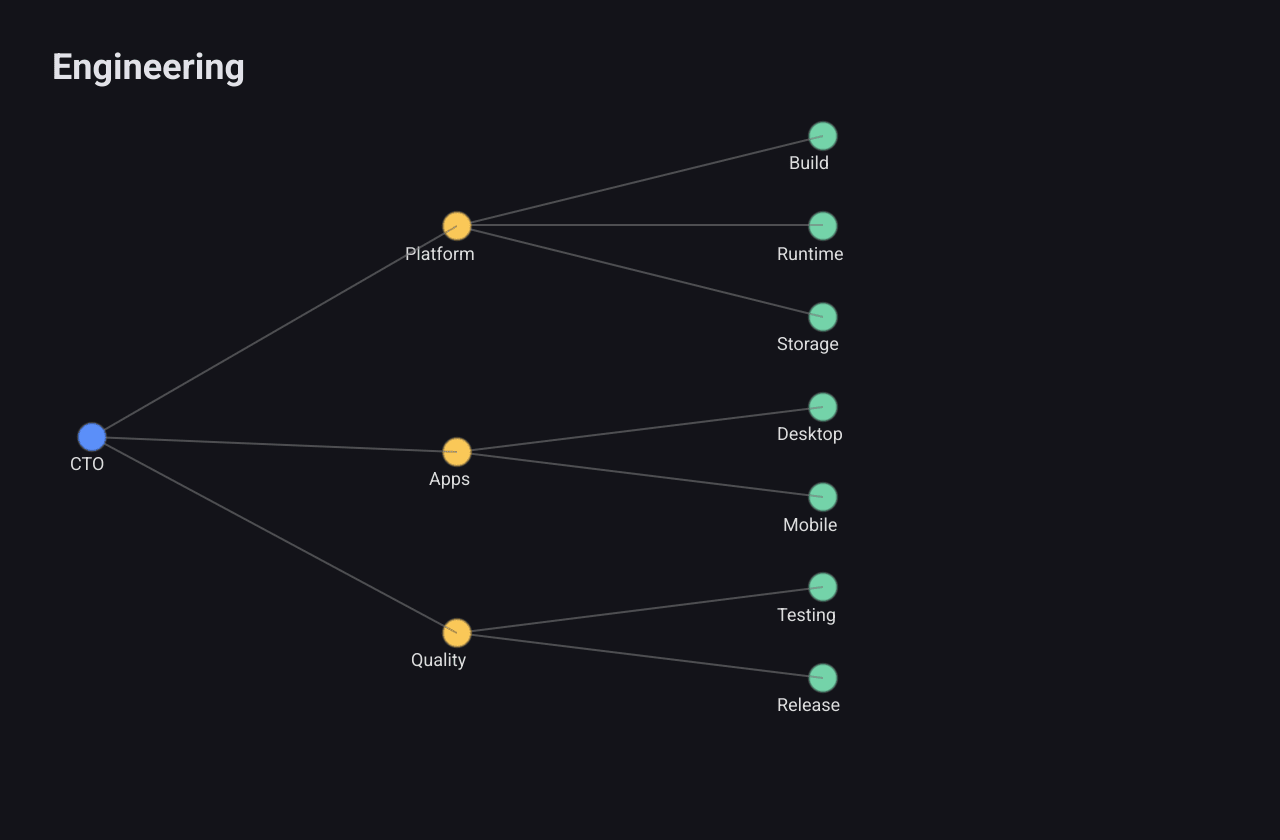
fixed light colour, so the labels are easy to read in the dark theme and faint
in the light theme. The sunburst draws its labels in dark grey.
Tree
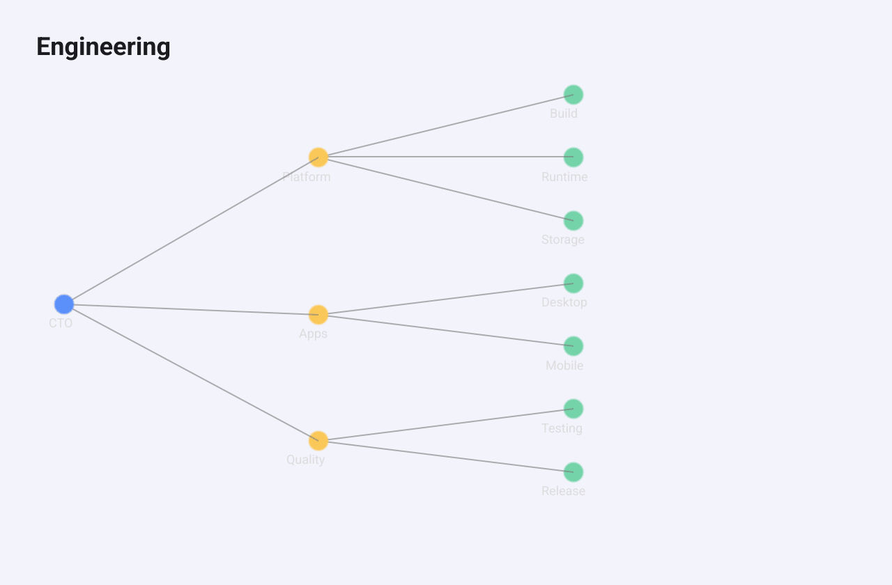
A TreeSeries
draws a hierarchy as nodes joined by lines, such as an organisation chart or a
file tree.
c := chart.New(chart.Option{
	Title: &chart.Title{Text: "Engineering"},
	Series: []series.Series{
		&series.TreeSeries{
			SeriesName: "Org",
			Orient:     "LR", // left to right; the default "TB" is top to bottom
			NodeSize:   7,
			Data: series.TreeNode{Name: "CTO", Children: []series.TreeNode{
				{Name: "Platform", Children: []series.TreeNode{
					{Name: "Build"}, {Name: "Runtime"}, {Name: "Storage"},
				}},
				{Name: "Apps", Children: []series.TreeNode{
					{Name: "Desktop"}, {Name: "Mobile"},
				}},
				{Name: "Quality", Children: []series.TreeNode{
					{Name: "Testing"}, {Name: "Release"},
				}},
			}},
		},
	},
})
Data is the root
TreeNode,
and each node lists its Children. Orient is "TB" for top to bottom (the
default) or "LR" for left to right. NodeSize is the radius of each dot
(default 6). Nodes are coloured by depth.
Leaves are spaced evenly and each parent is centred on its children. The
deepest level is placed short of the far edge, which leaves empty space on
that side, as in the screenshot. TreeNode.Value is not used for drawing.
Treemap
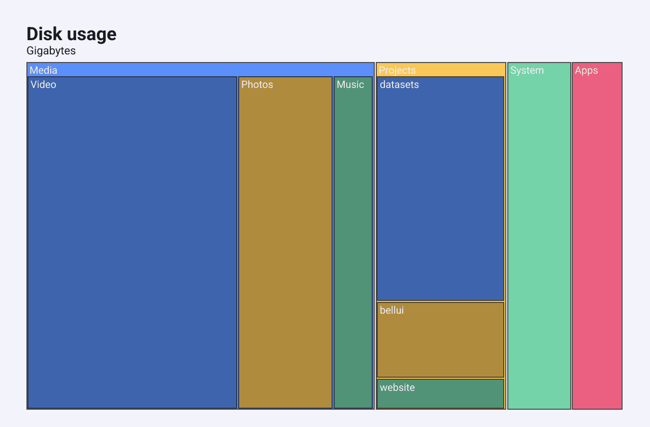
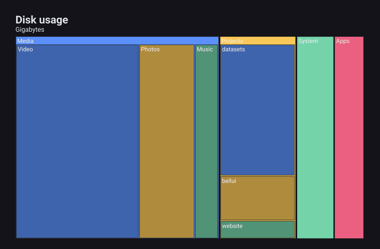
A TreemapSeries
divides a rectangle into nested rectangles sized by value. Use it to see what
takes up the space, such as disk usage.
c := chart.New(chart.Option{
	Title: &chart.Title{Text: "Disk usage", SubText: "Gigabytes"},
	Series: []series.Series{
		&series.TreemapSeries{
			SeriesName: "Disk",
			Data: []series.TreemapNode{
				{Name: "Media", Children: []series.TreemapNode{
					{Name: "Video", Value: 210}, {Name: "Photos", Value: 95}, {Name: "Music", Value: 40},
				}},
				{Name: "Projects", Children: []series.TreemapNode{
					{Name: "website", Value: 12}, {Name: "bellui", Value: 30}, {Name: "datasets", Value: 88},
				}},
				{Name: "System", Value: 64},
				{Name: "Apps", Value: 51},
			},
		},
	},
})
Data lists the top-level
TreemapNodes.
A leaf’s size is its Value. A node with Children is the sum of its
children, and its own Value is ignored. Siblings are sorted largest first and
placed side by side along the longer side of their parent’s rectangle. A
rectangle’s name is drawn when there is room for it.
Sunburst
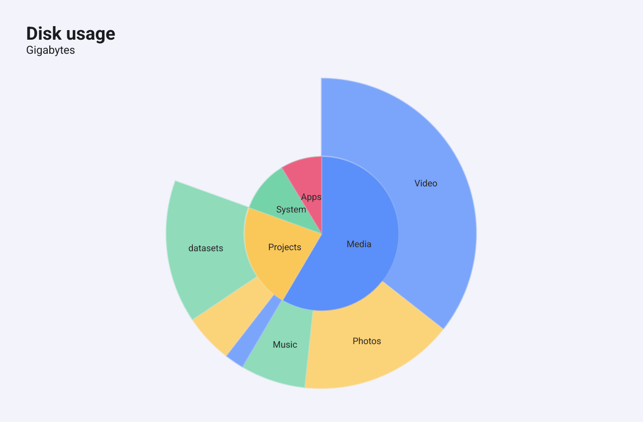
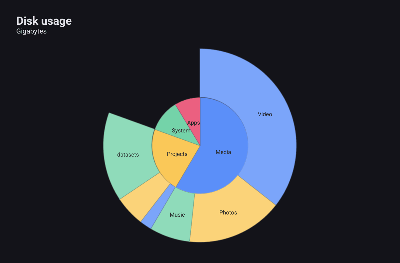
A SunburstSeries
shows the same kind of hierarchy as rings: the top level in the middle, each
deeper level one ring further out.
c := chart.New(chart.Option{
	Title: &chart.Title{Text: "Disk usage", SubText: "Gigabytes"},
	Series: []series.Series{
		&series.SunburstSeries{
			SeriesName: "Disk",
			Data: []series.SunburstNode{
				{Name: "Media", Children: []series.SunburstNode{
					{Name: "Video", Value: 210}, {Name: "Photos", Value: 95}, {Name: "Music", Value: 40},
				}},
				{Name: "Projects", Children: []series.SunburstNode{
					{Name: "website", Value: 12}, {Name: "bellui", Value: 30}, {Name: "datasets", Value: 88},
				}},
				{Name: "System", Value: 64},
				{Name: "Apps", Value: 51},
			},
		},
	},
})
SunburstNode
works like the treemap’s node: a leaf has a Value, and a parent is the sum of
its children. Each segment spans an angle in proportion to its value. Each ring
colours its segments from the palette in order, lighter in the outer rings. A segment gets a label only
when it spans more than 20 degrees.
Sankey
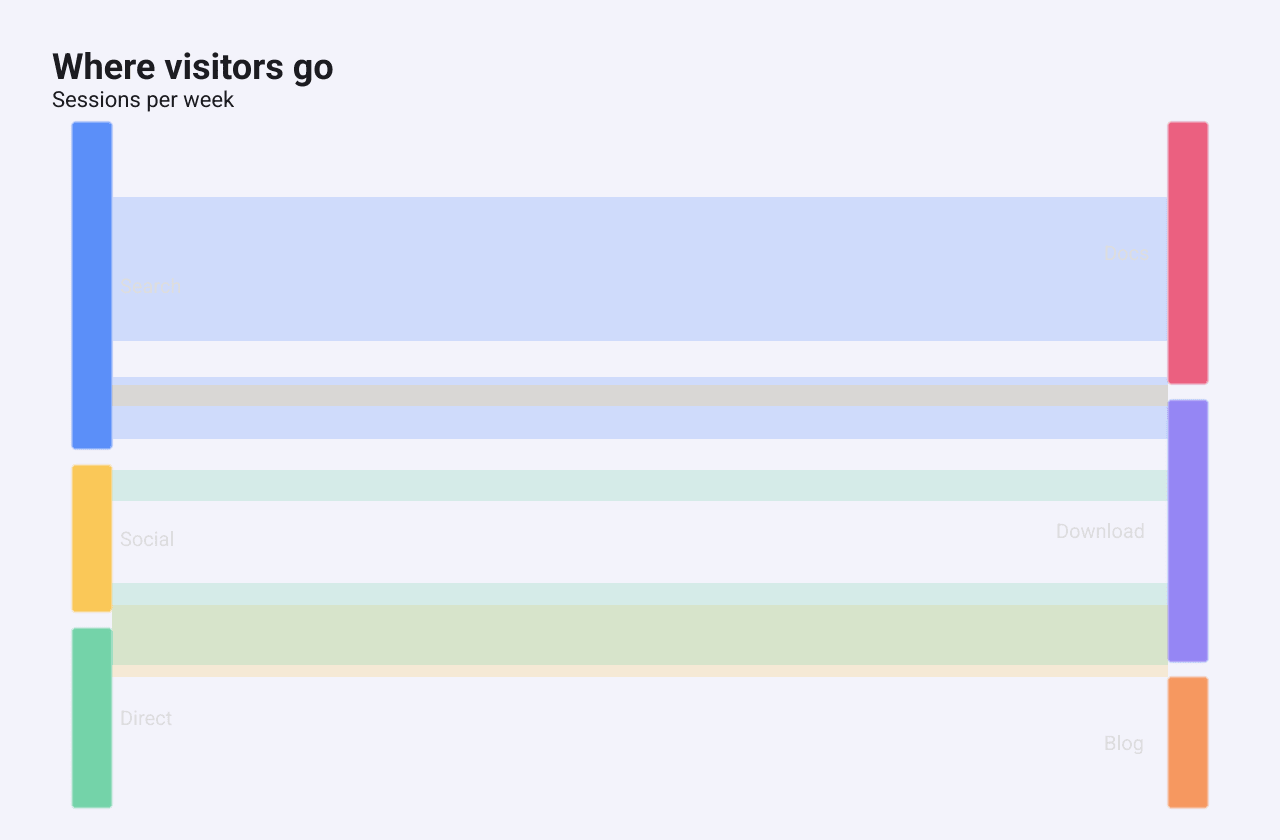
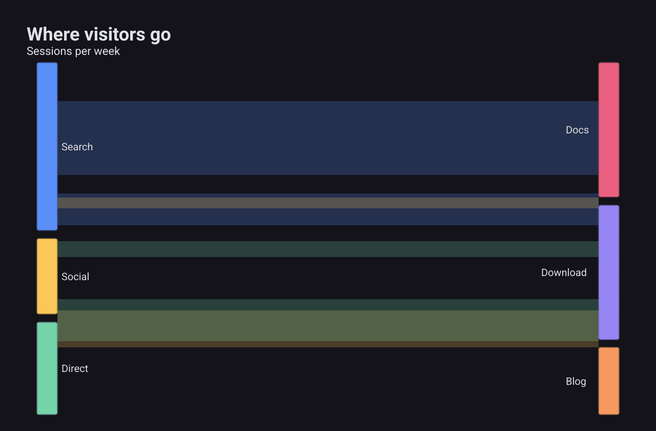
A SankeySeries
is meant to show quantities flowing from sources to targets, with the width of
each link proportional to its value.
c := chart.New(chart.Option{
	Title: &chart.Title{Text: "Where visitors go", SubText: "Sessions per week"},
	Series: []series.Series{
		&series.SankeySeries{
			SeriesName: "Traffic",
			Nodes: []series.SankeyNode{
				{Name: "Search"}, {Name: "Social"}, {Name: "Direct"}, // 0-2: sources
				{Name: "Docs"}, {Name: "Download"}, {Name: "Blog"}, // 3-5: targets
			},
			Links: []series.SankeyLink{
				{Source: 0, Target: 3, Value: 420},
				{Source: 0, Target: 4, Value: 180},
				{Source: 1, Target: 5, Value: 210},
				{Source: 1, Target: 3, Value: 60},
				{Source: 2, Target: 4, Value: 240},
				{Source: 2, Target: 3, Value: 90},
			},
		},
	},
})
Nodes lists the
SankeyNodes
by index, and each
SankeyLink
joins a Source index to a Target index with a Value.
Graph
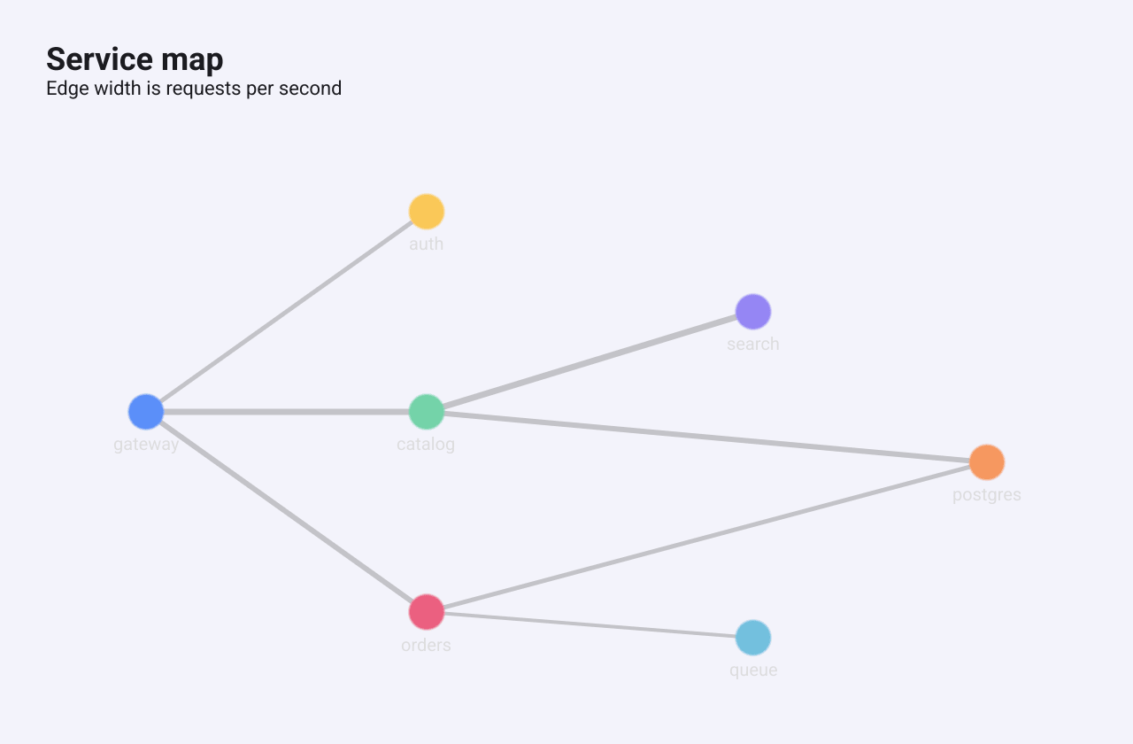
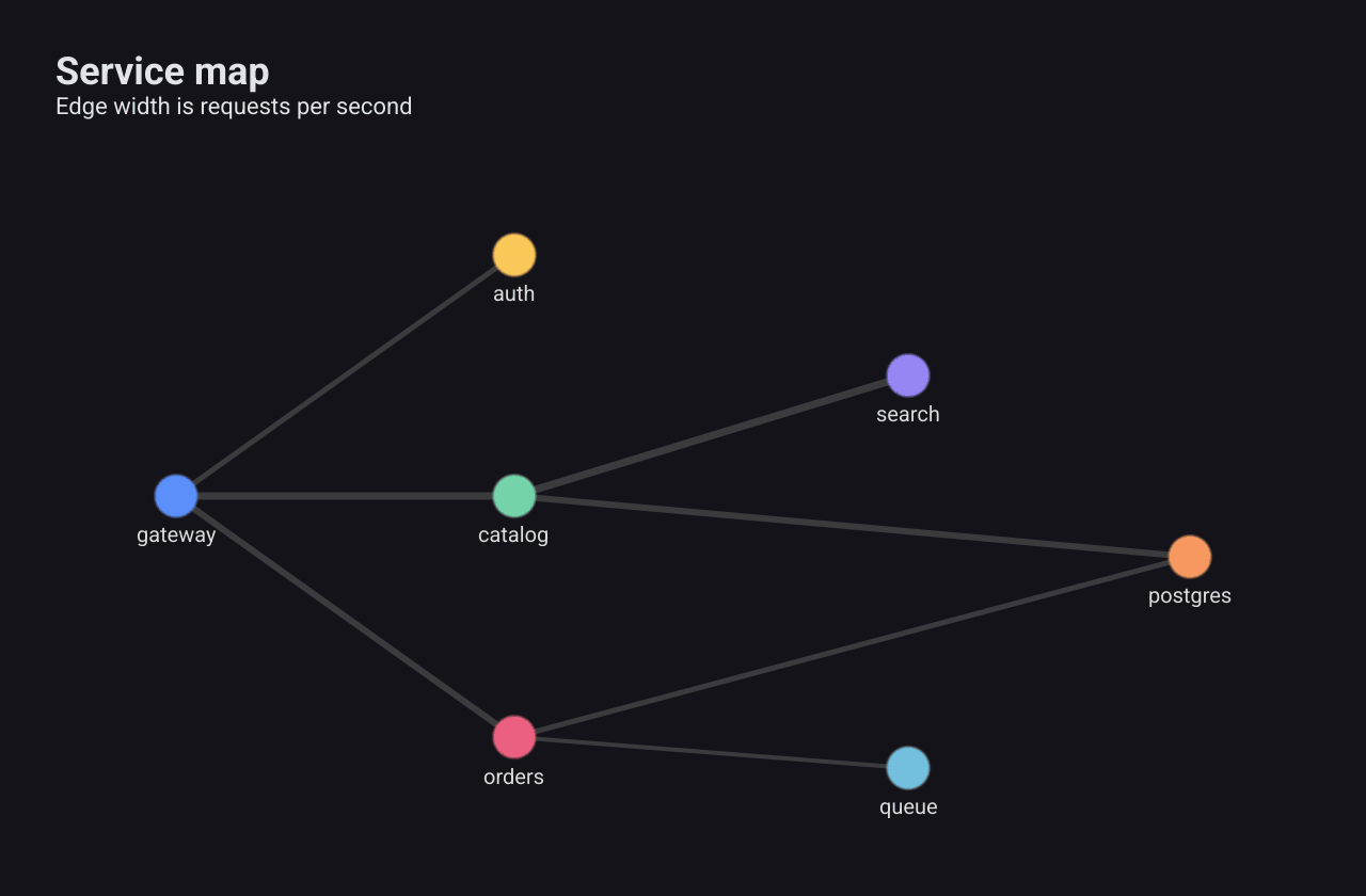
A GraphSeries
draws nodes joined by edges, for networks such as services and their
dependencies. For graphs the user edits, see the Graphs
extension instead.
c := chart.New(chart.Option{
	Title: &chart.Title{Text: "Service map", SubText: "Edge width is requests per second"},
	Series: []series.Series{
		&series.GraphSeries{
			SeriesName: "Services",
			NodeSize:   10,
			// X and Y are fractions of the plot area, from 0 to 1.
			Nodes: []series.GraphNode{
				{Name: "gateway", X: 0.05, Y: 0.5},
				{Name: "auth", X: 0.35, Y: 0.1},
				{Name: "catalog", X: 0.35, Y: 0.5},
				{Name: "orders", X: 0.35, Y: 0.9},
				{Name: "search", X: 0.7, Y: 0.3},
				{Name: "postgres", X: 0.95, Y: 0.6},
				{Name: "queue", X: 0.7, Y: 0.95},
			},
			Edges: []series.GraphEdge{
				{Source: 0, Target: 1, Value: 2},
				{Source: 0, Target: 2, Value: 5},
				{Source: 0, Target: 3, Value: 3},
				{Source: 2, Target: 4, Value: 4},
				{Source: 2, Target: 5, Value: 3},
				{Source: 3, Target: 5, Value: 2},
				{Source: 3, Target: 6, Value: 1},
			},
		},
	},
})
The main fields:
Nodeslists theGraphNodes.XandYplace a node as fractions of the plot area, from 0 to 1. If every node is left at 0, 0, the nodes are arranged on a circle instead.GraphNode.Valuemakes a node larger;NodeSizeis the base radius (default 8).Edgesjoins nodes by index.GraphEdge.Valuemakes an edge thicker.
Edges are plain lines without arrowheads, and there is no automatic force-directed layout.