Specialised charts
These series each answer one kind of question: how several measures compare, where a single value stands, how many drop out at each step. Radar, gauge, funnel, parallel and custom series lay themselves out in the plot area. Pictorial and effect scatter series are drawn on the chart’s axes.
Radar
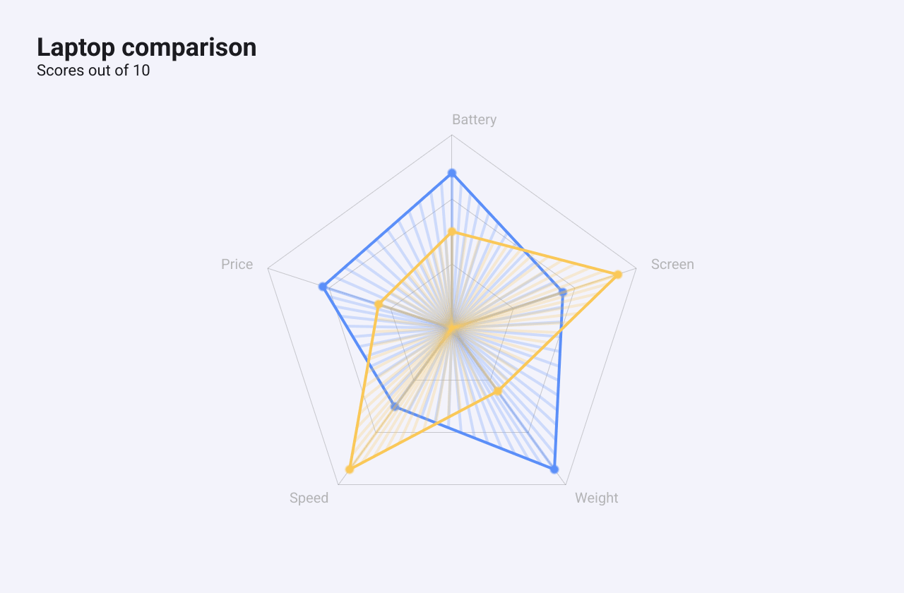
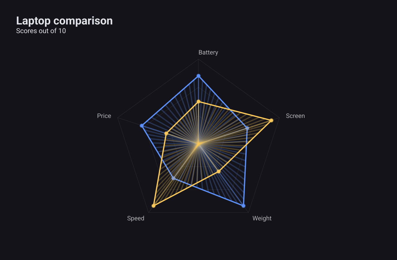
A RadarSeries
puts several measures on spokes around a centre and joins each item’s values
into a polygon. Use it to compare a few items across the same measures.
c := chart.New(chart.Option{
	Title: &chart.Title{Text: "Laptop comparison", SubText: "Scores out of 10"},
	Series: []series.Series{
		&series.RadarSeries{
			SeriesName: "Laptops",
			Indicators: []series.RadarIndicator{
				{Name: "Battery", Max: 10}, {Name: "Screen", Max: 10},
				{Name: "Weight", Max: 10}, {Name: "Speed", Max: 10},
				{Name: "Price", Max: 10},
			},
			// One row per item, one value per indicator.
			Data: [][]float64{
				{8, 6, 9, 5, 7},
				{5, 9, 4, 9, 4},
			},
			ShowArea: true,
			Opacity:  0.25,
		},
	},
})
Indicators lists the spokes, each a
RadarIndicator
with a Name and a Max. With Max at 0 the spoke’s maximum is the largest
value on it. Data has one row per item and one value per indicator; a row
with fewer values than indicators is skipped. ShowArea fills the polygons,
with Opacity as the fill’s opacity (default 0.3).
The fill is drawn as a fan of lines from the centre, so it looks striped rather
than solid. Polygons take their colours from the built-in palette, and
DataNames is not used for drawing in v1.0.0.
Gauge
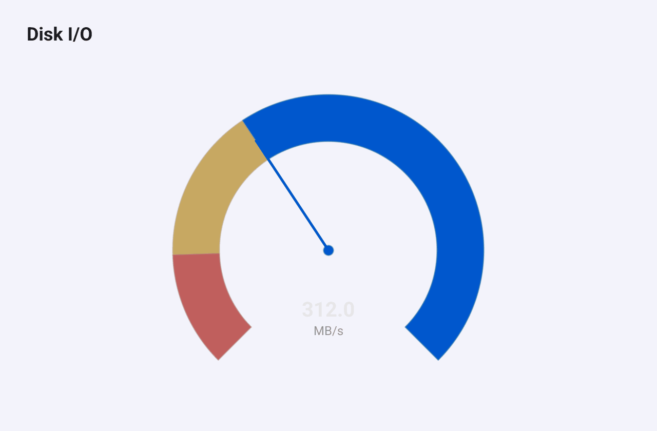
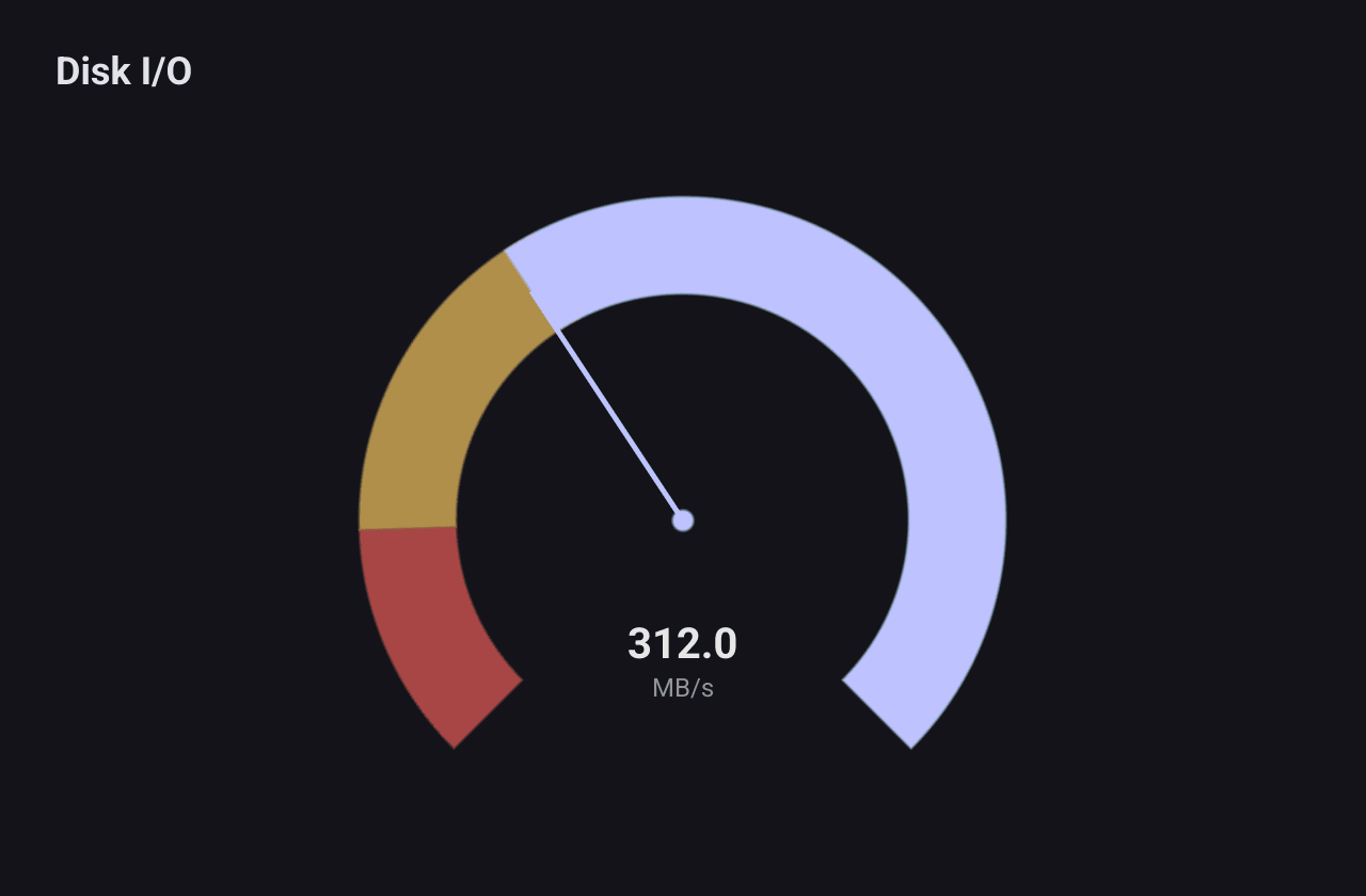
A GaugeSeries
shows one value on a dial, with coloured ranges for normal, warning and
critical.
c := chart.New(chart.Option{
	Title: &chart.Title{Text: "Disk I/O"},
	Series: []series.Series{
		&series.GaugeSeries{
			SeriesName: "MB/s",
			Value:      312,
			Min:        0,
			Max:        500,
			ShowValue:  true,
			// Minimum at the bottom right, maximum at the bottom left,
			// with the gap at the bottom. Values grow counter-clockwise.
			StartAngle: 135,
			EndAngle:   -135,
			Sectors: []series.GaugeSector{
				{Min: 0, Max: 300, Color: color.NRGBA{R: 38, G: 186, B: 121, A: 160}},
				{Min: 300, Max: 420, Color: color.NRGBA{R: 250, G: 200, B: 88, A: 160}},
				{Min: 420, Max: 500, Color: color.NRGBA{R: 239, G: 83, B: 80, A: 160}},
			},
		},
	},
})
The main fields:
Valueis the reading.MinandMaxset the scale; whenMaxis not aboveMin, the scale runs to 100.Sectorscolour ranges of the scale, each aGaugeSectorwithMin,MaxandColor.ShowValuewrites the value, with the series name under it, in the middle.Radiusis a fraction of the available space (default 0.85).StartAngleandEndAngle, in degrees with 0 at the top, set where the scale starts and ends.
StartAngle. With the default angles
(225 and -45) the scale starts at the bottom left and runs through the bottom,
the right and the top, leaving the gap on the left side. The example sets
StartAngle: 135, EndAngle: -135, which puts the gap at the bottom, with the
minimum at the bottom right. The value arc is drawn over the sectors, so a
sector below the current value is hidden. The value text is a fixed light
colour, which is faint in the light theme.Funnel
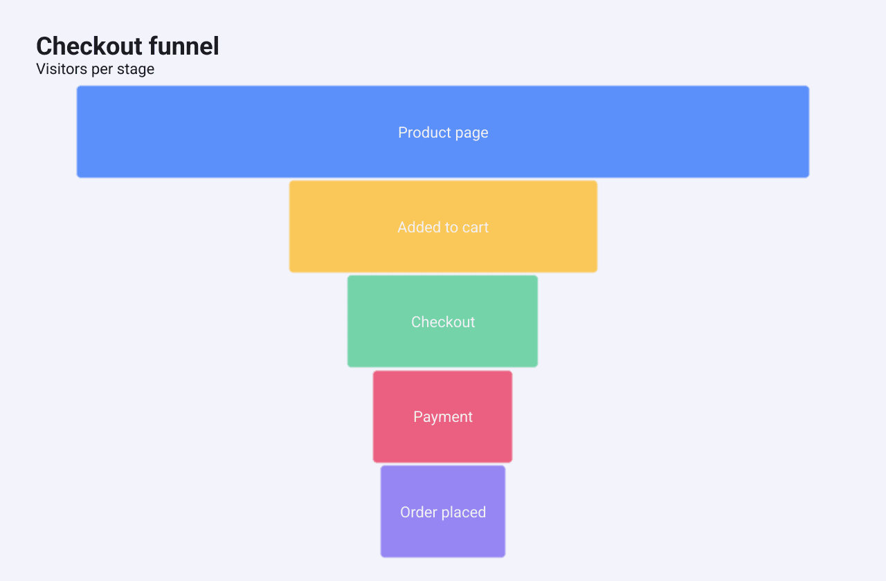
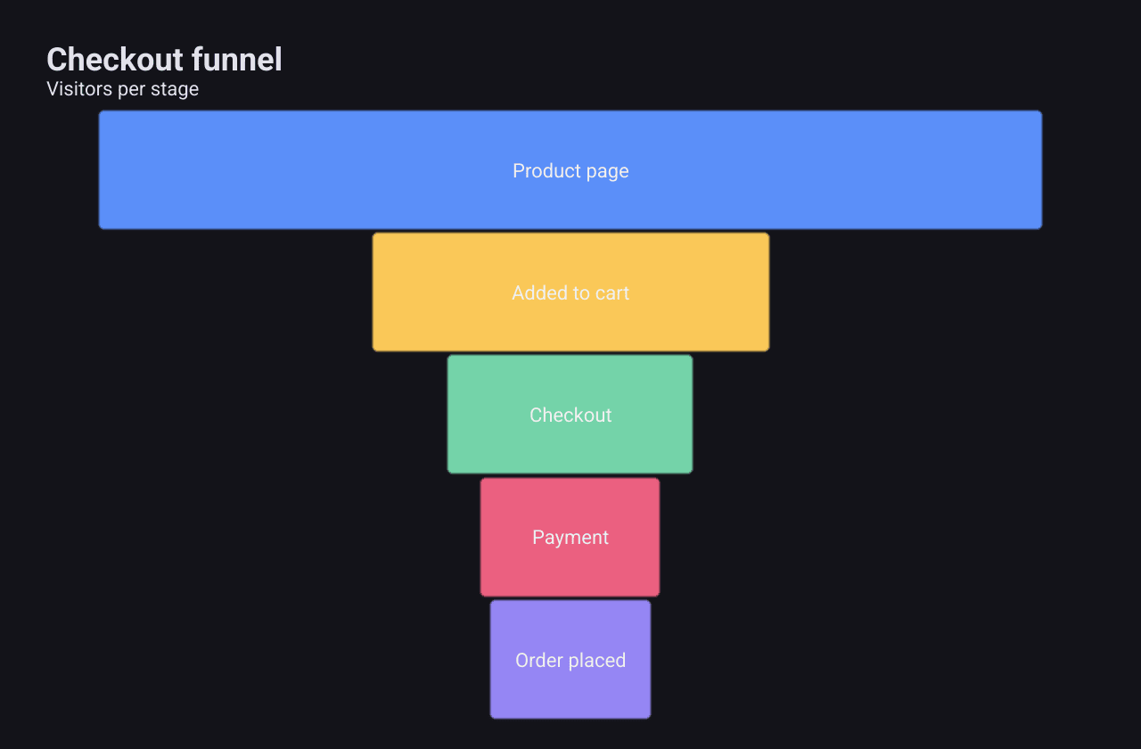
A FunnelSeries
shows how many remain at each step of a process, such as a checkout.
c := chart.New(chart.Option{
	Title: &chart.Title{Text: "Checkout funnel", SubText: "Visitors per stage"},
	Series: []series.Series{
		&series.FunnelSeries{
			SeriesName: "Checkout",
			// Stages are drawn top to bottom in this order.
			Data: []series.FunnelData{
				{Name: "Product page", Value: 10000},
				{Name: "Added to cart", Value: 4200},
				{Name: "Checkout", Value: 2600},
				{Name: "Payment", Value: 1900},
				{Name: "Order placed", Value: 1700},
			},
		},
	},
})
Each FunnelData
stage has a Name, a Value and an optional Color. Stages are centred bars
whose width is proportional to their value. All stages are the same height,
unless DynamicHeight is set, which makes each stage’s height proportional to
its value.
Stages are drawn top to bottom in the order you give them. Sort is declared
but has no effect in v1.0.0, so put the stages in order yourself.
Parallel coordinates
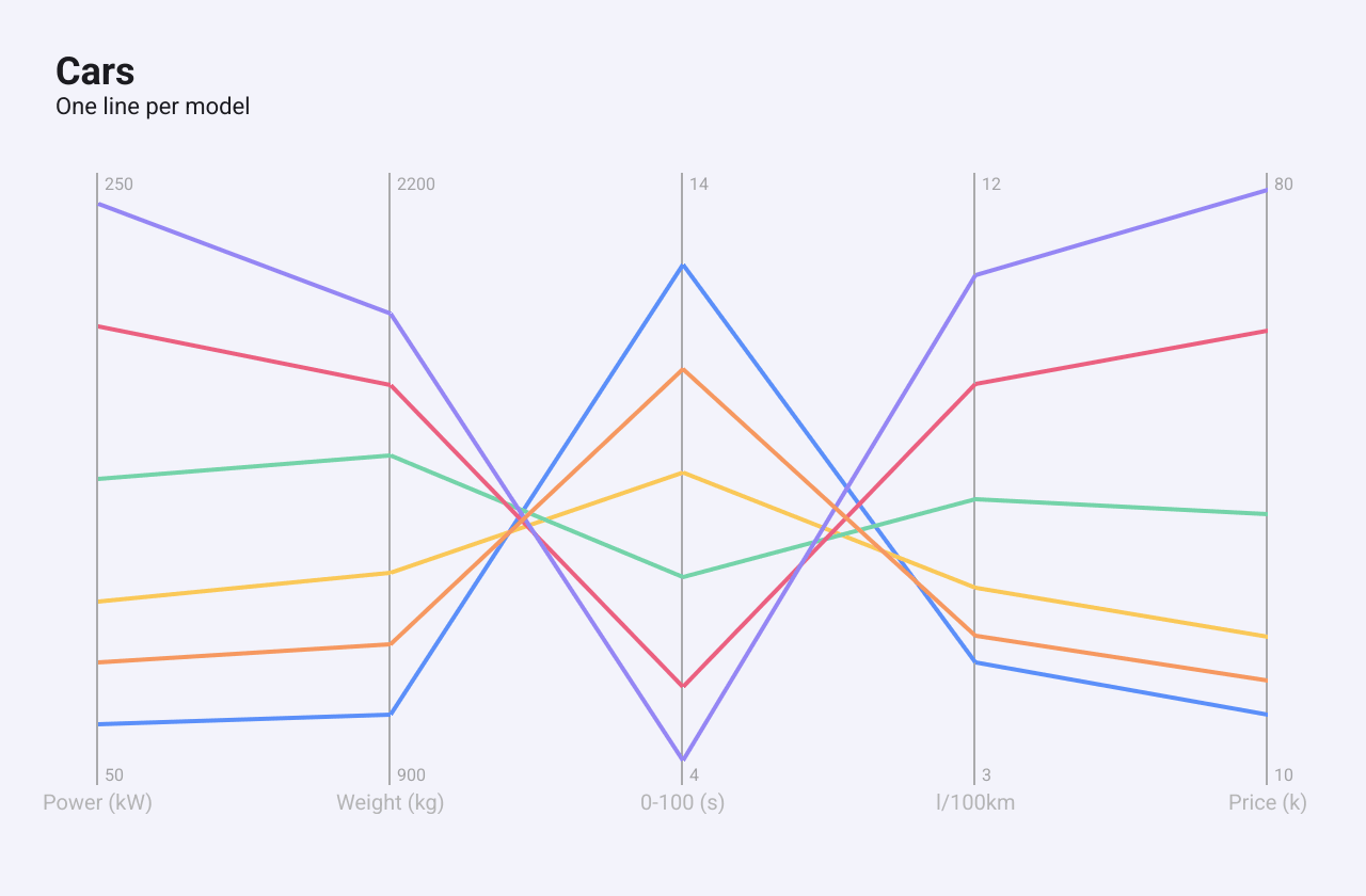
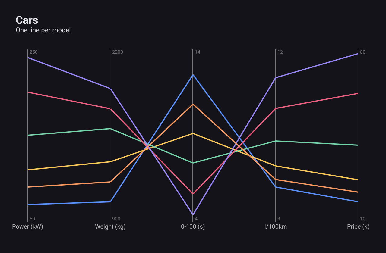
A ParallelSeries
draws one vertical axis per measure and one line per item across them. Use it
to spot patterns across many measures, such as heavier cars being slower and
more expensive.
c := chart.New(chart.Option{
	Title: &chart.Title{Text: "Cars", SubText: "One line per model"},
	Series: []series.Series{
		&series.ParallelSeries{
			SeriesName: "Cars",
			Axes: []series.ParallelAxis{
				{Name: "Power (kW)", Min: 50, Max: 250},
				{Name: "Weight (kg)", Min: 900, Max: 2200},
				{Name: "0-100 (s)", Min: 4, Max: 14},
				{Name: "l/100km", Min: 3, Max: 12},
				{Name: "Price (k)", Min: 10, Max: 80},
			},
			// Data[line][axis]
			Data: [][]float64{
				{70, 1050, 12.5, 4.8, 18},
				{110, 1350, 9.1, 5.9, 27},
				{150, 1600, 7.4, 7.2, 41},
				{200, 1750, 5.6, 8.9, 62},
				{240, 1900, 4.4, 10.5, 78},
				{90, 1200, 10.8, 5.2, 22},
			},
			LineWidth: 2,
		},
	},
})
Axes lists the
ParallelAxises,
each with a Name, Min and Max. When both Min and Max are 0, the range
comes from the data. Data holds one row per line and one value per axis.
LineWidth defaults to 1.5. Each line takes the next colour from the built-in
palette.
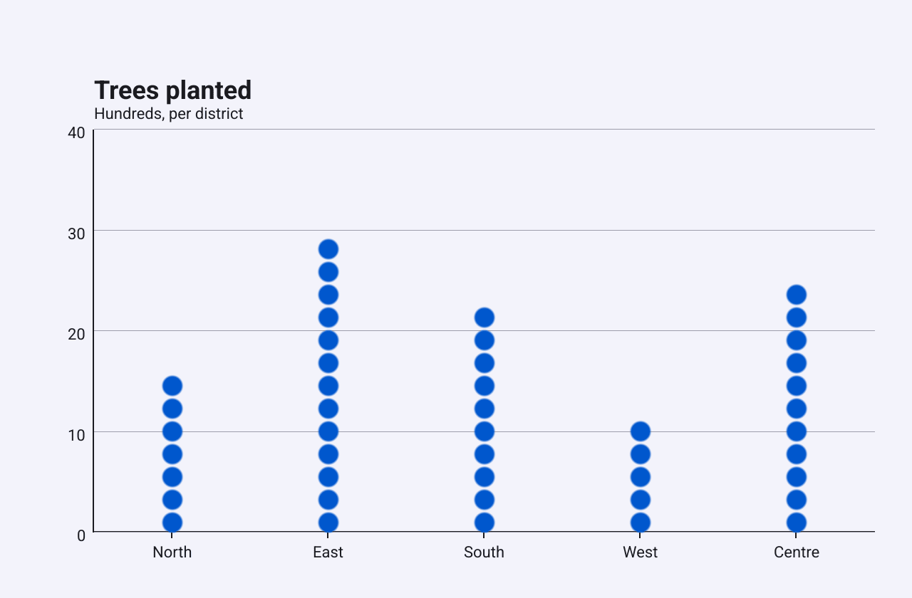
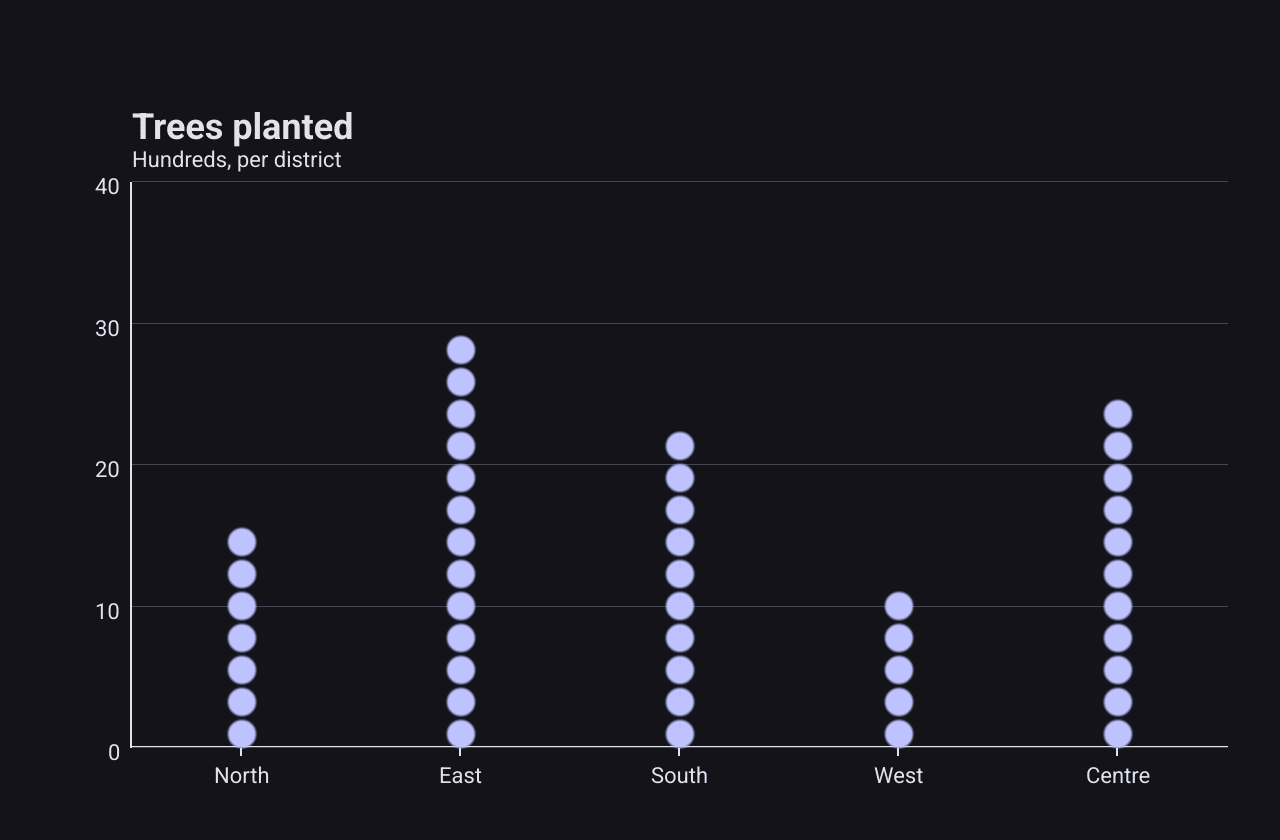
Pictorial bar
A PictorialSeries
is a bar chart whose bars are stacks of symbols. It suits counts of things,
where a column of items reads better than a solid bar.
c := chart.New(chart.Option{
	Title: &chart.Title{Text: "Trees planted", SubText: "Hundreds, per district"},
	XAxis: []axis.Config{{Type: axis.TypeCategory, Data: []string{"North", "East", "South", "West", "Centre"}}},
	YAxis: []axis.Config{{Type: axis.TypeValue}},
	Series: []series.Series{
		&series.PictorialSeries{
			SeriesName: "Trees",
			Data:       []float64{18, 31, 24, 12, 27},
			Symbol:     series.SymbolCircle, // a column of circles
			SymbolSize: 14,
		},
	},
})
SymbolSize is the size of one symbol (default 12), and the number of symbols
follows the bar’s height. With Symbol: series.SymbolCircle the bar is a
column of circles; any other symbol draws a column of rounded bars instead.
Color overrides the palette colour.
Effect scatter
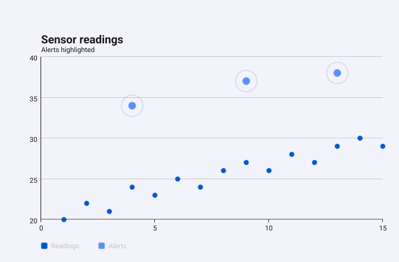
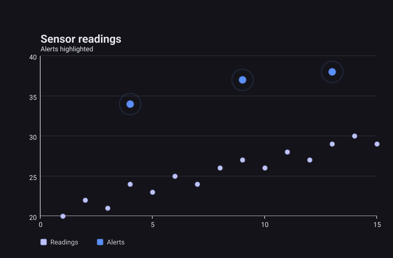
An EffectScatterSeries
is a scatter series whose points have a ring around them. Use it to make a few
points stand out, here alerts over ordinary readings.
c := chart.New(chart.Option{
	Title: &chart.Title{Text: "Sensor readings", SubText: "Alerts highlighted"},
	XAxis: []axis.Config{{Type: axis.TypeValue}},
	YAxis: []axis.Config{{Type: axis.TypeValue}},
	Series: []series.Series{
		&series.ScatterSeries{
			SeriesName: "Readings",
			Data: []float64{
				1, 20, 2, 22, 3, 21, 4, 24, 5, 23, 6, 25, 7, 24, 8, 26,
				9, 27, 10, 26, 11, 28, 12, 27, 13, 29, 14, 30, 15, 29,
			},
			Symbol: series.SymbolCircle,
		},
		&series.EffectScatterSeries{
			SeriesName:  "Alerts",
			Data:        []float64{4, 34, 9, 37, 13, 38}, // x0, y0, x1, y1, ...
			SymbolSize:  12,
			RippleScale: 3,
		},
	},
})
Data stores x, y pairs flat, like a scatter series. SymbolSize sets the
point size (default 8), and RippleScale the size of the ring relative to the
point (default 2.5). The ring grows during the chart’s entrance animation and
then stays still: in v1.0.0 it does not pulse.
Custom
A CustomSeries
hands drawing to your own function. Use it for a chart the other types do not
cover, while keeping the chart’s title, background and theme.
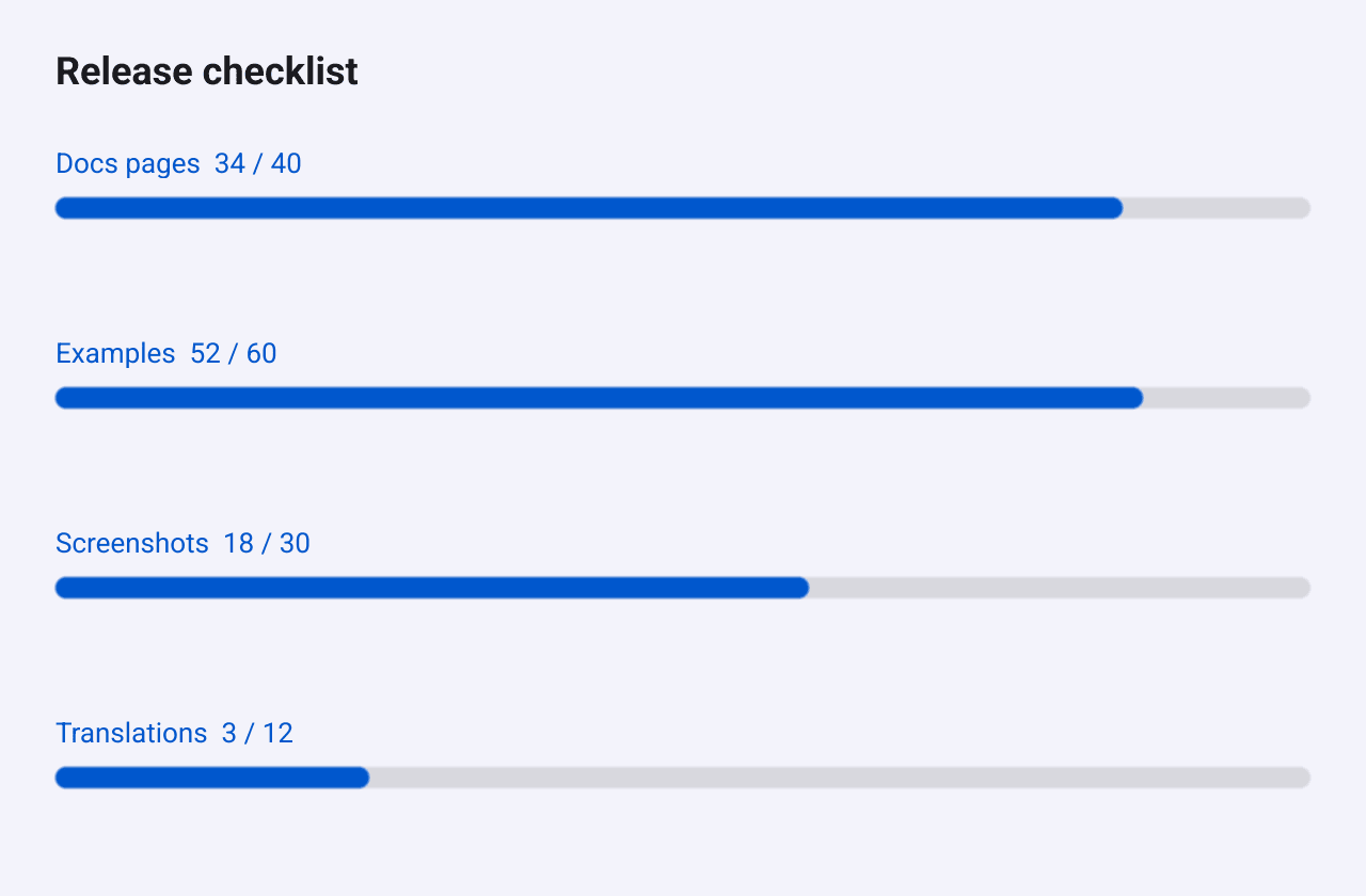
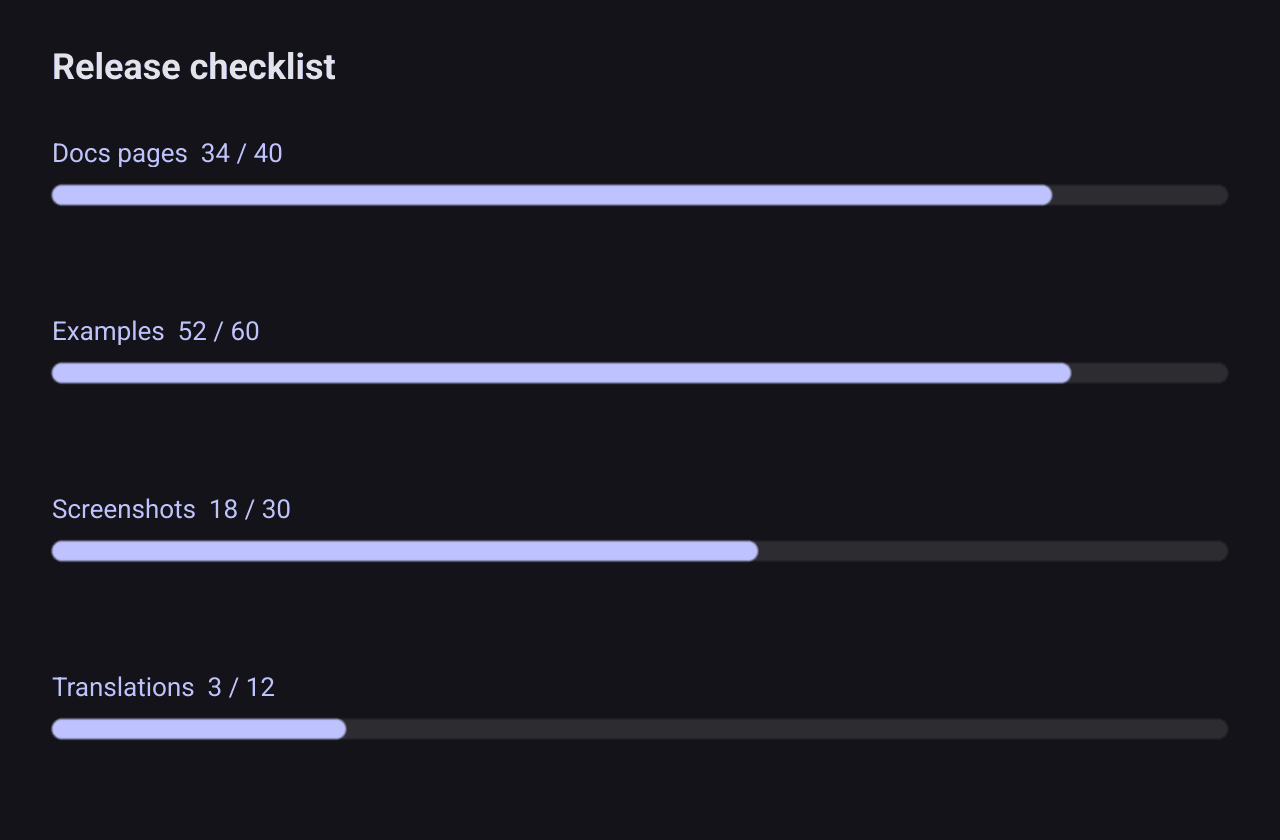
progress := func(ctx series.RenderContext) []core.CanvasObject {
	vp := ctx.Viewport // the plot area, in pixels
	rowH := vp.H / float32(len(goals))
	track := color.NRGBA{R: 128, G: 128, B: 128, A: 60}

	var objs []core.CanvasObject
	for i, g := range goals {
		y := vp.Y + float32(i)*rowH + rowH/2

		label := canvas.NewText(fmt.Sprintf("%s  %.0f / %.0f", g.name, g.done, g.total), ctx.Color)
		label.TextSize = 13
		label.Move(geo.NewPos(vp.X, y-24))
		objs = append(objs, label)

		bg := canvas.NewRectangle(track)
		bg.CornerRadius = 5
		bg.Move(geo.NewPos(vp.X, y))
		bg.Resize(geo.NewSize(vp.W, 10))

		bar := canvas.NewRectangle(ctx.Color) // the series colour from the palette
		bar.CornerRadius = 5
		bar.Move(geo.NewPos(vp.X, y))
		bar.Resize(geo.NewSize(vp.W*float32(g.done/g.total), 10))
		objs = append(objs, bg, bar)
	}
	return objs
}

c := chart.New(chart.Option{
	Title: &chart.Title{Text: "Release checklist"},
	Series: []series.Series{
		&series.CustomSeries{SeriesName: "Progress", RenderFunc: progress},
	},
})
RenderFunc receives a
RenderContext
and returns the canvas objects to draw. The fields you will use most:
Viewportis the plot area in pixels. Position everything inside it.Coloris the series’ colour from the palette.AnimateandAnimProgress(0 to 1) tell you when the entrance animation is running, so you can animate too.
A custom series is laid out like a pie or a radar: the chart draws no axes for
it, and Coord maps data values to the same pixel values.