Tables
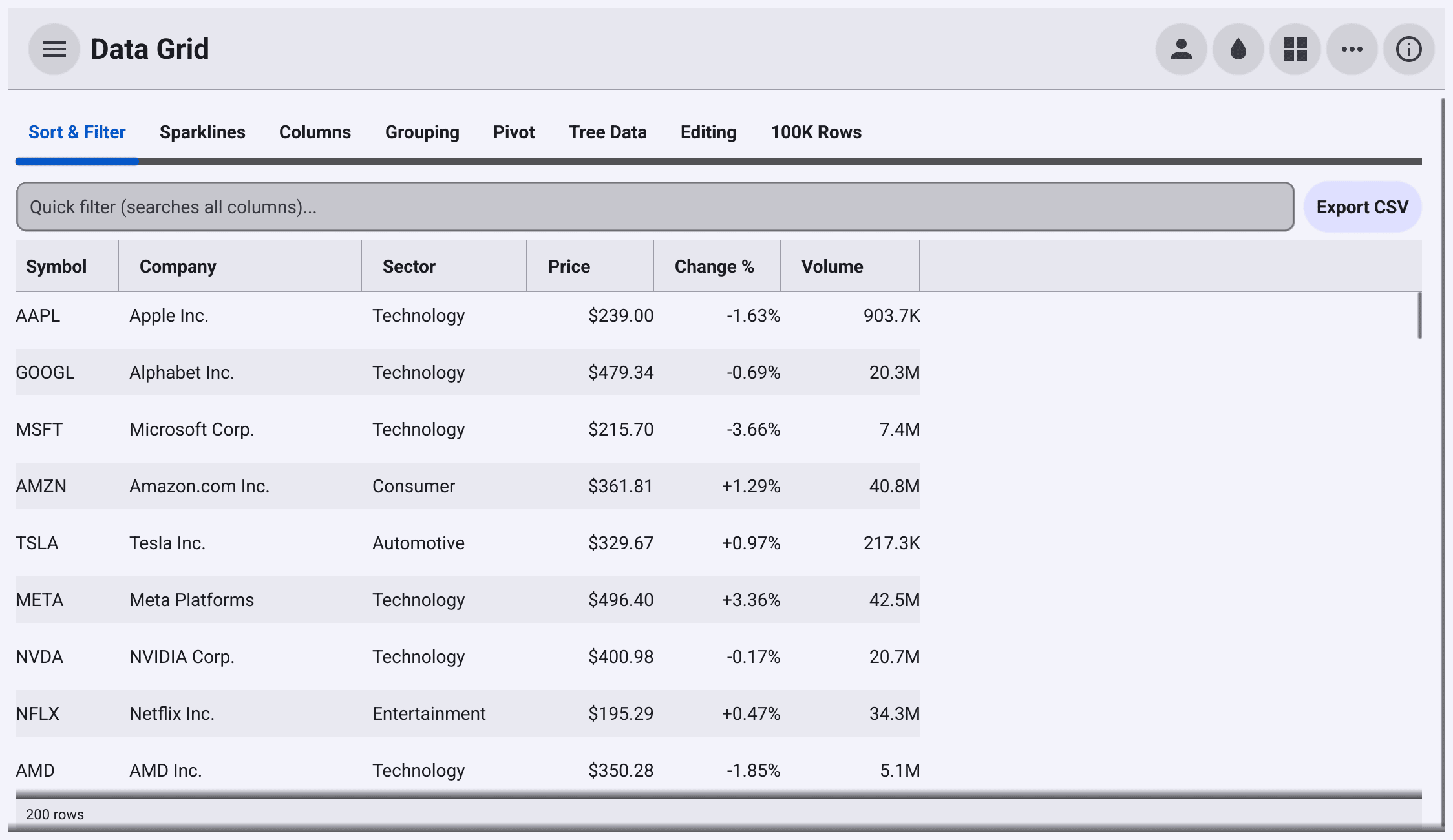
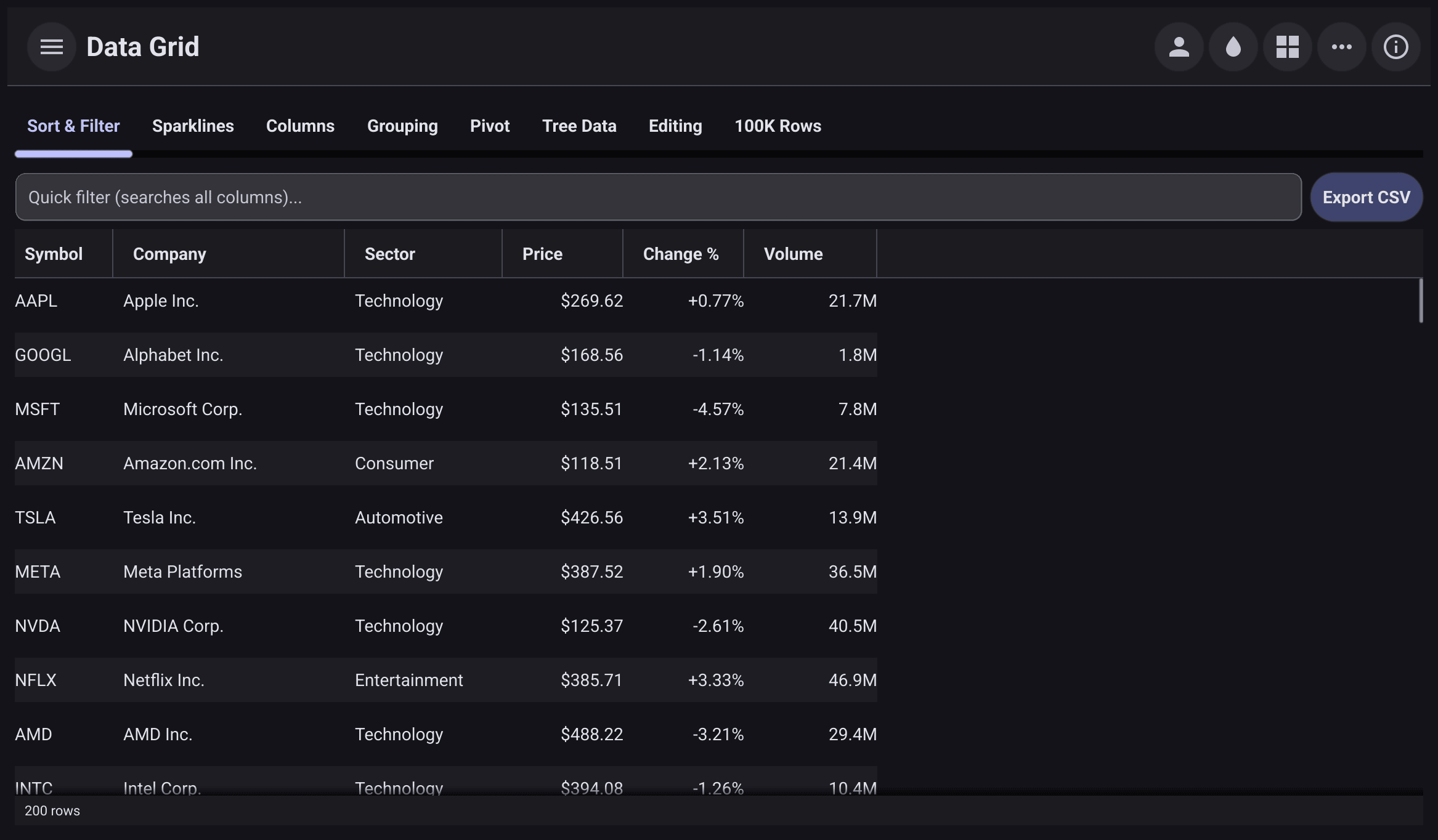
x/tables provides
DataGrid,
a spreadsheet-like table for large data sets. It only creates widgets for the
cells you can see, so it scrolls through hundreds of thousands of rows. Users
can sort, filter, resize, reorder and pin columns, select rows or cells, edit
values, and copy and paste. Sorting, filtering, selection, editing and column
changes are also available from code.
Install
go get github.com/belluikit/bellui/x/tables@latestA first grid
A grid needs three things: the column definitions, a function returning the number of rows, and a function returning one row. The grid never copies your data; it calls the functions when it needs a row.
A row can be a struct, a pointer to a struct, or a map[string]any:
type Order struct {
	ID       int
	Customer string
	Total    float64
	Shipped  bool
}
Each column’s Field names a struct field or a map key:
grid := tables.NewDataGrid(
	[]*tables.ColumnDef{
		{Field: "ID", Type: tables.ColumnNumber, Width: 80},
		{Field: "Customer", Flex: 1},
		{
			Field: "Total", HeaderName: "Total", Type: tables.ColumnNumber, Width: 110,
			ValueFormatter: func(v any) string { return fmt.Sprintf("$%.2f", v) },
		},
		{Field: "Shipped", Type: tables.ColumnBoolean, Width: 90},
	},
	func() int { return len(orders) },
	func(row int) any { return orders[row] },
)
grid.Options.RowAlternation = true
grid.Options.ShowStatusBar = true
The full program builds 100,000 orders. The grid creates cells only for the rows in view and reuses them as you scroll.
HeaderNameis the header text. It defaults toField.Typechooses how the column draws, sorts and filters its values:ColumnText(the default),ColumnNumber,ColumnDateorColumnBoolean.Widthis in pixels.Flexinstead shares out the remaining width, like a flex-grow factor.ValueFormatterturns a value into display text. Without one, the column’s renderer shows the raw value:fmt.Sprintfor text and number columns, and the2006-01-02layout fortime.Timevalues in date columns.Fieldaccepts dot notation for nested values, such as"address.city". For anything else, setValueGetterto a function that extracts the value from the row.
grid.Options holds the grid-wide settings: RowAlternation stripes the rows,
ShowStatusBar adds a footer with the row count, the selection count and the
current page, and Density chooses compact, comfortable or spacious row
spacing. When your data changes, call
RefreshData
so the grid reads it again.
Sorting and filtering
Click a header to sort by that column; click again to reverse or clear the sort.
Shift-click adds the column to a multi-column sort. Right-click a header for a
menu with sort, filter, pin and hide commands. The menu’s filter matches cells
containing the text you type. Options.FloatingFilters also adds a filter field
under every header.
From code, use the grid’s
GridAPI,
returned by grid.API():
api := grid.API()

// Sort by sector, then by price, highest first.
api.SetSort(
	tables.SortItem{ColID: "sector", Direction: tables.SortAscending},
	tables.SortItem{ColID: "price", Direction: tables.SortDescending},
)

// Keep rows whose price is at least 100.
atLeast100 := &filter.NumberFilter{Mode: filter.NumberGreaterThanOrEqual, Value: 100}
api.SetColumnFilter("price", atLeast100.Matches)

// A quick filter matches its text against every column.
search := widget.NewEntry()
search.SetPlaceHolder("Search all columns")
search.OnChanged = api.SetQuickFilter
A column filter is any func(value any) bool. The
filter
package has ready-made ones: TextFilter, NumberFilter, DateFilter and
SetFilter, each with a Matches method you can pass directly. Set
Comparator on a column to sort it your own way. Set Sortable or
Filterable to a false value to turn either off for a column.
grid.DefaultColDef, though, its fields become the defaults for every
column, and a zero DefaultColumnDef has all of them false. Set every field
you want on, not only the one you came to change.Selection
grid.SelectionMode chooses what a click selects: SelectionSingleCell (the
default), SelectionMultiCell, SelectionSingleRow, SelectionMultiRow or
SelectionNone. With multi-row selection, shift-click selects a range and
ctrl-click or cmd-click toggles one row. Options.CheckboxSelection
adds a checkbox column.
OnSelectionChanged receives the selected rows as indexes into your data, not
screen positions, so they stay correct after the user sorts or filters.
OnCellClicked, OnCellDoubleClicked and OnRowActivated (Enter or Space on
a row) report clicks and activation.
The arrow keys and Tab move the cursor. The copy shortcut copies whole rows as tab-separated text, every column of each selected row, or of the selected cell’s row. The paste shortcut puts the clipboard text into the current cell, if that cell is editable.
Editing
Make a column editable with Editable. It is a *bool, so a column without
it inherits from DefaultColDef. The user starts editing with a double-click
or F2, commits with Enter, and cancels with Escape.
people := []map[string]any{
	{"name": "Alice", "role": "Engineer", "active": true},
	{"name": "Bob", "role": "Designer", "active": true},
	{"name": "Chen", "role": "Manager", "active": false},
}

editable := true
grid := tables.NewDataGrid(
	[]*tables.ColumnDef{
		{Field: "name", HeaderName: "Name", Width: 150, Editable: &editable},
		{
			Field: "role", HeaderName: "Role", Width: 150, Editable: &editable,
			Editor: cell.NewSelectEditor([]string{"Engineer", "Designer", "Manager"}),
		},
		{
			Field: "active", HeaderName: "Active", Type: tables.ColumnBoolean, Width: 80,
			Editable: &editable, Editor: cell.NewCheckboxEditor(),
		},
	},
	func() int { return len(people) },
	func(row int) any { return people[row] },
)

status := widget.NewLabel("Double-click a cell or press F2 to edit.")
grid.OnCellValueChanged = func(id tables.CellID, old, new any) {
	// The grid has already written new into the row's map.
	status.SetText(fmt.Sprintf("Changed %v to %v", old, new))
}
The default editor is a text field, whatever the column type. Choose another
with Editor: cell.NewSelectEditor for a fixed list of choices,
cell.NewCheckboxEditor for booleans, cell.NewDateEditor for dates, or your
own cell.EditorFactory.
CanEdit refuses editing for individual rows of an editable column.
The undo and redo shortcuts undo and redo edits and pastes; grid.Undo and
grid.Redo do the same from code.
map[string]any; it stores it under the column’s Field. For struct rows,
copy the value into your data in OnCellValueChanged. The text editor
produces a string, even in a number column, so convert it there if you need
a number.Columns
grid := tables.NewDataGrid(
	[]*tables.ColumnDef{
		{Field: "id", HeaderName: "ID", Type: tables.ColumnNumber, Width: 60, Pinned: tables.PinLeft},
		{
			HeaderName: "Name", ColID: "name", OpenByDefault: true,
			Children: []*tables.ColumnDef{
				{Field: "first", HeaderName: "First", Width: 120},
				{Field: "last", HeaderName: "Last", Width: 120},
			},
		},
		{Field: "city", HeaderName: "City", Width: 120},
		{Field: "country", HeaderName: "Country", Width: 120},
		{Field: "phone", HeaderName: "Phone", Width: 140, Hidden: true},
		{Field: "balance", HeaderName: "Balance", Type: tables.ColumnNumber, Width: 100, Pinned: tables.PinRight},
	},
	func() int { return len(rows) },
	func(row int) any { return rows[row] },
)- Pinned columns stay in place while the rest scroll sideways.
Pinned: tables.PinLeftortables.PinRightsets this up; the header menu lets the user change it. - Column groups put a shared header over several columns. A
ColumnDefwithChildrenis a group, and itsColIDnames it. - Hidden columns are defined but not shown until you make them visible.
- Users resize a column by dragging the edge of its header, and move it
by dragging the header.
MinWidthandMaxWidthbound resizing;ResizableandMovableturn each off.
The same changes can be made from code:
toggleGroup := widget.NewButton("Collapse or expand Name", func() {
	grid.ToggleColumnGroup("name")
})
showPhone := widget.NewButton("Show phone", func() {
	grid.API().SetColumnVisible("phone", true)
})
fit := widget.NewButton("Size to fit", grid.API().SizeColumnsToFit)
GetGridState returns the column widths, order, pinning and visibility, and
the sort, as a JSON-tagged struct. Save it and pass it to SetGridState the
next time the grid opens. SetGridState restores the widths, pinning,
visibility and sort, but not the column order, and neither call saves the
page.
Grouping, pivots and tree data
Row grouping collects rows with the same value in one column under a group row that the user expands and collapses:
sales := []map[string]any{
	{"region": "North", "product": "Widget", "revenue": 1200.0},
	{"region": "South", "product": "Widget", "revenue": 800.0},
	{"region": "North", "product": "Gadget", "revenue": 450.0},
	{"region": "East", "product": "Gadget", "revenue": 990.0},
	{"region": "South", "product": "Gizmo", "revenue": 310.0},
}
grouped := tables.NewDataGrid(
	[]*tables.ColumnDef{
		{Field: "region", HeaderName: "Region", Width: 120},
		{Field: "product", HeaderName: "Product", Width: 120},
		{Field: "revenue", HeaderName: "Revenue", Type: tables.ColumnNumber, Width: 100},
	},
	func() int { return len(sales) },
	func(row int) any { return sales[row] },
)
grouped.API().SetRowGroupColumn("region")
ExpandAllGroups and CollapseAllGroups open and close every group; pass
"" to SetRowGroupColumn to remove the grouping.
A pivot turns the values of one column into columns of their own and
aggregates a third column into the cells, with pipeline.AggSum, AggAvg,
AggMin, AggMax, AggCount, AggFirst or AggLast:
pivoted := tables.NewDataGrid(
	[]*tables.ColumnDef{
		{Field: "region", HeaderName: "Region", Width: 100},
		{Field: "product", HeaderName: "Product", Width: 100},
		{Field: "revenue", HeaderName: "Revenue", Type: tables.ColumnNumber, Width: 100},
	},
	func() int { return len(sales) },
	func(row int) any { return sales[row] },
)
// One row per region, one column per product, cells summing revenue.
pivoted.API().SetPivot("region", "product", "revenue", pipeline.AggSum)
Tree data shows rows as a hierarchy, indented under their parents, with a disclosure arrow on each parent row. You supply two functions: one returns a row’s ID, the other its parent’s ID, or a negative number for a top-level row.
staff := []map[string]any{
	{"id": 1, "parent": -1, "name": "Ada", "title": "CEO"},
	{"id": 2, "parent": 1, "name": "Grace", "title": "CTO"},
	{"id": 3, "parent": 1, "name": "Linus", "title": "CFO"},
	{"id": 4, "parent": 2, "name": "Ken", "title": "Engineer"},
	{"id": 5, "parent": 2, "name": "Barbara", "title": "Engineer"},
}
tree := tables.NewDataGrid(
	[]*tables.ColumnDef{
		{Field: "name", HeaderName: "Name", Width: 180},
		{Field: "title", HeaderName: "Title", Width: 140},
	},
	func() int { return len(staff) },
	func(row int) any { return staff[row] },
)
tree.API().SetTreeData(
	func(row any) any { return row.(map[string]any)["id"] },
	func(row any) int { return row.(map[string]any)["parent"].(int) },
)
tree.API().ExpandAllNodes()
The parent function returns an int, and it is looked up among the values the
ID function returns. Return the ID as an int too, or parents will not be
found and every row will appear at the top level.
Pagination splits the rows into pages: EnablePagination(50), then
SetPage and GetPageCount to move between them.
Master-detail rows
A master row expands to show a band beneath it with any widget you like:
grid := tables.NewDataGrid(
	[]*tables.ColumnDef{
		{Field: "name", HeaderName: "Customer", Width: 200},
		{Field: "orders", HeaderName: "Orders", Type: tables.ColumnNumber, Width: 100},
	},
	func() int { return len(customers) },
	func(row int) any { return customers[row] },
)
grid.MasterDetail = tables.MasterDetailConfig{
	Enabled:      true,
	DetailHeight: 80,
	// Only customers with orders can be expanded.
	IsRowMaster: func(sourceRow int) bool { return customers[sourceRow]["orders"].(int) > 0 },
	DetailRenderer: func(sourceRow int) core.CanvasObject {
		c := customers[sourceRow]
		return widget.NewLabel(fmt.Sprintf("%s has %d open orders.", c["name"], c["orders"]))
	},
}
grid.ToggleDetail(0) // expand the first row from code
Master-detail needs Enabled, a DetailRenderer and a DetailHeight above
zero. The user expands a row with the arrow at the left of its first column.
Expansion follows the row, not its position, so it survives sorting and
filtering.
Sparklines
The sparkline
package draws a small chart in each cell of a column whose values are
[]float64. There are four kinds: Line, Area, Bar and Column.
blue := color.NRGBA{R: 33, G: 150, B: 243, A: 255}
grid := tables.NewDataGrid(
	[]*tables.ColumnDef{
		{Field: "name", HeaderName: "Name", Width: 80},
		{
			// The cell value must be a []float64.
			Field: "trend", HeaderName: "Trend", Width: 160,
			CellRenderer: sparkline.NewCellRenderer(sparkline.Area,
				sparkline.WithStroke(blue),
				sparkline.WithFill(color.NRGBA{R: 33, G: 150, B: 243, A: 50}),
			),
		},
		{
			Field: "change", HeaderName: "Daily change", Width: 160,
			CellRenderer: sparkline.NewCellRenderer(sparkline.Column,
				sparkline.WithStroke(blue),
				sparkline.WithAxis(),
				func(o *sparkline.Options) { o.NegativeColor = color.NRGBA{R: 244, G: 67, B: 54, A: 255} },
			),
		},
	},
	func() int { return len(rows) },
	func(row int) any { return rows[row] },
)
The same charts are available outside a grid as widgets, with
sparkline.NewLine and the other constructors. Hovering such a widget
highlights the nearest point and shows its value.
Export
The API exports the rows the grid currently shows, after filtering and sorting, with formatted values:
save := func(name string, write func(*bytes.Buffer) error) {
	var buf bytes.Buffer
	if err := write(&buf); err != nil {
		dialog.ShowError(err, w)
		return
	}
	if err := os.WriteFile(name, buf.Bytes(), 0o644); err != nil {
		dialog.ShowError(err, w)
	}
}
api := grid.API()
csv := widget.NewButton("CSV", func() {
	save("stock.csv", func(b *bytes.Buffer) error { return api.ExportCSV(b) })
})
xlsx := widget.NewButton("Excel", func() {
	save("stock.xlsx", func(b *bytes.Buffer) error { return api.ExportExcel(b) })
})
pdf := widget.NewButton("PDF", func() {
	save("stock.pdf", func(b *bytes.Buffer) error {
		return api.ExportPDF(b, export.PDFOptions{Title: "Stock", Landscape: true})
	})
})| Method | Writes |
|---|---|
ExportCSV | Comma-separated values with a header row |
ExportTSV | Tab-separated values |
ExportExcel | An .xlsx workbook |
ExportPDF | A paginated report: headers repeated on every page, columns scaled to fit, page numbers, an optional title. PDFOptions sets the paper size, orientation, font size and a row limit. |
ExportPXF | A typed PXF document with an embedded schema. Number columns need ExportType set. |
Each writes to an io.Writer, so you choose where the file goes.
Licence
x/tables is BSD 3-Clause licensed, like Bellui. Its feature set is
modelled on that of AG Grid, a JavaScript data
grid.