Gallery
The MD3 Gallery is a showcase app built with Bellui. Each page shows one group of widgets in a running window: buttons, inputs, navigation, sheets, dialogs, type styles and themes. It also shows the extensions: charts, the data grid and the code editor. Every screenshot on this site was taken from it.
Run it
You need Go and the platform setup from Prerequisites. In a checkout of the gallery:
go run .On desktop the window opens at 900 × 650 with the developer inspector turned on.
To see the app as it looks on a phone, without a phone, add the mobile
build tag:
go run -tags mobile .Bellui then uses its mobile driver on your computer. The gallery notices and changes its layout: the window is not resized, the inspector stays off, and wide pages scroll sideways as well as up and down instead of forcing a desktop width.
The top bar
The menu button on the left opens a navigation drawer listing every page. The five buttons on the right, in order:
| Button | What it does |
|---|---|
| Account | Opens a sign-in dialog with buttons for Google, Microsoft, Apple, GitHub, Okta and a custom provider |
| Light or dark | Switches the theme between light and dark |
| Grid | Switches between the default theme and the dense theme |
| Three dots | Switches the whole app between left-to-right and right-to-left layout |
| Info | Opens the About dialog built from the app’s metadata |
Package it
The gallery is packaged like any Bellui app, with the
bellui command. Its manifest.pxf gives the app ID
io.bellui.md3gallery, the name “MD3 Gallery” and the icon Icon.png; see
App metadata for the file format.
bellui packageFor Android, the repository has scripts/android-build.sh. It runs
bellui package -os android/arm64, re-packs and signs the APK with the debug
key, and with --install installs and starts it on a connected device
through adb. It needs the Android SDK and NDK.
Platforms
Most pages build everywhere, Android included. Two pages, Clair and Code Assistant, are only in desktop builds: they are left out when you build for Android, along with the libraries they use.
Tour
The pages are listed in the order the drawer shows them.
Actions
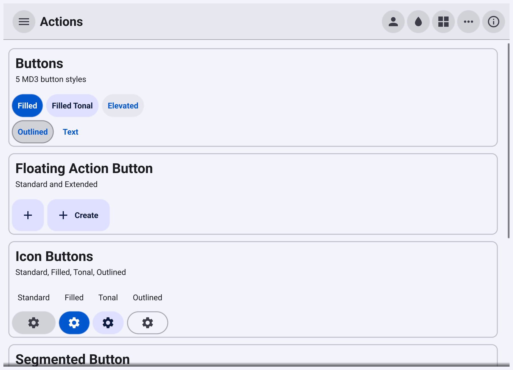
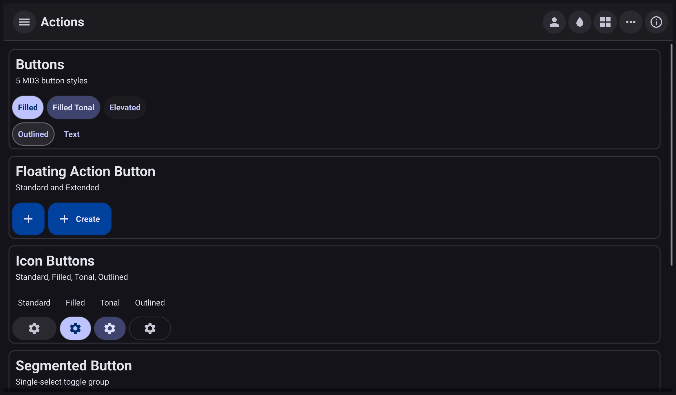
Every kind of button. The five button styles (filled, filled tonal, elevated, outlined and text), a floating action button in its standard and extended forms, icon buttons in four styles, a segmented button, a group of connected buttons, and a split button with a menu. See Buttons and actions.
The screenshot at the top of this page is the Actions page.
Animated GIF
A rotating-earth GIF played by widget.AnimatedGif, at the frame delays
stored in the file. A toolbar above it has a two-state button that pauses
and resumes the animation, and a refresh button that stops and starts it.
Auth
A button that opens the same sign-in dialog as the account button in the top bar. The provider buttons are set up with a demonstration client ID. See Sign-in.
Charts
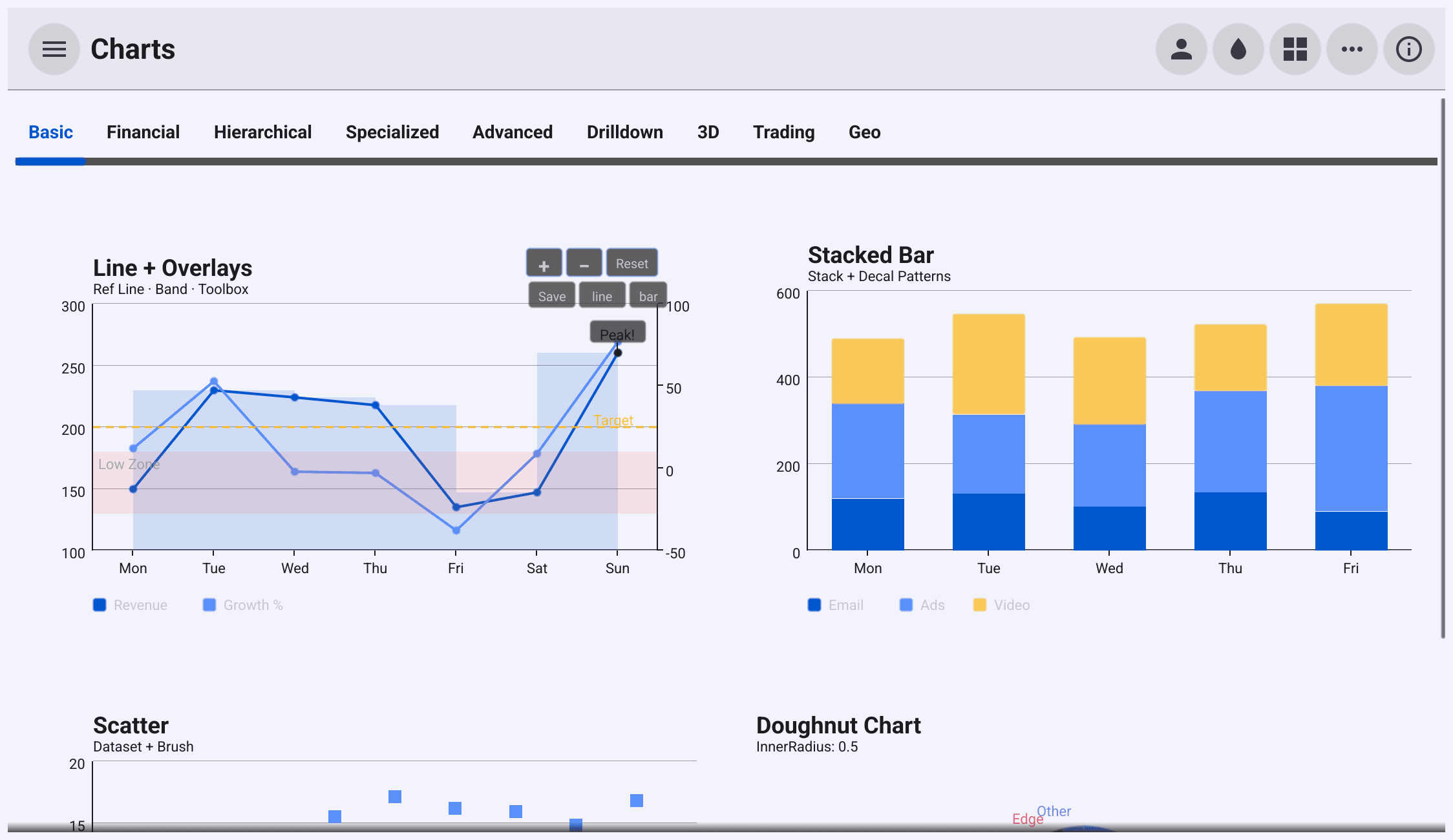
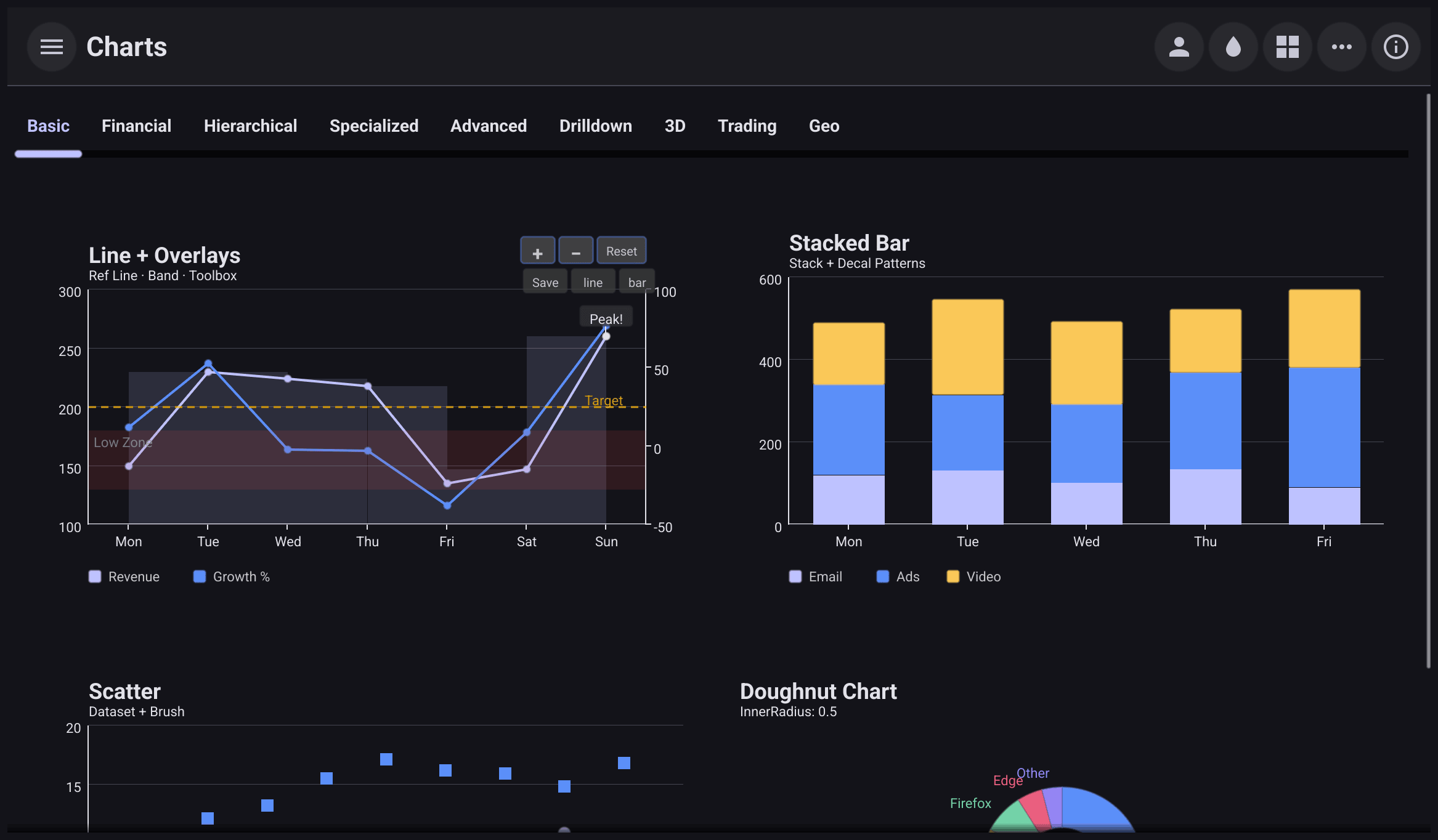
The charts extension in nine tabs: Basic, Financial, Hierarchical, Specialized, Advanced, Drilldown, 3D, Trading and Geo. They cover line, bar, scatter, pie, candlestick, heatmap, radar, gauge, funnel, box plot, treemap, Sankey, sunburst, graph, tree and parallel charts, 3D bars, scatter, surfaces and lines, and maps. The Trading tab has a chart that streams a new point every half second, and drawing tools. The Geo tab has a field for a map tile URL or API key. See Charts.
Code Editor
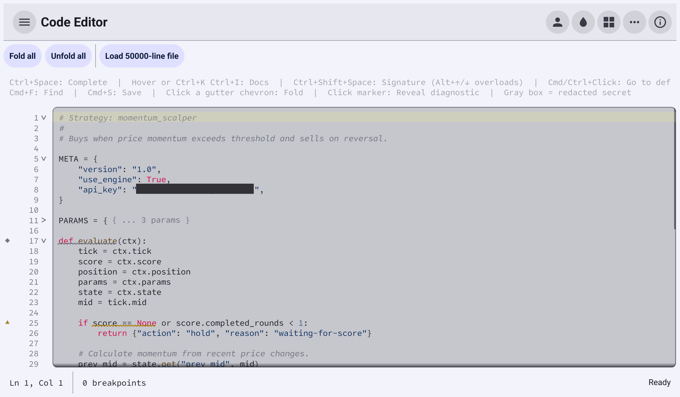
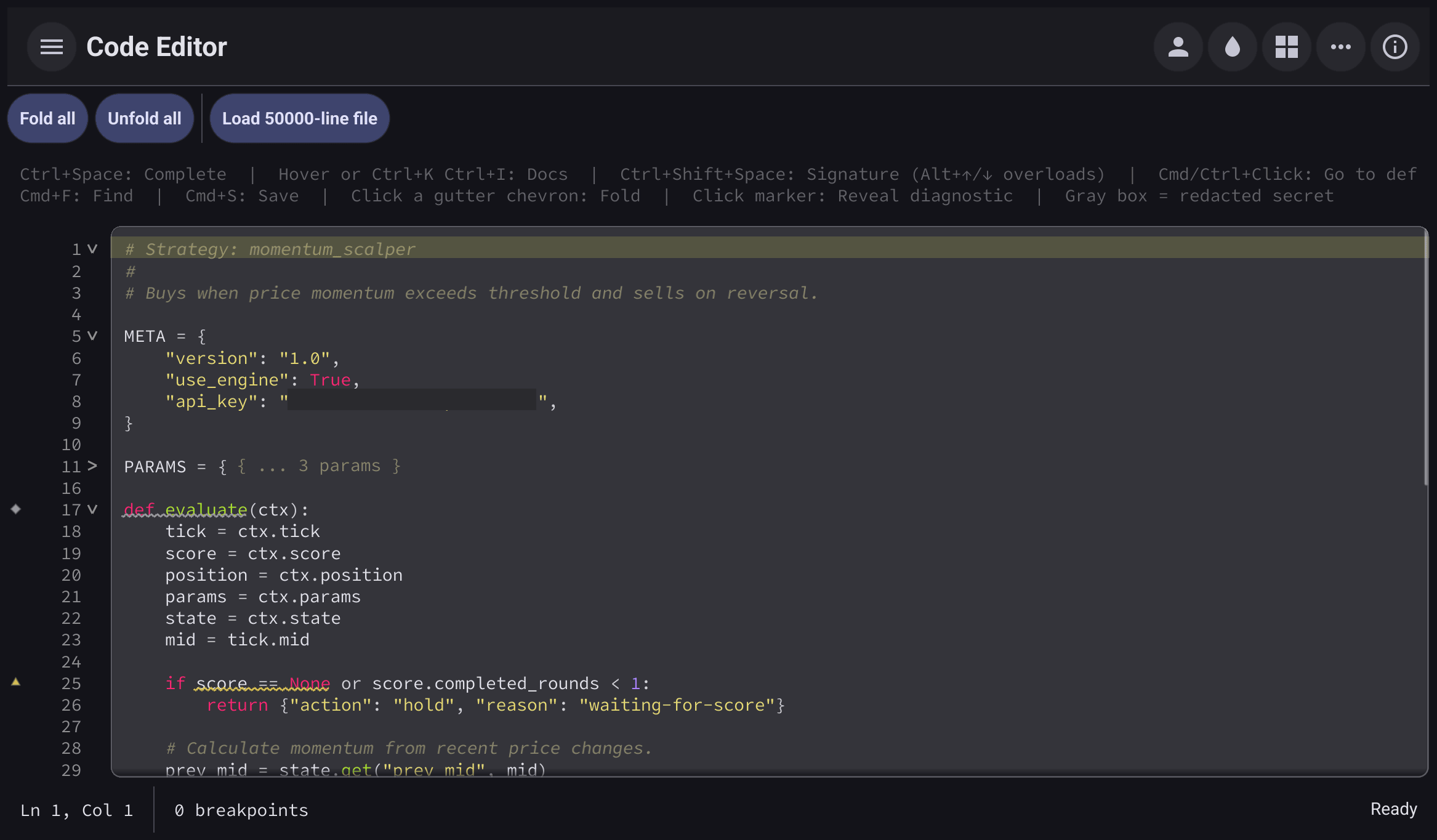
The code editor extension, editing a Starlark script. It shows syntax highlighting, a gutter with line numbers, breakpoints and fold arrows, error and warning markers with wavy underlines, completion, hover help, signature help, go-to-definition, a find bar, and a secret hidden behind a redaction box. A button swaps in a 50,000-line file to show that large files stay responsive. A help line above the editor lists the keyboard shortcuts. See Code editor.
Communication
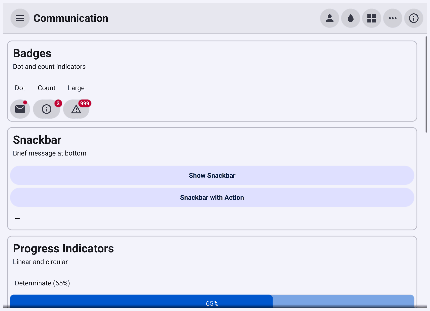
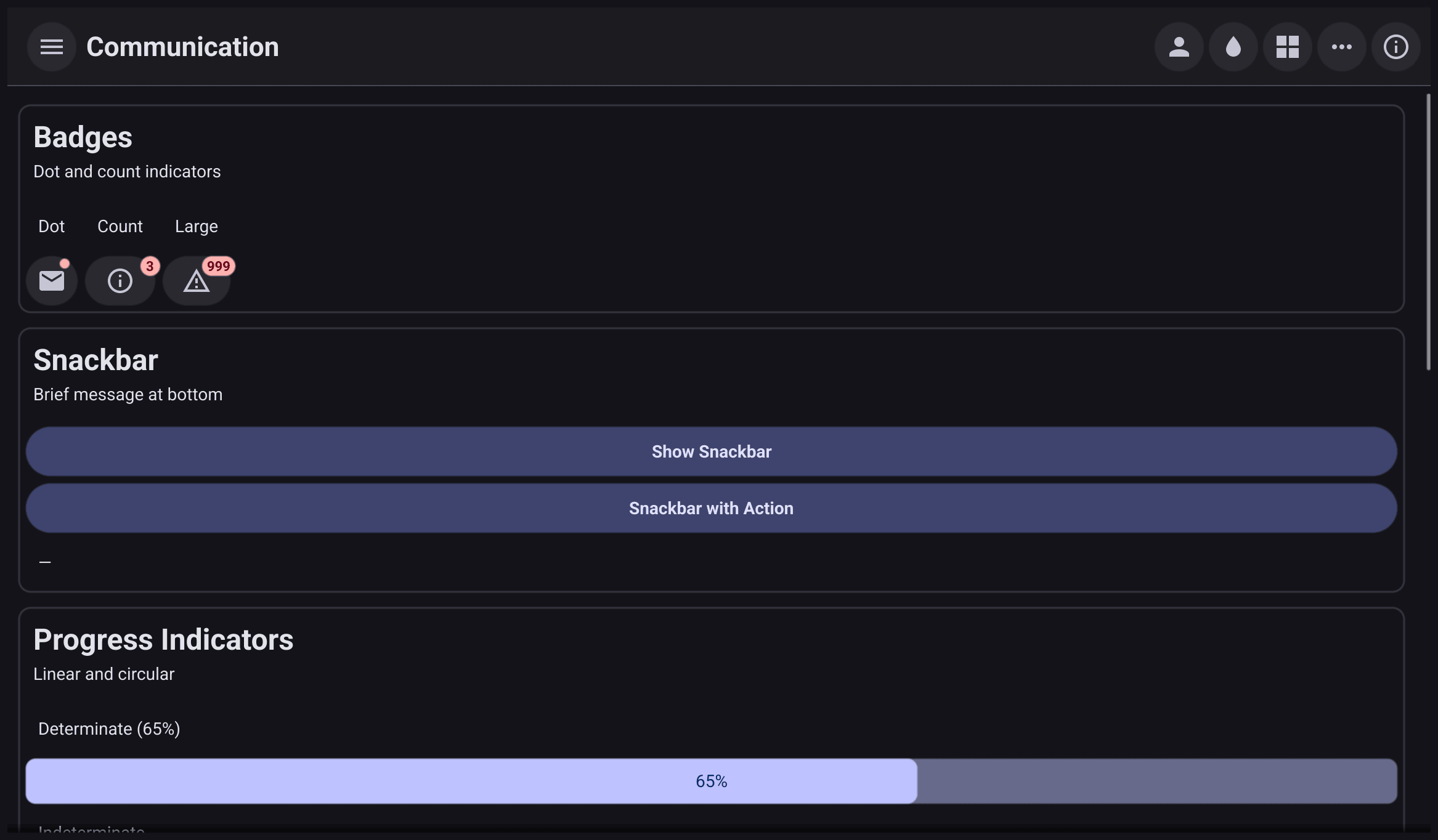
Ways to tell the user something. Badges with a dot or a count, snackbars with and without an action, determinate and indeterminate progress bars, an activity spinner, skeleton loading placeholders, a tooltip, and a toast. Buttons open the standard dialogs: confirm, information, a form with one field, file open, file save and folder open. See Feedback and Dialogs.
Containment
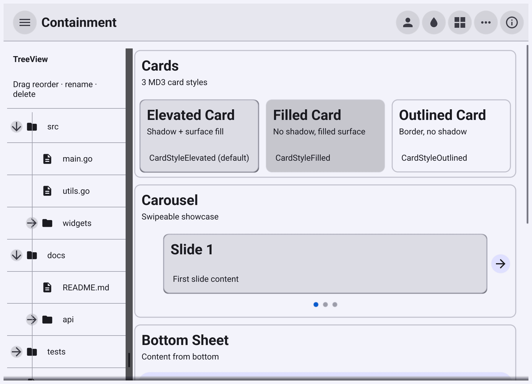
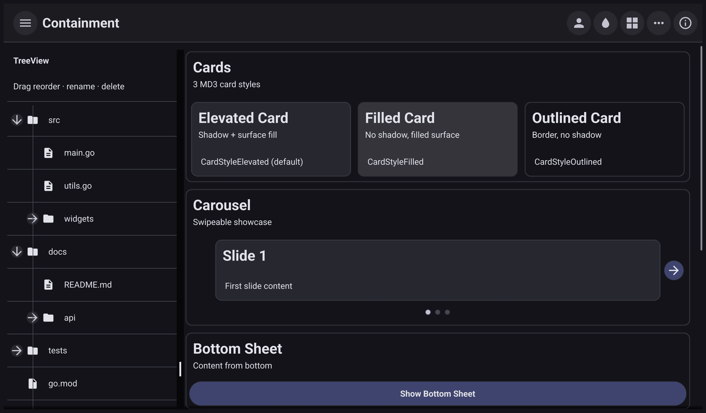
The three card styles, a carousel, a bottom sheet, a side sheet, a divider and a list. On the left, a tree view whose items you can drag to reorder, rename and delete. See Containment and overlays.
Data Grid
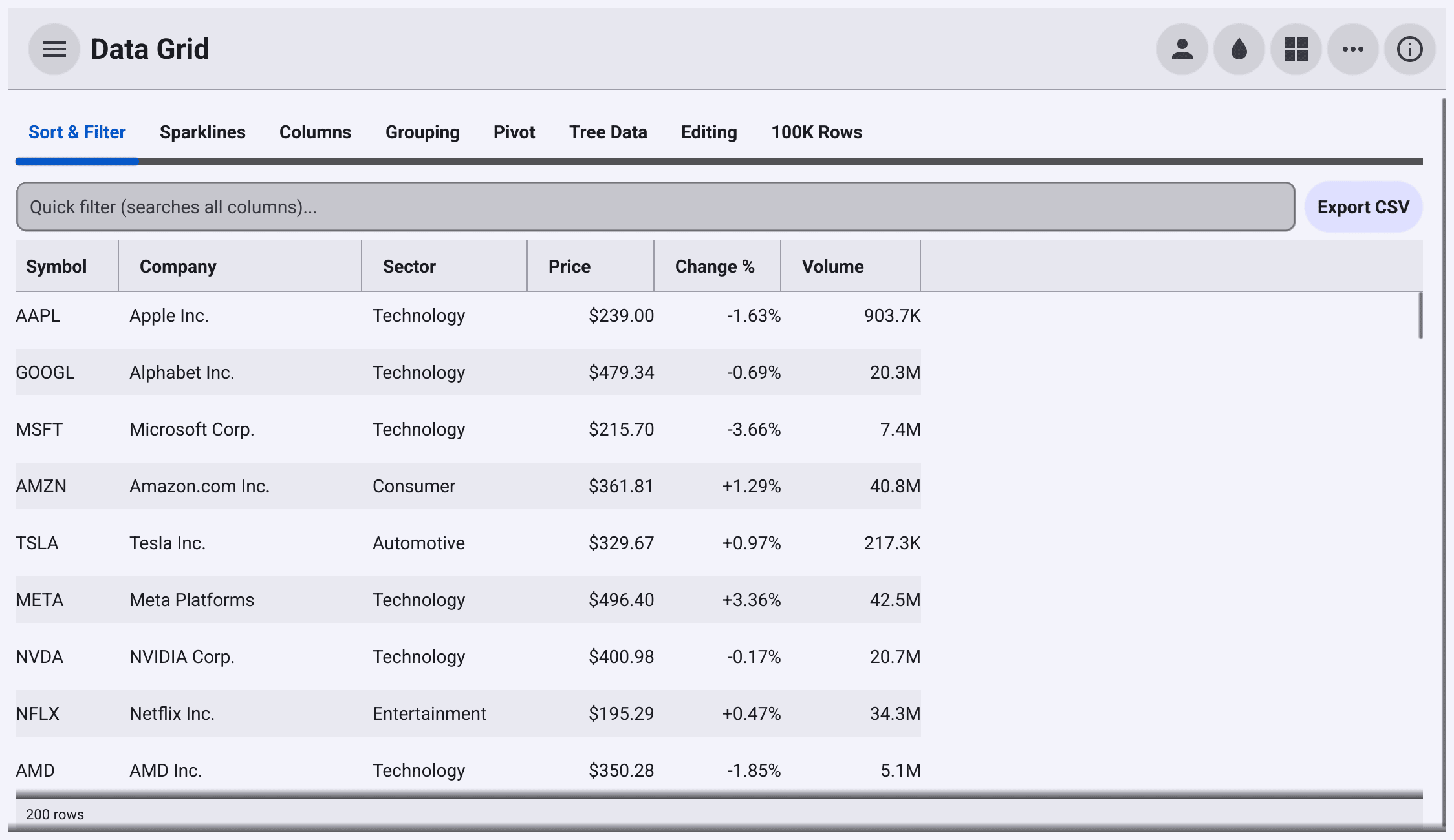
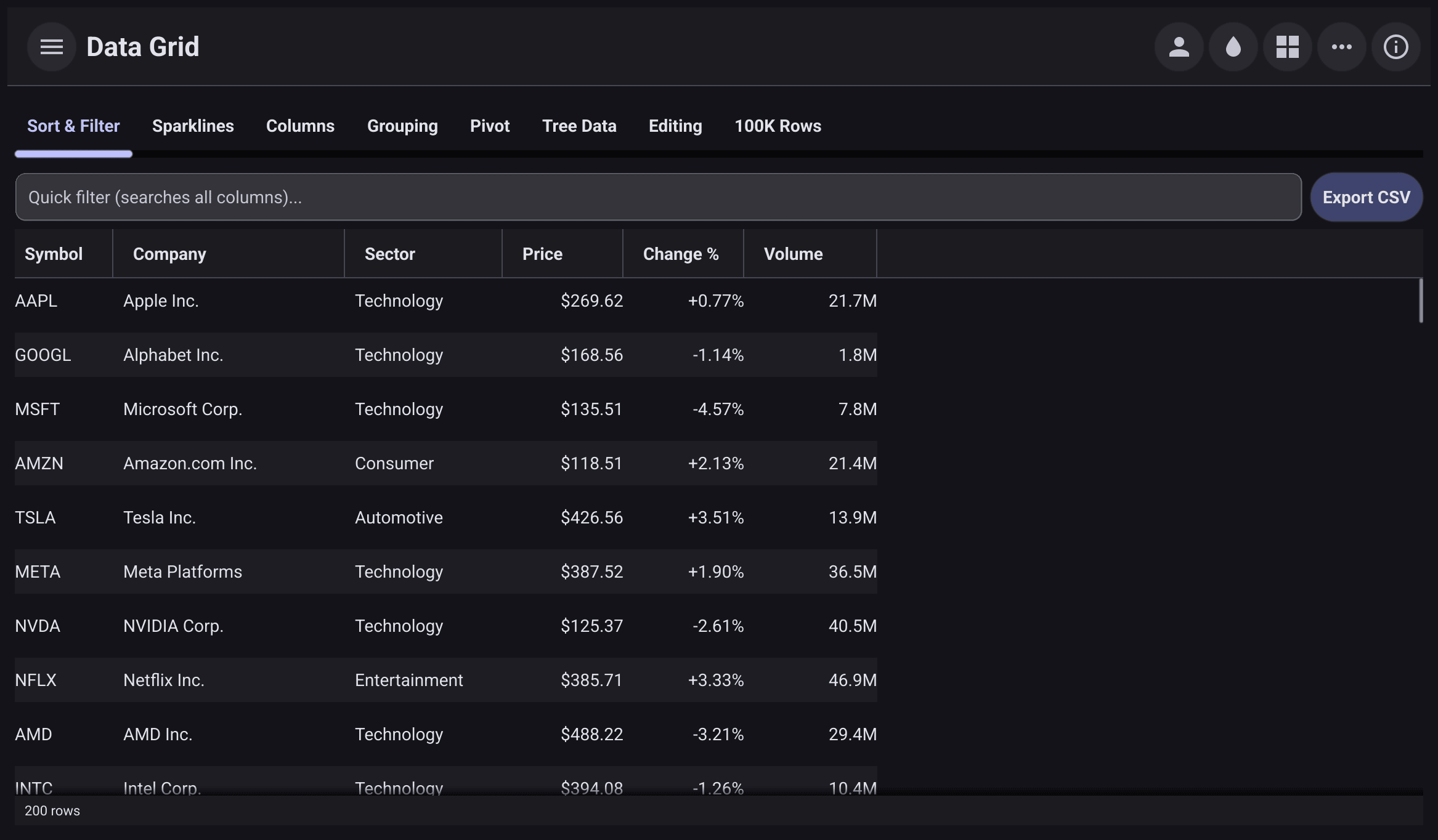
The data grid extension in eight tabs. Sort and filter with a quick filter box and CSV export; sparklines in cells; column groups, hiding, pinning and sizing; row grouping and pagination; a pivot table; tree data; cell editing with undo and redo; and a 100,000-row data set. See Tables.
File Transfer
A client for an Uploader server. Type the server’s
address (it starts as localhost:9090) and connect. Then pick a file to
upload, and save the uploaded file somewhere else to download it. A progress
bar follows each transfer, and a failed download shows the session ID to
resume it with. The page needs a running Uploader server.
File Tree
A file browser rooted at your home folder, built with widget.FileTree. A
switch shows or hides hidden files. The tree watches the folders it shows, so
a file you create in another app appears on its own. Selecting a file shows
its path below the tree.
Font Picker
A font picker inline on the page, listing the fonts installed on the system, and a button that opens the same picker as a pop-up. Both show what you picked: family, size, weight, and bold, italic and underline.
Inputs
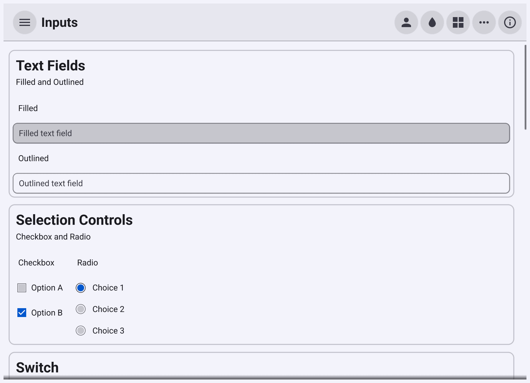
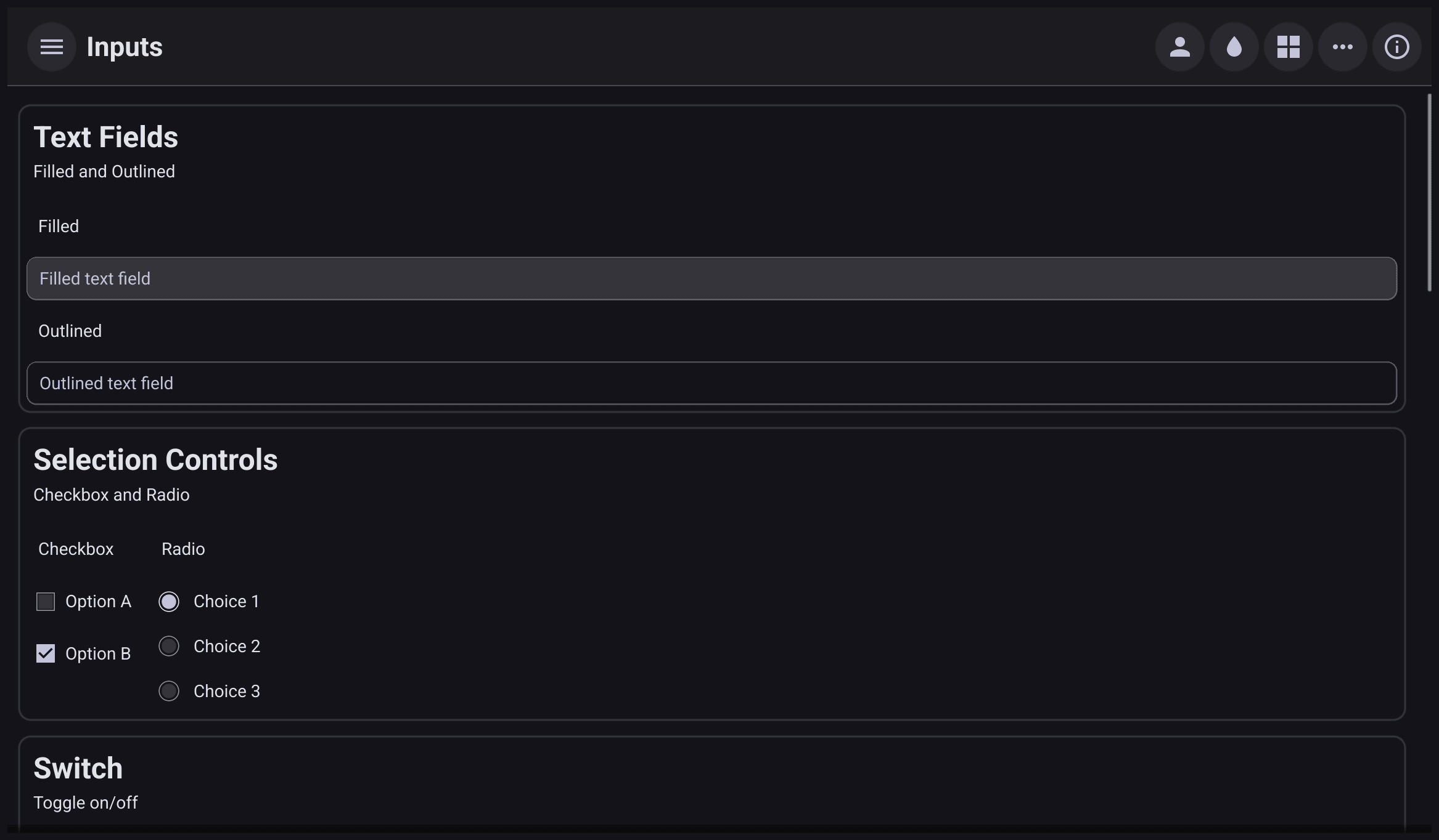
Filled and outlined text fields, checkboxes and radio buttons, switches, sliders (continuous, with tick marks, and a range slider), filter and assist chips, numeric and integer fields, a search field, a drop-down, and buttons that open the date, time, and date-and-time pickers. See Text input, Selection controls and Pickers.
Navigation
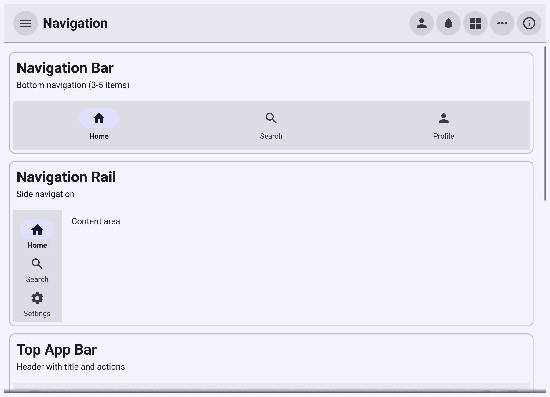
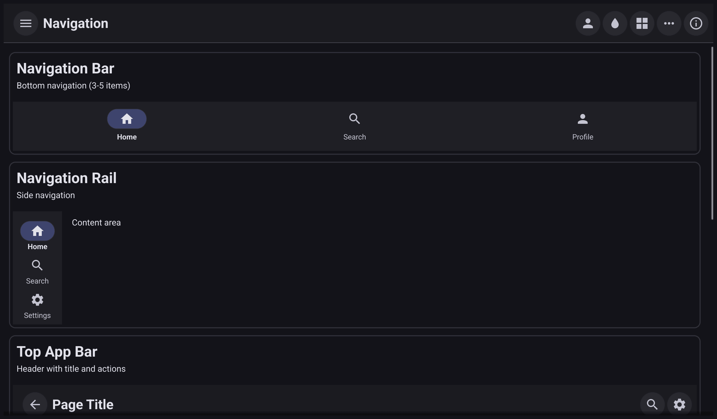
A navigation bar, a navigation rail, a top app bar and a bottom app bar with a floating action button, tabs, a navigation drawer that slides in, and a toolbar. See Navigation.
Responsive
Coloured tiles in a responsive layout. Each tile declares how much of a row it takes in each window size class, so the grid reflows as you resize the window: full width on a narrow window, halves on a medium one, quarters on a wide one. A label shows the current width and size class. See Responsive layouts.
Scrolling
Three scrolling cases side by side: a list of 50,000 rows, a 5,000-line text editor with wrapping off so both scroll bars are active, and word-wrapped text with a switch for the space reserved for the scroll bar. Text at the top suggests things to try. See Scrolling.
Theme
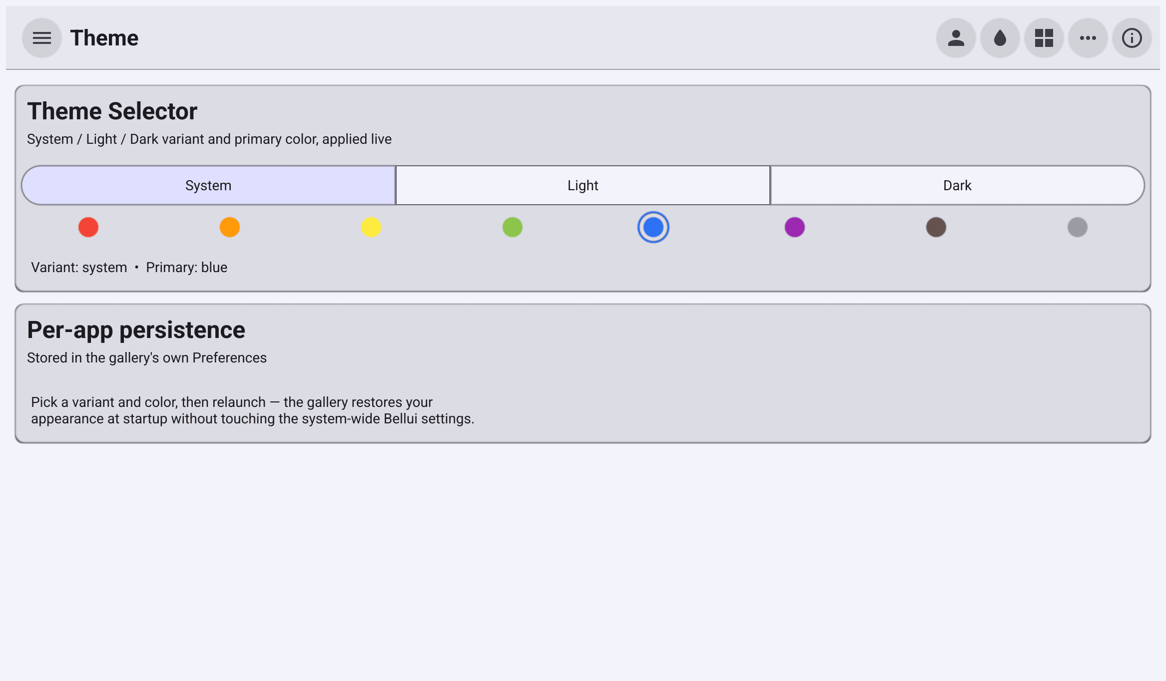
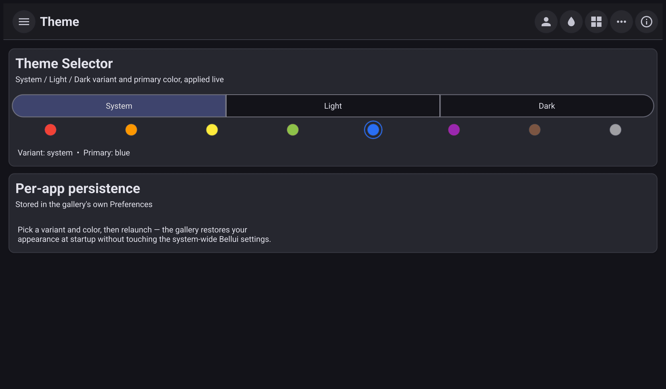
The theme selector: system, light or dark, and a primary colour, applied to the running app as you choose. The gallery saves your choice in its own preferences and restores it at the next start, without changing the settings of other Bellui apps.
Typography
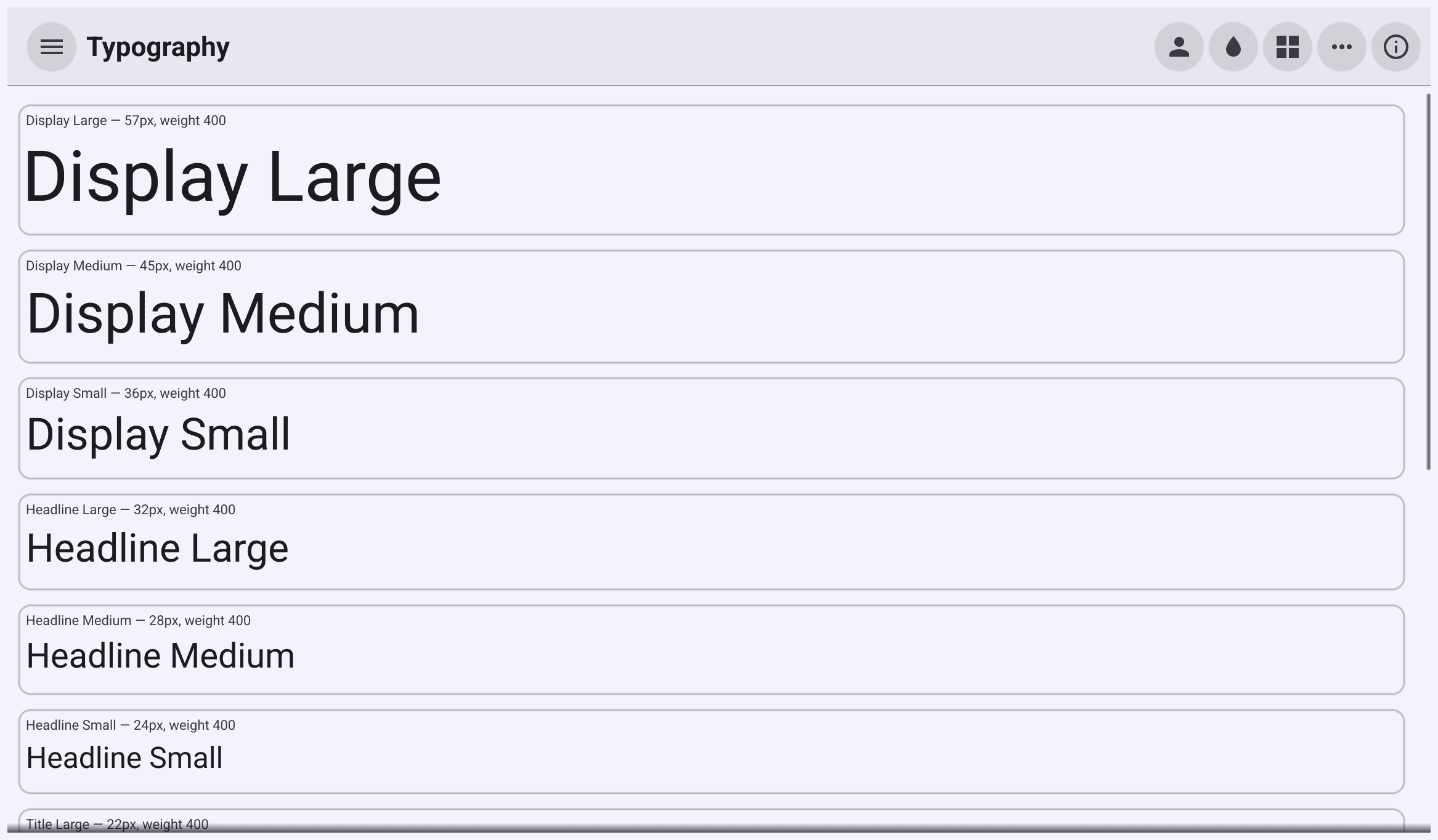
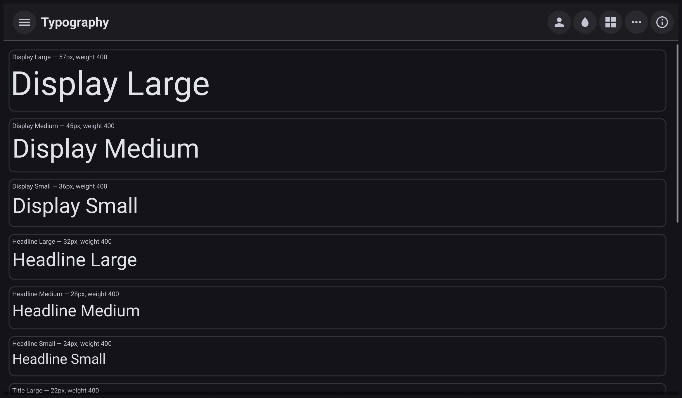
All fifteen Material Design 3 type styles, from Display Large to Label Small. Each shows a sample and its size and weight in the current theme. See Fonts and typography.
Clair
Desktop only. A search box over an index of Bellui’s widget and
container packages, built with Clair. Type a query and
press Enter to see matching declarations with their signatures and doc
comments. The first search builds the index in your system’s temporary
folder. To do that it needs a Bellui source checkout, either next to the
gallery (../bellui) or under $GOPATH/src/github.com/belluikit/bellui.
Code Assistant
Desktop only. A small Go program with deliberate mistakes in an editor, next to a chat. You ask a question, and the assistant answers through Anthropic’s API using Clair, with the program and matching Bellui API entries included. It needs your own Anthropic API key, entered on the page and stored in the app’s preferences. You can load the list of available models and choose one. Like the Clair page, it needs a Bellui source checkout to build its index, and shows an error instead of the editor when it cannot find one.